A Guide to Master Machine Learning Modeling from Scratch

Categories:
 Written by:
Nathan Rosidi
Machine learning modeling is intimidating for beginners. With this article, we’ll make it less complicated and guide you through essential modeling techniques.
Ever wonder how Netflix knows precisely what you want, even if you don’t? It’s magic!
OK, it’s not, but it also starts with M: machine learning modeling. This is a process that provides predictive power to today’s decision-making. Recommendation systems. Fraud detection. Autonomous vehicles. Credit scoring systems. Even your phone’s camera adjusting focus. Yup, that’s all machine learning modeling.
Get ready for some explanations of a machine learning modeling workflow, practical code examples, vital ML modeling techniques, and tips to help you bring the model to life.
What is Machine Learning Modeling?
Machine learning modeling is a process of training algorithms to recognize patterns in historical data, thus making them able to recognize patterns in new, similar data.
In essence, you supply structured data consisting of features and known outcomes. The learning algorithm then optimizes internal parameters to minimize prediction error, thus creating a machine learning model that can generalize to new, unseen data.
It sounds similar to programming, but there’s one significant difference. In classical programming, you write the rules a program will follow to execute an operation. In machine learning modeling, you only provide the system with examples for it to infer rules on its own. Over time - meaning, during the training process - the model will adapt to the structure and statistical relationships it detects, making its decisions more refined.
Different problems require different approaches. That’s why there are so many machine learning algorithms. However, choosing a suitable algorithm is not the start nor the end of machine learning modeling. As I already mentioned, machine learning modeling is a process, and processes typically follow a certain workflow.
The Machine Learning Modeling Workflow
Machine learning modeling typically involves six steps.
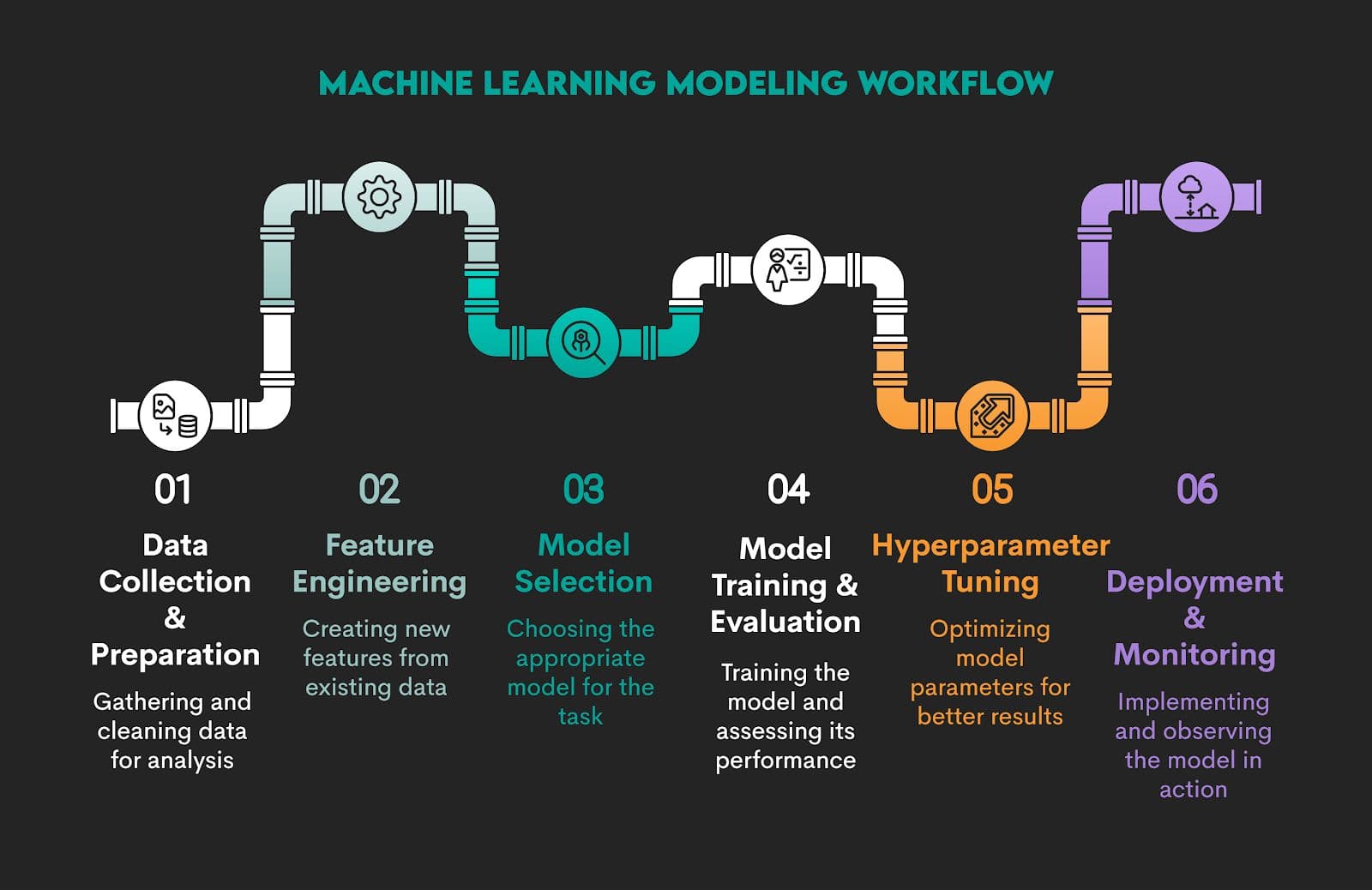
However, when we’re talking about workflow, we don’t mean there are (always) very clear-cut borders between the stages. Machine learning modeling is an iterative process. There’s typically a lot of back-and-forth between the stages. Some techniques can be used in different stages, so the lines between them can easily get blurred.
So, this division into strict stages is for educational purposes. In practice, it’s just one continuous process.
1. Data Collection and Preparation
In the workflow, it’s difficult to say that one step is more important than the other. They all build on the one before. However, all models need high-quality data. If you mess it up here, no machine learning knowledge and algorithms will save your model. That old adage of ‘Garbage in, garbage out’ (GIGO) applies here.
After you collect raw data from sources such as web scraping, API endpoints, relational databases, cloud storage, or local files, you must transform it into a structured format that machines can read.
Next, you should perform an exploratory data analysis (EDA) to understand data structure, catch errors or anomalies, and assess distributions and relationships.
Then you preprocess it, meaning you handle missing values, duplicate records, data type inconsistencies, outliers, and encoding mismatches.
Example
I’ll use the property click prediction data project by No Broker from our platform as an example for demonstrating different stages of an ML modeling workflow.
The requirement is pretty straightforward: build a model that predicts the number of interactions a property would receive in a period of time. This can be any period. We will do a 3-day and 7-day interaction prediction for simplicity.
We will divide initial steps into:
1.1. Data Collection
1.2. Data Preparation
1.3. EDA and Data Processing
1.1. Data Collection
In the project, the data is provided in the .csv file, so we’ll use pandas to read the data. There are three .csv files in the dataset:
property_data_set.csv– data about the propertiesproperty_interactions.csv– data with timestamps of interactions with propertiesproperty_photos.tsv– data containing the count of property photos
We’ll import all the required libraries and all the files. To be precise, data collection for our project will involve these steps:
1.1.1. Import Required Libraries
1.1.2. Set pandas Display Options
1.1.3. Load Dataset – Properties
1.1.4. Load Dataset – Property Interactions
1.1.5. Load Dataset – Photo Metadata
1.1.6. Print Dataset Shapes
1.1.7. Sampling Data With sample()
1.1.1. Import Required Libraries
Project Code:
##### Import required libraries
# Import the pandas library as pd
import pandas as pd

# Import the numpy library as np
import numpy as np

# Import the seaborn library as sns
import seaborn as sns

# Import the matplotlib.pyplot library as plt
import matplotlib.pyplot as plt

# Import the json library
import json
What It Does: Imports essential Python libraries for data manipulation (pandas, NumPy), visualization (seaborn, Matplotlib), and working with JSON-encoded strings.
1.1.2. Set pandas Display Options
Project Code:
# View options for pandas
pd.set_option('display.max_columns', 50)
pd.set_option('display.max_rows', 10)
What It Does: Changes how many columns and rows pandas shows when printing DataFrames.
1.1.3. Load Dataset – Properties
Project Code:
# Read all data

# Properties data
data = pd.read_csv('property-click-prediction/resources/property_data_set.csv',parse_dates = ['activation_date'],
                   infer_datetime_format = True, dayfirst=True)
What It Does:
- Loads the main property dataset.
- Parses the
activation_datecolumn as a datetime. - Assumes day-first date format (e.g.,
31/12/2023)
1.1.4. Load Dataset – Property Interactions
Project Code:
# Data containing the timestamps of interaction on the properties
interaction = pd.read_csv('property-click-prediction/resources/property_interactions.csv',
                          parse_dates = ['request_date'] , infer_datetime_format = True, dayfirst=True)
What It Does:
- Loads interaction logs where users have clicked or shown interest in a property.
- Parses
request_dateas datetime.
1.1.5. Load Dataset – Photo Metadata
Project Code:
# Data containing photo counts of properties
pics = pd.read_table('property-click-prediction/resources/property_photos.tsv')
What It Does: Loads photo data froma tab-separated values (TSV) file.
1.1.6. Print Dataset Shapes
Project Code:
# Print shape (num. of rows, num. of columns) of all data
print('Property data Shape', data.shape)
print('Pics data Shape',pics.shape)
print('Interaction data Shape',interaction.shape)
Here’s the output.
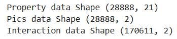
What It Does: Prints the number of rows and columns in each dataset.
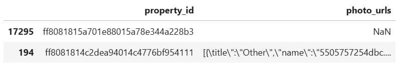
1.1.7. Sampling Data With sample()
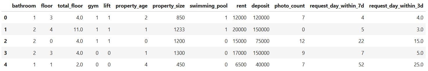
Project Code: In the project, we will show two rows from the property data.
# Sample of property data
data.sample(2)
Here’s the output.

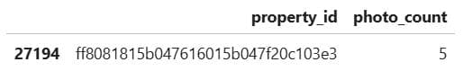
Now, the same for the pics data.
# Sample of pics data
pics.sample(2)
Here’s the output.
Finally, the sample of interaction data, too.
# Sample of interaction data
interaction.sample(2)
Here’s the output.
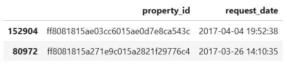
What It Does: Display two random rows from the DataFrames we use in the project.
1.2. Data Preparation
We can now start preparing the data. It will involve these steps.
1.2.1. Preview the Dataset with head()
1.2.2. Output Column Types With .dtypes
1.2.3. Count NaNs With isna() And sum()
1.2.4. Access a String With Label-Based Indexing With Bracket Notation
1.2.5. Replace a Corrupted String Using replace()
1.2.6. Define a Cleaning and Counting Function
1.2.7. Apply the Function to All Rows With apply()
1.2.8. Remove the Original Column
1.2.10. Merge DataFrames With merge()
1.2.11. Calculate Days Between Activation and Request
1.2.12. Count With groupby and agg()
1.2.13. Rename Columns With .rename()
1.2.14. Categorize Data and Counting Properties in Each Column
1.2.15. Define Category Mapping Function
1.2.16. Apply Category Mapping
1.2.17. Preview Categorized Data
1.2.18. Count the Number of Properties
1.2.19. Check Data Before Merging
1.2.20. Merge 3-Day and 7-Day Interaction Features
1.2.21. Replace NaNs Using fillna()
1.2.22. Check for Missing Values
1.2.23. Merge Property Data With Photo Counts
1.2.24. Create Final Dataset for Modeling
1.2.25. Final Null Check
Here we go!
1.2.1. Preview the Dataset With head()
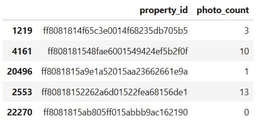
Project Code: First, let’s show the first five rows of the pics data.
# Show the first five rows
pics.head()
Here’s the output.
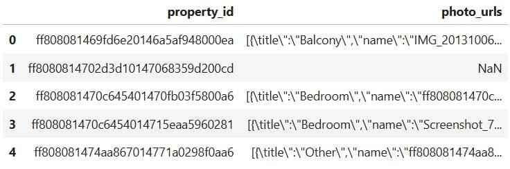
What It Does: Displays the first five rows of the pics DataFrame, showing:
property_id: unique ID for each propertyphoto_urls: JSON-like strings listing the images and their metadata (e.g., title, filename)
1.2.2. Output Column Types With .dtypes
Project Code:
# Types of columns
pics.dtypes
Here’s the output.
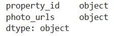
What It Does: Displays the data type of each column in the pics DataFrame.
1.2.3. Count NaNs With isna() and sum()
Project Code: We will now use these two functions to count the number of NaNs in the pics data.
# Number of nan values
pics.isna().sum()
Here’s the output.
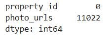
What It Does: Calculates the number of missing (NaN) values in each column of the pics DataFrame.
1.2.4. Access a String With Label-Based Indexing With Bracket Notation
Project Code: We preview the photo_urls column of the first row in the pics dataset to see which characters we need to fix in an attempt to fix a corrupted data in the JSON file.
# Try to correct the first Json
text_before = pics['photo_urls'][0]
print('Before Correction: \n\n', text_before)
Here’s the output.
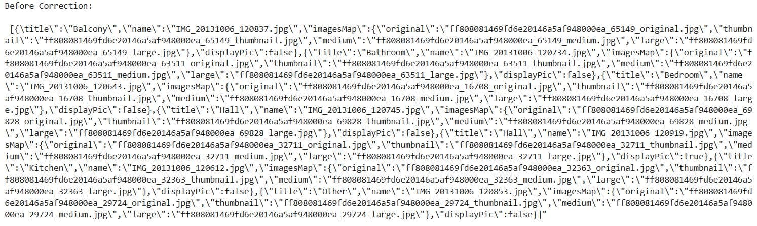
What It Does:
- Retrieves the first value from the
photo_urlscolumn in thepicsDataFrame. - Prints its raw, unprocessed content — which appears to be a malformed JSON-like string.
1.2.5. Replace a Corrupted String Using replace()
Project Code:
# Try to replace corrupted values then convert to json
text_after = text_before.replace('\\' , '').replace('{title','{"title').replace(']"' , ']').replace('],"', ']","')
print("\n\nAfter correction and converted to json: \n\n", json.loads(text_after))
Here’s the output.
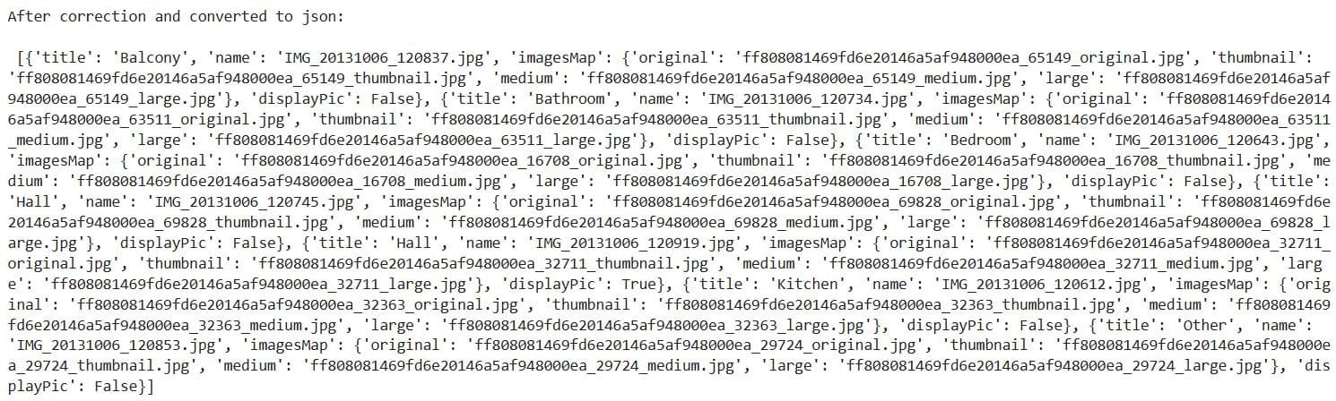
What It Does:
- Cleans up the corrupted
photo_urlsstring by:- Replacing all backslashes
(\)with escape character. - Adding a quote before
title, converting{title:to{"title": - Fixing
]"into just] - Adding quotes between adjacent arrays or objects where they’re missing
- Replacing all backslashes
- Converts the cleaned string into a valid Python list of dictionaries using
json.loads().
1.2.6. Define a Cleaning and Counting Function
Project Code:
# Function to correct corrupted json and get count of photos
def correction (x):
    # if value is null put count with 0 photos
    if x is np.nan or x == 'NaN':
        return 0
    else :
        # Replace corrupted values then convert to json and get count of photos
        return len(json.loads( x.replace('\\' , '').replace('{title','{"title').replace(']"' , ']').replace('],"', ']","') ))
What It Does:
- Checks if the
photo_urlsfield is missing (NaN) and returns 0. - Otherwise, it cleans up the corrupted JSON string (the same characters as in the previous step, only we do that for all rows) and counts how many photo entries exist.
1.2.7. Apply the Function to All Rows With apply()
Project Code:
# Apply Correction Function
pics['photo_count'] = pics['photo_urls'].apply(correction)
What It Does: Applies the correction() function row by row to the photo_urls column of the pics DataFrame and stores the result in a new column called photo_count.
1.2.8. Remove the Original Column
Project Code:
# Delete photo_urls column
del pics['photo_urls']
What It Does: Removes the now-unnecessary photo_urls column.
1.2.9. Preview the Cleaned Data
Project Code:
# Sample of Pics data
pics.sample(5)
Here’s the output.
What It Does: Displays five random rows from the updated pics DataFrame.
1.2.10. Merge DataFrames With merge()
Project Code:
# Merge data with interactions data on property_id
num_req = pd.merge(data, interaction, on ='property_id')[['property_id', 'request_date', 'activation_date']]
num_req.head(5)
Here’s the output.
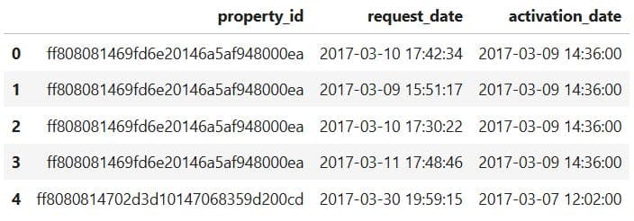
What It Does:
- Merges the
data(property listings) andinteraction(user requests) datasets using the common keyproperty_id. - Selects only three relevant columns from the merged result:
property_id: unique property identifierrequest_date: when a user interacted with the propertyactivation_date: when the property was listed
1.2.11. Calculate Days Between Activation and Request
Project Code:
Now, we calculate the difference between the request and activation dates.
# Get a Time between Request and Activation Date to be able to select request within the number of days
num_req['request_day'] = (num_req['request_date'] - num_req['activation_date']) / np.timedelta64(1, 'D')

# Show the first row of data
num_req.head(1)
Here’s the output.
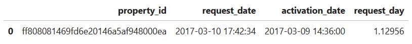
What It Does:
- Computes the number of days between a property’s activation date and each user request.
- Stores the result in a new column
request_day, which contains float values representing days. - Displays the first row to verify the new column
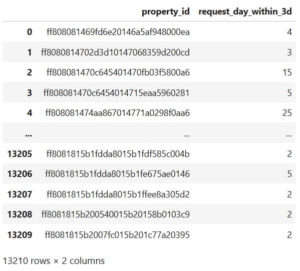
1.2.12. Count With groupby and agg()
Project Code: Let’s now get the number of interactions within 3 days.
# Get a count of requests in the first 3 days
num_req_within_3d = num_req[num_req['request_day'] < 3].groupby('property_id').agg({ 'request_day':'count'}).reset_index()
We then do the same for the 7-day interactions.
# Get a count of requests in the first 7 days
num_req_within_7d = num_req[num_req['request_day'] < 7].groupby('property_id').agg({ 'request_day':'count'}).reset_index()
What It Does:
- Filters requests that happened within the first 3 and 7 days after a property was activated.
- Groups them by
property_id. - Counts how many requests each property received in that 3-day and 7-day window.
- Stores the result as new DataFrames
num_req_within_3dandnum_req_within_7dwith two columnsproperty_idrequest_day(now representing the number of early requests)
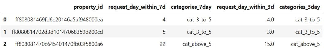
1.2.13. Rename Columns With .rename()
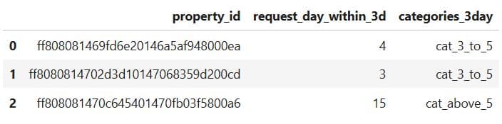
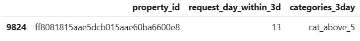
Project Code: To customize the output, we rename the 'request_day' column to 'request_day_within_3d'.
# Show every property id with the number of requests in the first 3 days
num_req_within_3d = num_req_within_3d.rename({'request_day':'request_day_within_3d'},axis=1)

# Dataset with the number of requests within 3 days
num_req_within_3d
Here’s the output.
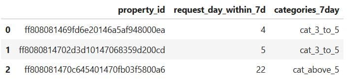
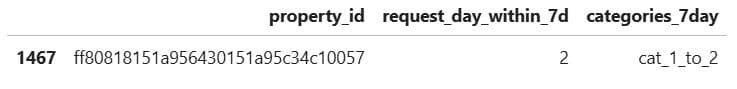
Now, the same thing, only for the 7-day interactions.
# Show every property id with the number of requests in the first 7 days
num_req_within_7d = num_req_within_7d.rename({'request_day':'request_day_within_7d'},axis=1)

# Dataset with the number of requests within 7 days
num_req_within_7d
Here’s the output.
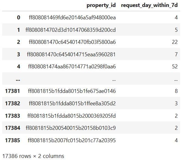
What It Does:
- It changes column name from
request_daytorequest_day_within_3dandrequest_day_within_7dto clearly reflect that the values represent the number of requests within the first 3 and 7 days. - Shows each
property_idwith its corresponding request count in 3-day and 7-day windows.
1.2.14. Categorize Data and Counting Properties in Each Column
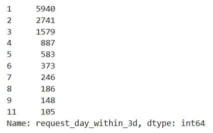
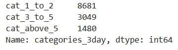
Project Code: In the project, we use value_counts() to list the top ten number of property interactions within three days.
num_req_within_3d['request_day_within_3d'].value_counts()[:10]
Here’s the output.
Here’s the same thing for 7-day interactions.
num_req_within_7d['request_day_within_7d'].value_counts()[:10]
Here’s the output.
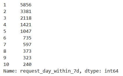
What It Does:
- Counts how many properties had the same number of requests within the first 3 and 7 days.
- Returns the top 10 most common request counts (e.g., how many properties had 1 request, 2 requests, etc.).
1.2.15. Define Category Mapping Function
Project Code:
def divide(x):
    if x in [1,2]:
        return 'cat_1_to_2'
    elif x in [3,4,5]:
        return 'cat_3_to_5'
    else:
        return 'cat_above_5'
What It Does: Defines a function that maps numerical request counts into 3 categories.
1.2.16. Apply Category Mapping
Project Code: Here’s the function application for 3-day interactions.
num_req_within_3d['categories_3day'] = num_req_within_3d['request_day_within_3d'].apply(divide)
We apply the same function on 7-day interactions.
num_req_within_7d['categories_7day'] = num_req_within_7d['request_day_within_7d'].apply(divide)
What It Does: Applies the divide() function to 'request_day_within_3d' and 'request_day_within_7d' columns and creates new columns with category labels.
1.2.17. Preview Categorized Data
Project Code: Here we preview the 3-day data.
num_req_within_3d.head(3)
Here’s the output.
Here’s the code for the 7-day data preview.
num_req_within_7d.head(3)
Here’s the output.
What It Does: Displays the first three rows of the updated datasets to confirm the new columns have been added correctly.
1.2.18. Count the Number of Properties
Project Code: Here’s the 3-day properties count.
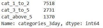
num_req_within_3d['categories_3day'].value_counts()
Here’s the output.
This is the 7-day properties count.
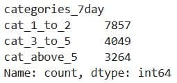
num_req_within_7d['categories_7day'].value_counts()
Here’s the output.
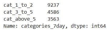
What It Does: Counts the number of properties in each category of the 'categories_3day' and 'categories_7day' columns.
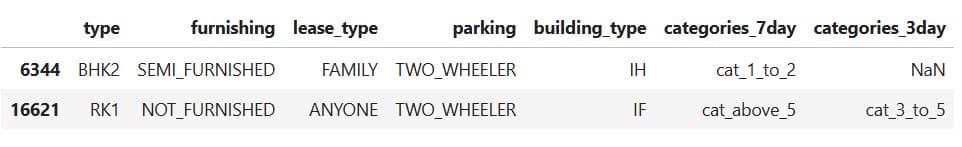
1.2.19. Check Data Before Merging
Project Code:
data.sample()
Here’s the output.

pics.sample()
Here’s the output.
num_req_within_3d.sample()
Here’s the output.
num_req_within_7d.sample()
Here’s the output.
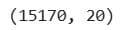
print(num_req_within_3d.shape)
print(num_req_within_7d.shape)
Here’s the output.
What It Does:
- Displays random samples from key datasets (
data,pics,num_req_within_3d,num_req_within_7d) - Prints the number of rows and columns for the 3-day and 7-day request datasets
1.2.20. Merge 3-Day and 7-Day Interaction Features
Project Code:
label_data = pd.merge(num_req_within_7d, num_req_within_3d, on ='property_id' , how='left')
What It Does: This code line merges two datasets:
num_req_within_7d(requests in the first 7 days)num_req_within_3d(requests in the first 3 days)
1.2.21. Replace NaNs Using fillna()
Project Code:
label_data['request_day_within_3d'] = label_data['request_day_within_3d'].fillna(0)
label_data.head(3)
Here’s the output.
What It Does:
fillna(0)replaces anyNaNvalues in therequest_day_within_3dcolumn with 0. TheseNaNsappear when a property had no requests in the first three days- Shows the first three rows of the merged
label_dataDataFrame.
1.2.22. Check for Missing Values
Project Code:
label_data.isna().sum()
Here’s the output.
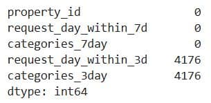
What It Does: Counts the number of missing values (NaN) in each column of the label_data DataFrame.
1.2.23. Merge Property Data With Photo Counts
Project Code:
data_with_pics = pd.merge(data, pics, on ='property_id', how = 'left')
data_with_pics.head(3)
Here’s the output.

What It Does:
- Merges the main
dataDataFrame (property listings) with thepicsDataFrame (which containsphoto_count). - Uses a left join to keep all property listings and bring in photo information where available.
- Displays the first 3 rows of the merged dataset to verify the result.
1.2.24. Create Final Dataset for Modeling
Project Code:
dataset = pd.merge(data_with_pics, label_data, on ='property_id')
dataset.head(3)
Here’s the output.

What It Does:
- Merges the enriched property data (with photo counts) from
data_with_picswith the labeled request data (3-day and 7-day interactions) fromlabel_data. - Joins on property_id to create a complete dataset that includes:
- Property details
- Photo features
- Request counts and categories (labels)
- Shows the first three rows to confirm successful merging
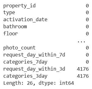
1.2.25. Final Null Check
Project code:
dataset.isna().sum()
Here’s the output.
1.3. EDA and Data Processing
We’ve now entered the third substage of the Data Collection and Preparation stage. We’ll go through these steps:
1.3.1. Exploring Locality Distribution
1.3.2. Removing Columns With drop()
1.3.3. Dataset Summary – Nulls and Data Types
1.3.4. Visualize Distribution of a Numeric Feature on Histogram With Seaborn
1.3.5. Visualize Distribution of a Categorical Feature on a Count Plot With Seaborn
1.3.6. Split the Dataset Into Categorical and Numeric Columns With select_dtypes()
1.3.7. Sample Categorical & Numeric Features Value
1.3.8. Categorical Value Counts Summary
1.3.9. Categorical Feature Distribution Plots
1.3.10. Preview Numerical Features
1.3.11. Box Plot for Outlier Detection and Range Overview Using plot()
1.3.12. Numerical Data Statistics With describe()
1.3.13. Creating a Scatterplot in Seaborn for Relationship Exploration
Let’s begin with this.
1.3.1. Exploring Locality Distribution
Project Code:
dataset['locality'].value_counts()
Here’s the output.
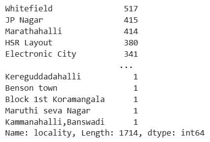
What It Does: Counts the frequency of each unique value in the locality column, showing how many properties exist in each location.
1.3.2. Removing Columns With drop()
Project Code: We now apply the same method to the project dataset.
# Dropped those columns that won't have an effect on the number of requests
dataset = dataset.drop(['property_id', 'activation_date' ,'latitude', 'longitude', 'pin_code','locality'  ] , axis=1)
What It Does: Removes columns from the dataset that are not useful for prediction, including:
- Identifiers (
property_id) as they have no predictive power - Raw geographic coordinates that are too detailed without transformation (
latitude,longitude) - Sparse or overly specific location info (
pin_code,locality) - A raw date field (
activation_date) that hasn’t been transformed into a usable feature
1.3.3. Dataset Summary – Nulls and Data Types
Project Code:
# Some info about all columns
print('Column : Num. of null values')
print(dict(dataset.isna().sum()))
print('\n\n')
print('Column : data type')
print(dict(dataset.dtypes))
Here’s the output.
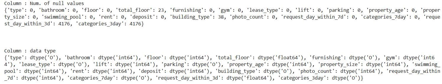
What It Does:
- Prints the number of missing (
NaN) values for each column. - Prints the data type of each column.
1.3.4. Visualize Distribution of a Numeric Feature on Histogram With Seaborn
Project Code: We first plot the 3-day interactions on a histogram.
# Show histogram of the number of requests in first 3 days
plt.figure(figsize=(10,5))
sns.histplot(dataset, x="request_day_within_3d")

plt.title('histogram of num. of requests in first 3 days')
plt.show()
Here’s the output.
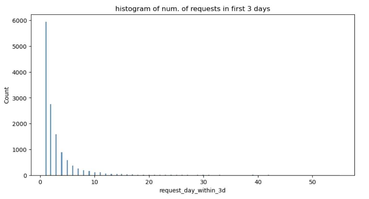
It shows that the data distribution is right-skewed. The data is heavily unbalanced, as most listings are low-engagement, and a few are high-performing outliers.
Let’s now make the same plots for the 7-day interactions.
# Show histogram of the number of requests in first 7 days
plt.figure(figsize=(10,5))
sns.histplot(dataset, x="request_day_within_7d")

plt.title('histogram of num. of requests in first 7 days')
plt.show()
Here’s the histogram.
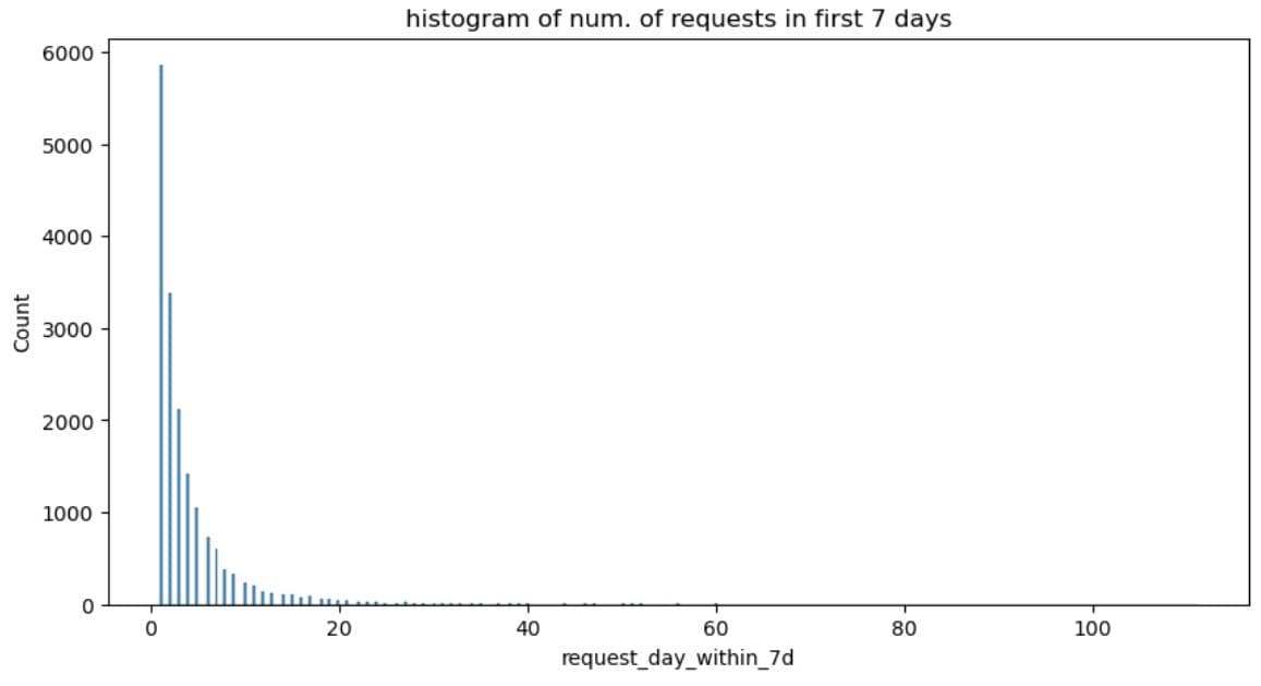
What It Does: Draws a histogram showing how many properties received different numbers of requests within the first 3 days after activation.
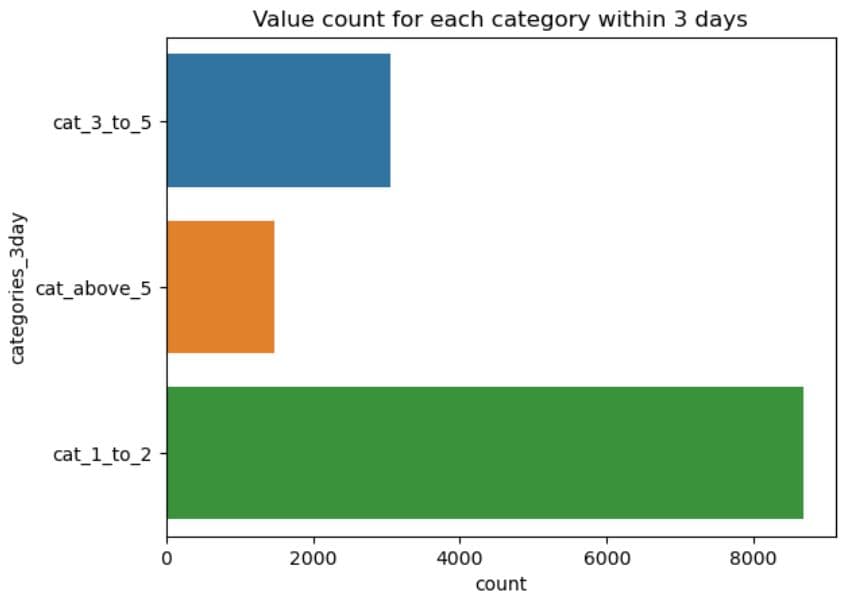
1.3.5. Visualize Distribution of a Categorical Feature on a Count Plot With Seaborn
Project Code: We first visualize the 3-day interactions.
sns.countplot(y=dataset.categories_3day)
plt.title('Value count for each category within 3 days')
plt.show()
Here’s the output.
Now, the same for the 7-day interactions.
sns.countplot(y=dataset.categories_7day)
plt.title('Value count for each category within 7 days')
plt.show()
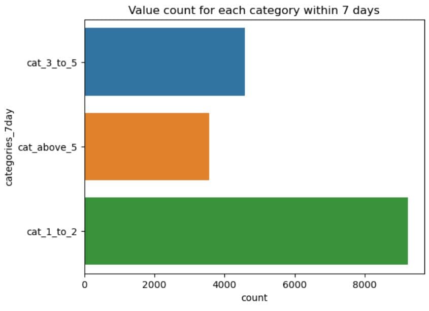
What It Does:
- Draws a horizontal bar chart showing how many properties fall into each category in the
categories_3dayandcategories_7daycolumn. - The y-axis shows the category names (
cat_1_to_2,cat_3_to_5,cat_above_5). - The x-axis shows the count of properties in each category.
1.3.6. Split the Dataset Into Categorical and Numeric Columns With select_dtypes()
Project Code: Now we do the same for dataset and create two DataFrames; one for categorical, an the other for numeric columns.
# Get categorical columns
df_cat = dataset.select_dtypes(include=['object'])

# Get numeric columns
df_num = dataset.select_dtypes(exclude=['object'])

print("Categorical Columns : \n",list(df_cat.columns) )
print("Numeric Columns : \n",list(df_num.columns) )
Here’s the output.

What It Does:
- Extracts all categorical columns (usually strings or objects) into
df_cat. - Extracts all numeric columns (integers, floats) into
df_num. - Displays the names of all categorical and numeric columns.
1.3.7. Sample Categorical & Numeric Features Value
Project Code: Here’s the categorical features preview.
df_cat.sample(2)
Here’s the output.
Now, numeric columns.
df_num.sample(2)

What It Does: Randomly selects and displays two rows from the categorical features dataframe df_cat and from the numeric features dataframe df_num.
1.3.8. Categorical Value Counts Summary
Project Code:
# Show all values and get count of them in every categorical column
for col in df_cat.columns[:-2]:
    print('Column Name : ', col)
    print(df_cat[col].value_counts())
    print('\n-------------------------------------------------------------\n')
Here are the outputs.
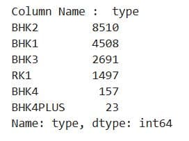
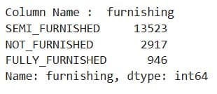
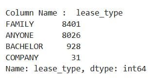
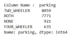
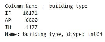
What It Does:
- Iterates over all categorical columns except the last two.
- For each column, it:
- Prints the column name.
- Prints the frequency count of each unique value using
value_counts(). - Separates outputs with a visual delimiter line for readability.
1.3.9. Categorical Feature Distribution Plots
Project Code:
# Plot count of values in every columns
for col in df_cat.columns[:-2]:
    sns.countplot(x = col,

            data = dataset
                 )
    plt.title(f'Show value counts for column {col}')

    # Show the plot
    plt.show()
Here are the outputs.
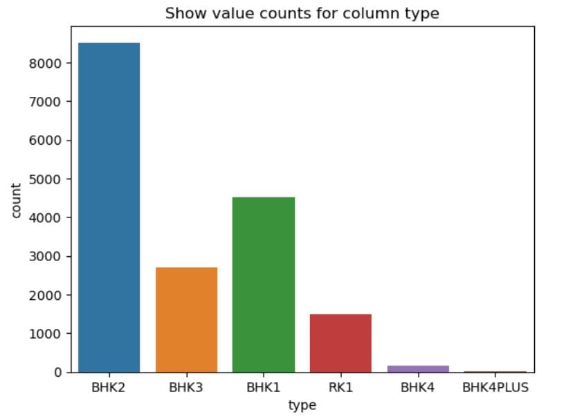
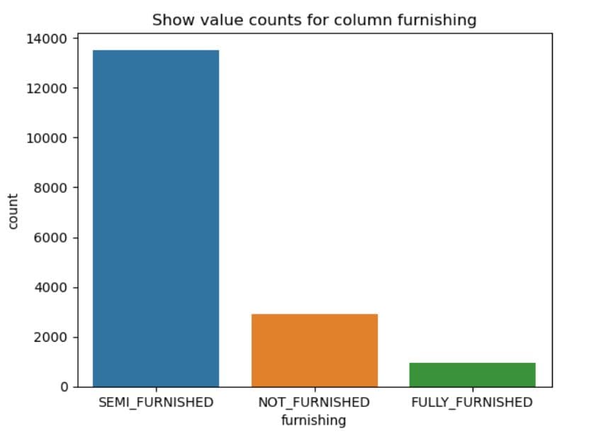
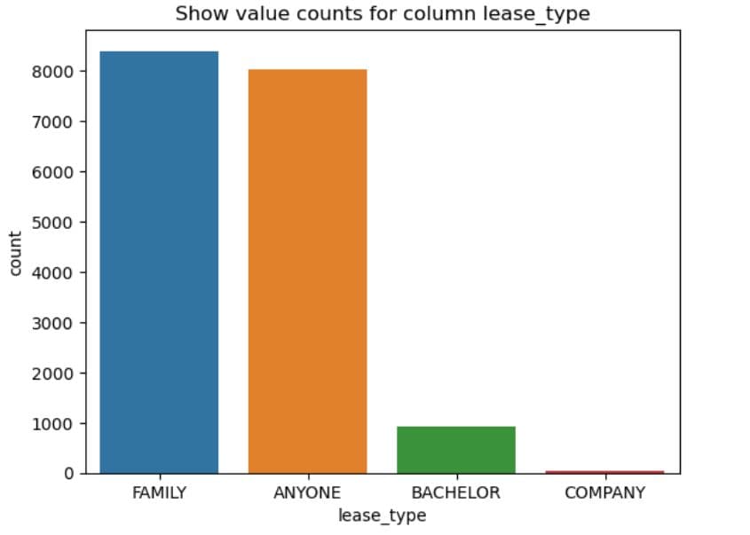
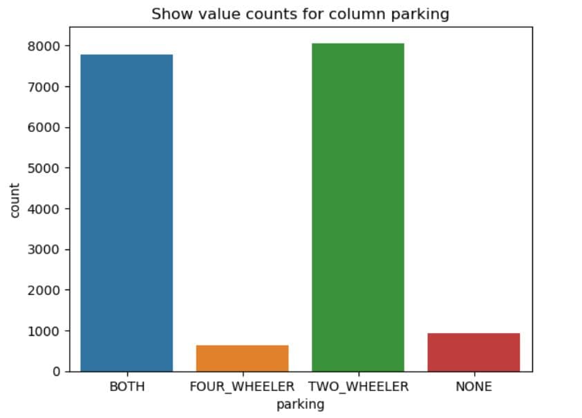
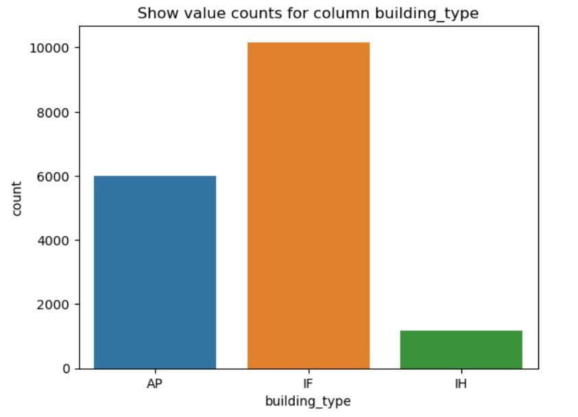
What It Does:
- Iterates through all categorical columns except the last two.
- For each column, it:
- Plots a bar chart using
sns.countplot()to visualise how often each category appears. - Sets a title for context.
- Displays the chart.
- Plots a bar chart using
1.3.10. Preview Numerical Features
Project code:
df_num.head()
Here’s the output.
What It Does:
- Displays the first 5 rows of the numerical portion of the dataset.
df_numcontains only columns with numeric data types, extracted earlier viaselect_dtypes().
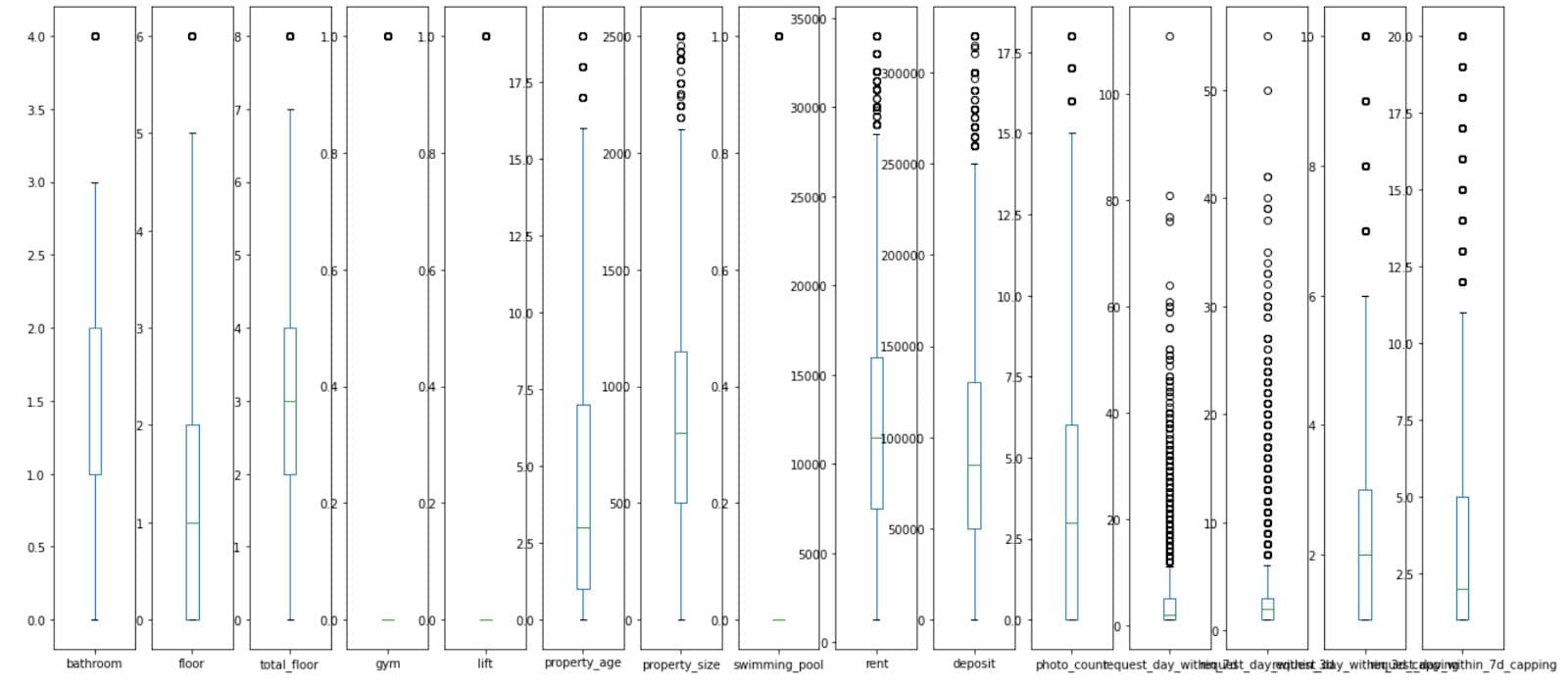
1.3.11. Box Plot for Outlier Detection and Range Overview Using plot()
Project Code: We can now plot the numerical data from out project.
# Box Plot to show ranges of values and outliers
df_num.plot(kind='box', subplots=True,  sharex=False, sharey=False,figsize=(22,10))
plt.show()
The additional arguments are:
subplots=True– draws each box plot in a separate subplotsharex=False– each subplot gets its own x-axis scale (no shared x-axis)sharey=False– each subplot gets its own y-axis scale (no shared y-axis
Here’s the code output.
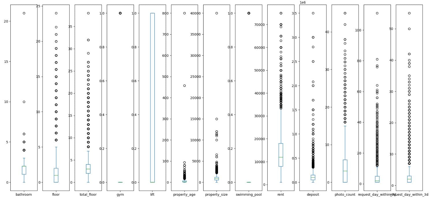
What It Does:
- Generates box plots for each numerical column in
df_num. subplots=Truedraws one box per variable in separate subplots.- The visualisation shows:
- Median (central line)
- Interquartile range (box)
- Potential outliers (points outside whiskers)
1.3.12. Numerical Data Statistics With describe()
Project Code:
# Get some statistics about numeric columns
df_num.describe()
Here’s the output.
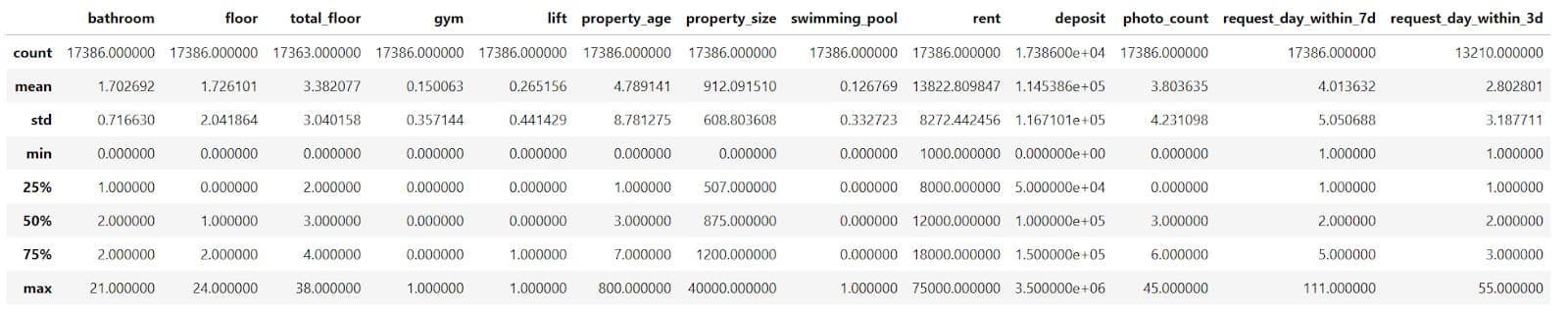
What does this output tell us about numerical data?
That the maximum number of bathrooms is 21, but 75% of properties have two or fewer bathrooms. So that’s probably an outlier. The same conclusion applies to the following features: floor, total_floor, property_size, and property_age. We’ll probably need outlier removal or capping here.
The rent features, such as rent and deposit, are right-skewed, making them candidates for scaling or transformation.
Target variables – request_day_within_3d and request_day_within_7d – could also benefit from capping or binning.
What It Does:
- Generates summary statistics for each numerical column in the
df_numDataFrame. - Outputs include:
- Count (non-null values)
- Mean
- Standard deviation
- Min, 25%, 50% (median), 75%, and max values
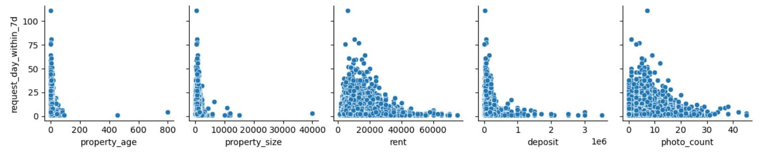
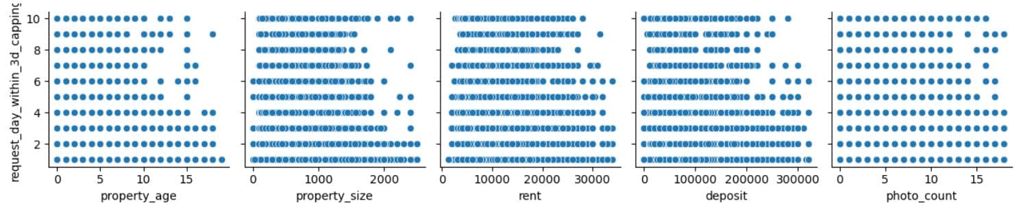
We’ll now create a pairwise scatterplot grid using Seaborn’s pairplot to understand the data better. We will plot five variables on the X-axis (property_age, property_size, rent, deposit, photo_count) against the request_day_within_3d variable on the Y-axis. Why did we choose those five columns? Because they are numeric, interpretable, and we think they have a direct impact on how users interact with property listings.
1.3.13. Creating a Scatterplot in Seaborn for Relationship Exploration
Project Code: In the project, we first plot the scatter plot grid for the for the 3-day interaction label, then for the 7-day interaction label.
sns.pairplot(data=dataset,
                  x_vars=['property_age', 'property_size','rent', 'deposit', 'photo_count'],
                  y_vars=['request_day_within_3d']

                  )
plt.show()
Here’s the output.

From the plots, we see that most interactions happen for newer properties, mid-sized properties, with the rent around ₹10,000–₹20,000, with the lower deposit required, and with 5-15 photos.
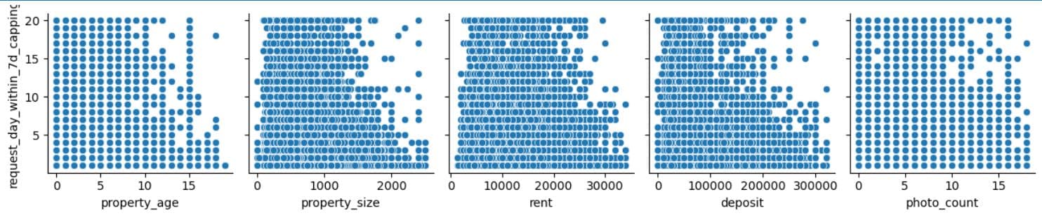
Let’s now do the same for the 7-day interactions.
sns.pairplot(data=dataset,
                  x_vars=['property_age', 'property_size','rent', 'deposit', 'photo_count'],
                  y_vars=['request_day_within_7d']

                  )
plt.show()
The interpretation is more or less the same as earlier.
What It Does:
- Uses Seaborn's
pairplot()to generate scatter plots for each selectedx_varagainst the target variablesrequest_day_within_3dandrequest_day_within_7d. - Helps visualise bivariate relationships between numerical features and the target.
With this, we came to the end of the Data Collection & Preparation stage of the workflow. If it seems like it’s never-ending, well, this is what it looks like in reality. In most data science projects, you’ll spend most of your time gathering and preparing data, which shows how delicate and crucial this stage is.
2. Feature Engineering
In this step, you create new input variables or transform existing ones to enhance the model’s ability to learn relevant patterns.
For example, you might combine multiple features into interaction terms, extracting time-based components, applying log or polynomial transformations, binning continuous values, or encoding categorical variables more meaningfully.
Depending on the data, you might go through some of those or all of the feature engineering stages.
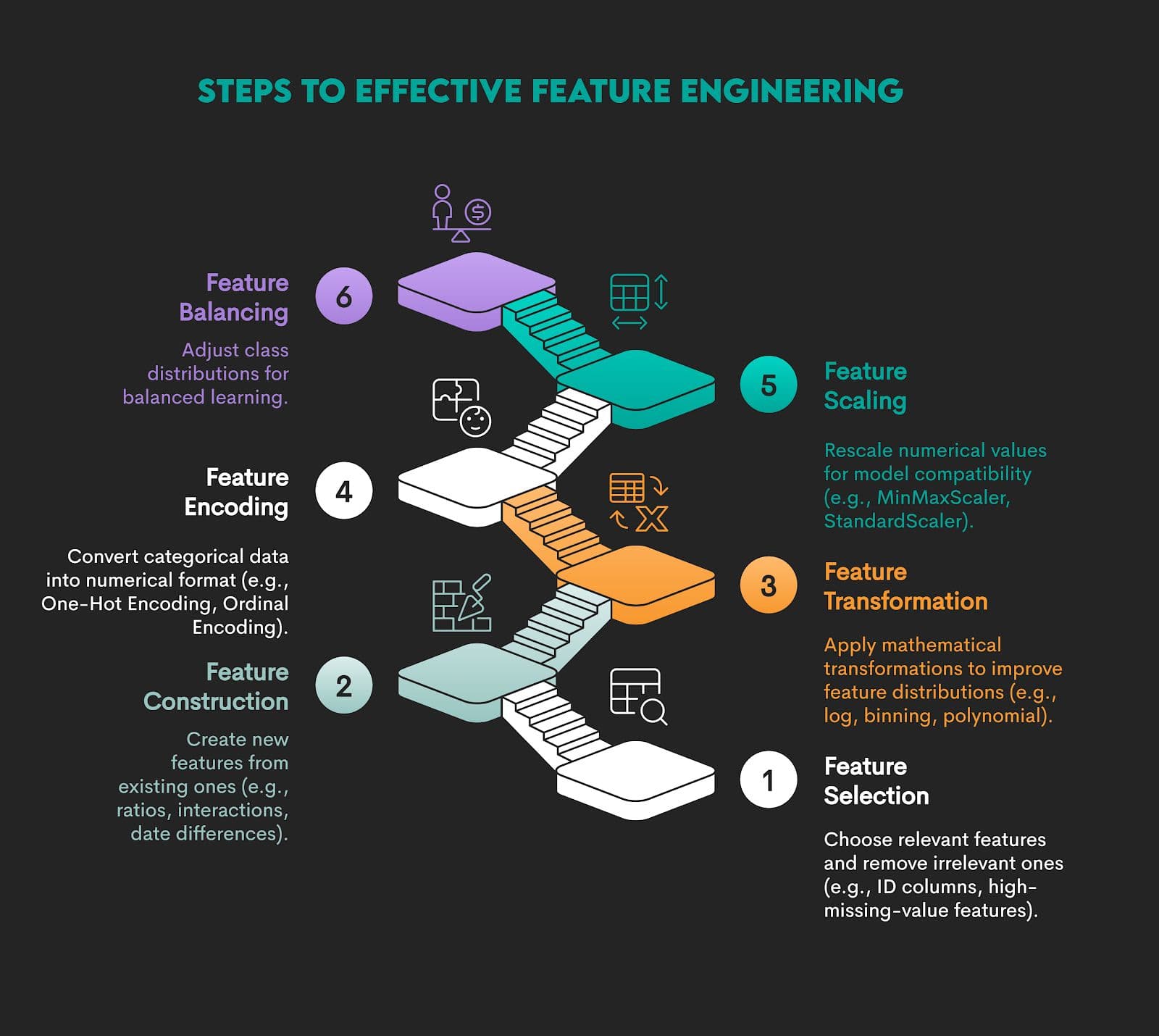
The whole idea behind this is to represent the data structure more effectively and enhance the model’s ability to learn relevant patterns.
Example
We’re continuing with our data project with these steps.
2.1. Removing Outliers
2.2. One-Hot Encoding
2.3. MinMaxScaler
2.1. Removing Outliers
As a first step of feature engineering, we’ll remove outliers using the interquartile range (IQR) method. Outliers can skew our model training, distort metrics like mean and standard deviation, and lead to poor generalization.
We’ll remove outliers in the following steps.
2.1.1. Define Outlier Removal Function With quantile()
2.1.2. List Numeric Columns
2.1.3. Copy Dataset for Cleaning
2.1.4. Apply Outlier Removal to Selected Columns
2.1.5. Capping Values
2.1.6. Apply Capping to Target Variables
2.1.7. Inspect Capped Target Distributions
2.1.8. Box Plot After Outlier Removal and Capping
2.1.9. Pairplot After Capping – Explore Final Feature Relationships
2.1.10. Drawing a Heat Map in Seaborn Using heatmap()
2.1.1. Define Outlier Removal Function With quantile()
Project Code:
# Function to remove outliers using quantiles
def remove_outlier(df_in, col_name):
    q1 = df_in[col_name].quantile(0.25)
    q3 = df_in[col_name].quantile(0.75)
    iqr = q3 - q1 #Interquartile range
    fence_low  = q1 - 2 * iqr
    fence_high = q3 + 2 * iqr
    df_out = df_in.loc[(df_in[col_name] <= fence_high) & (df_in[col_name] >= fence_low)]
    return df_out
What It Does:
- Defines a reusable function that removes outliers from a DataFrame column based on the interquartile range (IQR).
- It excludes values that fall outside Q1 - 2*IQR and Q3 + 2*IQR.
2.1.2. List Numeric Columns
Project Code:
df_num.columns
Here’s the output.
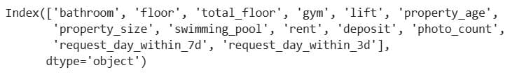
What It Does: Displays all numeric columns in the dataset.
2.1.3. Copy Dataset for Cleaning
Project Code:
df = dataset.copy()
What It Does: Creates a copy of the original dataset to perform outlier removal without altering the original data.
2.1.4. Apply Outlier Removal to Selected Columns
Project Code:
for col in df_num.columns:
    if col in ['gym', 'lift', 'swimming_pool',  'request_day_within_3d', 'request_day_within_7d']:
        continue

    df = remove_outlier(df , col)
What It Does: Loops through numeric columns and removes outliers from each, excluding binary indicator columns and label columns.
2.1.5. Capping Values
Project Code: As a next step, we cap interaction counts to avoid extremely large values, which reduces skewness in the target variables. This will help regression models focus on the common range and not be dominated by outliers.
We cap the 3-day interactions at 10 and the 7-day interactions at 20.
def capping_for_3days(x):
    num = 10
    if x > num:
        return num
    else :
        return x
def capping_for_7days(x):
    num = 20
    if x > num:
        return num
    else :
        return x
What It Does:
capping_for_3days(x)limits (caps) the value ofxto a maximum of 10.capping_for_7days(x)limits the value ofxto a maximum of 20.- If the value is already below or equal to the cap, it stays unchanged.
2.1.6. Apply Capping to Target Variables
Project Code:
df['request_day_within_3d_capping'] = df['request_day_within_3d'].apply(capping_for_3days)
df['request_day_within_7d_capping'] = df['request_day_within_7d'].apply(capping_for_7days)
What It Does:
- It creates two new columns (
_capping) that contain the capped versions of the original request counts. - The capping sets a maximum of 10 requests within 3 days and 20 within 7 days.
2.1.7. Inspect Capped Target Distributions
Project Code: We perform a frequency count for 3-day capped interactions.
df['request_day_within_3d_capping'].value_counts()
Here’s the output.
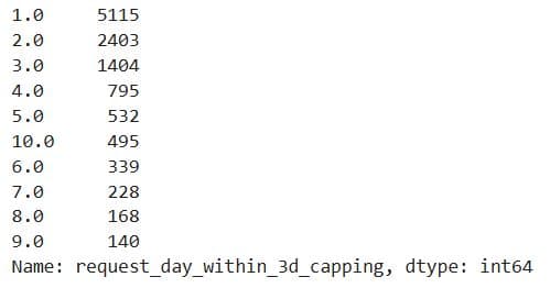
We do the same for 7-day capped interactions, but we have to explicitly limit the values to 10, as these interactions are capped at 20.
df['request_day_within_7d_capping'].value_counts()[:10]
Here’s the output.
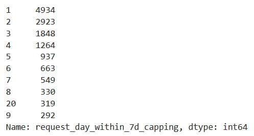
What It Does:
- Counts how many times each value appears in the
request_day_within_3d_cappingandrequest_day_within_7d_cappingcolumns. - Provides a frequency distribution of the capped 3-day and 7-day interaction values.
2.1.8. Box Plot After Outlier Removal and Capping
Project Code:
df.plot(kind='box', subplots=True, sharex=False, sharey=False, figsize=(22,10))
plt.show()
Compared to the previous such plot, it seems we managed to decrease the number of outliers.
What It Does:
- Draws box plots for all numeric columns in the updated
dfDataFrame. - Visualises the distribution, central tendency, and remaining outliers for each feature after cleaning (i.e. outlier removal and capping).
2.1.9. Pairplot After Capping – Explore Final Feature Relationships
Project Code: We draw scatter plots for the capped 3-day interactions
sns.pairplot(data=df,
                  x_vars=['property_age', 'property_size','rent', 'deposit', 'photo_count'],
                  y_vars=['request_day_within_3d_capping']
                  )
plt.show()
Here’s the output.
The insight that we can draw is that photo_count seems the most promising feature out of the five. The rent and deposit features may have a weak negative influence. There are less obvious patterns for property_age and size, but could still be valuable in combination with other features or with proper transformations.
We create the same plots for the 7-day interactions.
sns.pairplot(data=df,
                  x_vars=['property_age', 'property_size','rent', 'deposit', 'photo_count'],
                  y_vars=['request_day_within_7d_capping']

                  )
plt.show()
Here’s the output.
There’s no strong linear relationship in any feature, although there are some weak patterns in photo_count, rent, and deposit.
What It Does:
- Creates scatter plots to visualise the relationships between key numeric features (x-axis) and the capped 3-day and 7-day request counts (y-axes).
- Uses the cleaned and capped DataFrame (
df), reflecting the current state of the dataset post-preprocessing.
2.1.10. Drawing a Heat Map in Seaborn Using heatmap()
Project Code: We can now apply what we learned on the project data.
# Show a correlation on a heat map.
plt.subplots(figsize=(10,10))
dataplot = sns.heatmap(df.corr(), cmap="YlGnBu", annot=True)
# displaying heatmap
plt.show()
Here’s the output.
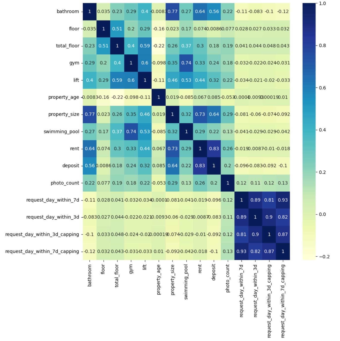
What It Does:
- Computes the correlation matrix for all numerical columns in
df - Plots the matrix as a heatmap, where:
- Colour intensity shows the strength of correlation.
annot=Truedisplays the actual correlation values inside each cell.
2.2. One-Hot Encoding
One-hot encoding is a technique to convert categorical data (words/labels) into numerical data – because most machine learning models can’t work with strings.
In our project, one-hot encoding will involve these steps.
2.2.1. Data Snapshot Before One-Hot Encoding
2.2.2. Check Column Names Before Feature Selection
2.2.3. Dropping Label Columns to Isolate Features
2.2.4. Separating Categorical Column (Including Possible Nulls)
2.2.5. Separating Remaining (Non-Categorical) Features
2.2.6. Storing Label Columns Separately
2.2.7. Initialize Clean DataFrames for Numeric and Categorical Data
2.2.8. Filling Null Values in Numeric Columns With the Mean
2.2.9. Filling Null Values in Categorical Columns With the Mode
2.2.10. Checking for Null Values
2.2.11. Import and Initialize OneHotEncoder
2.2.12. Fit and Transform the Categorical Data
2.2.13. Generate Column Names for New Features
2.2.14. Flatten the New Feature Labels
2.2.15. Extend Final Column List
2.2.16. Create DataFrame With Encoded Values and Named Columns
2.2.17. Check Output
Here we go.
2.2.1. Data Snapshot Before One-Hot Encoding
Project Code:
df.sample(5)
Here’s the output.

What It Does: Randomly displays five rows from the cleaned and processed dataset df.
2.2.2. Check Column Names Before Feature Selection
Project Code:
df.columns
Here’s the output.
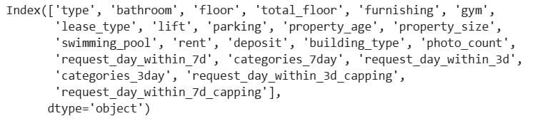
What It Does: Lists all column names in the DataFrame df.
2.2.3. Dropping Label Columns to Isolate Features
Project Code:
# One-Hot Encoder for categorical values
# dividing a data to categorical, numeric and label
X = df.drop(['request_day_within_7d', 'categories_7day', 'request_day_within_3d',
             'categories_3day', 'request_day_within_3d_capping',
             'request_day_within_7d_capping'] , axis=1)
What It Does: Removes target/label columns from the dataset df so you're left with only feature columns in X.
2.2.4. Separating Categorical Column (Including Possible Nulls)
Project Code:
x_cat_withNull= df[X.select_dtypes(include=['O']).columns]
What It Does:
- It selects all categorical (object-type) columns from the DataFrame
dfthat are part of the feature setX. - The result,
x_cat_withNull, holds only the categorical input features that may still contain missing values.
2.2.5. Separating Remaining (Non-Categorical) Features
Project Code:
x_remain_withNull = df[X.select_dtypes(exclude=['O']).columns]
What It Does:
- It selects all non-categorical (non-'object' dtype) columns from
dfthat are part of the feature setX. - These columns typically include numerical features like integers and floats.
- The result is stored in
x_remain_withNull, which contains numeric input features that may still contain null values.
2.2.6. Storing Label Columns Separately
Project Code:
y = df[['request_day_within_7d', 'categories_7day', 'request_day_within_3d',
             'categories_3day', 'request_day_within_3d_capping',
             'request_day_within_7d_capping']]
What it does:
- Selects specific columns from the full dataset
dfand stores them in a new DataFrame calledy. - These columns represent target variables that describe the number of user requests over time and their categorical groupings.
2.2.7. Initialize Clean DataFrames for Numeric and Categorical Data
Project Code:
x_remain = pd.DataFrame()
x_cat = pd.DataFrame()
What it does: Creates empty DataFrames to store cleaned numeric (x_remain) and categorical (x_cat) features.
2.2.8. Filling Null Values in Numeric Columns With the Mean
Project Code:
# Handling Null values
# if we having null values in a numeric columns fill it with mean (Avg)
for col in x_remain_withNull.columns:
    x_remain[col] = x_remain_withNull[col].fillna((x_remain_withNull[col].mean()))
What it does:
- The loop goes through each numeric column in
x_remain_withNulland fills anyNaN(missing) values with the mean of that column. - The result is stored in
x_remain.
2.2.9. Filling Null Values in Categorical Columns With the Mode
Project Code:
# if we having null values in a categorical columns fill it with mode
for col in x_cat_withNull.columns:
    x_cat[col] = x_cat_withNull[col].fillna(x_cat_withNull[col].mode()[0])
What It Does:
- This loop checks each categorical column in
x_cat_withNulland fills any missing (NaN) values with the most frequent value (i.e., the mode) of that column. - The cleaned data is saved into
x_cat.
2.2.10. Checking for Null Values
Project Code:
x_remain.isna().sum()
Here’s the output. There are no NULLs.
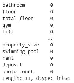
What It Does: Verifies that all missing values have been successfully filled (imputed).
2.2.11. Import and Initialize OneHotEncoder
Project Code:
from sklearn.preprocessing import OneHotEncoder

ohe = OneHotEncoder(categories='auto' , handle_unknown='ignore')
What It Does:
- Imports the
OneHotEncoderfrom scikit-learn. - Creates an instance of the encoder (
ohe) with these settings:categories='auto': Detects the unique values in each feature automatically.handle_unknown='ignore': Ensures that if new (unseen) categories appear in future data, they won’t cause errors during encoding.
2.2.12. Fit and Transform the Categorical Data
Project Code:
feature_train = ohe.fit_transform(x_cat).toarray()
feature_labels = ohe.categories_
What It Does:
- Learns the unique categories in each column (
fit) - Applies one-hot encoding to each category (
transform) - Converts the sparse output to a full array (
toarray) - Stores the learned categories per column
2.2.13. Generate Column Names for New Features
Project Code:
new_features = []
for i,j in zip(x_cat.columns,feature_labels):
    new_features.append(f"{i}_"+j)
What It Does: Combines original column names with category values.
2.2.14. Flatten the New Feature Labels
Project Code:
feature_labels = np.array(new_features, dtype=object).ravel()
What It Does: Flattens the list of new column names.
2.2.15. Extend Final Column List
Project Code:
f = []
for i in range(feature_labels.shape[0]):
    f.extend(feature_labels[i])
What It Does: Builds the final list of flattened column names.
2.2.16. Create DataFrame With Encoded Values and Named Columns
Project Code:
df_features = pd.DataFrame(feature_train, columns=f)
What It Does: Converts the NumPy array into a pandas DataFrame with readable column names.
2.2.17. Check Output
Project Code:
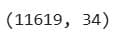
print(df_features.shape)
df_features.sample(3)
Here are the outputs.

What It Does:
- Shows how many new features were created.
- Randomly samples a few rows to inspect encoding.
2.3. MinMaxScaler
We’ll scale features using the MinMaxScaler. It scales numeric features into a fixed range, typically [0, 1]. Doing this is important for models sensitive to input data scale, such as neural networks, k-nearest neighbors (KNN), and support vector machines (SVM).
Here’s a step-by-step guide with additional explanations.
2.3.1. Import Scaler
2.3.2. Apply MinMax Scaling to Numeric Features
2.3.3. Preview Target Columns
2.3.4. Concatenate All Feature Data
2.3.5. Drop Any Remaining Nulls
2.3.6. Check Final Dataset Shape
Let’s start with scaling.
2.3.1. Import Scaler
Project Code:
from sklearn.preprocessing import MinMaxScaler
What It Does: Imports MinMaxScaler, a common feature scaling method.
2.3.2. Apply MinMax Scaling to Numeric Features
Project Code:
sc = MinMaxScaler()
x_remain_scaled = sc.fit_transform(x_remain)
x_remain_scaled = pd.DataFrame(x_remain_scaled, columns=x_remain.columns)
What It Does:
- Initializes the scaler
- Fits and transforms the numeric data (
x_remain) to scale it between 0 and 1. To do that it uses the following formula.
- Converts the resulting NumPy array back to a DataFrame with original column names.
2.3.3. Preview Target Columns
Project Code:
y.head(1)
Here’s the output.

What It Does: Displays the first row of the y DataFrame containing target columns related to request activity.
2.3.4. Concatenate All Feature Data
Project Code: We first concatenate 3-day interactions features.
data_with_3days = pd.concat([
    df_features.reset_index(drop=True),
    x_remain_scaled.reset_index(drop=True),
    y[['request_day_within_3d','request_day_within_3d_capping','categories_3day']].reset_index(drop=True)
], axis=1)
Let’s now do the same for 7-day interactions.
# Concatenate data after applying One-Hot Encoding
data_with_7days = pd.concat([df_features.reset_index(drop=True),x_remain_scaled.reset_index(drop=True), y[['request_day_within_7d',
                                                                                                        'request_day_within_7d_capping',
                                                                                                        'categories_7day']].reset_index(drop=True)], axis=1)
What It Does:
- Combines:
- One-hot encoded categorical features (
df_features) - Scaled numeric features (
x_remain_scaled) - Target columns from
y
- One-hot encoded categorical features (
- Uses
reset_index(drop=True)to align row indices before concatenation
2.3.5. Drop Any Remaining Nulls
Project Code: We drop nulls for 3-day interactions…
data_with_3days.dropna(inplace=True)

…and 7-day interactions.

data_with_7days.dropna(inplace=True)
What It Does: Removes any rows with missing values.
2.3.6. Check Final Dataset Shape
Project Code:
data_with_3days.shape
Here’s the output for the 3-day interactions.
Now, the same code, but for the 7-day interactions…
data_with_7days.shape
…and the output.
3. Model Selection
The goal of model selection is to identify the most suitable algorithm(s) for a specific problem. This process is based on the data structure and the problem type, e.g., classification, regression, or ranking.
Many models are based on certain mathematical assumptions about data, so make sure that these assumptions align with the actual data you’re using. To choose the right model, you should evaluate multiple algorithms that might suit your purpose using cross-validation and performance metrics.
What performance metrics, you might ask? Again, they depend on the specific goal of the problem. In the table below, you can find suitable metrics for each problem type.
These metrics are used to compare multiple models to answer this question: “Which model performs best on this problem?” In essence, you’re benchmarking several options.
It’s important to make this distinction, as performance metrics are also used in the following workflow step, but for a different purpose.
Example
The model selection for this project will look like this.
3.1. Data Splitting
3.2. Evaluation Metrics
3.3. Regression Models
3.4. Classification Models
3.5. Gradient Boosting
Let’s start with splitting the dataset.
3.1. Data Splitting
Project Code:
from sklearn.model_selection import train_test_split
What It Does: Imports the function to split the dataset into training and testing subsets.
3.2. Evaluation Metrics
Project Code:
from sklearn.metrics import classification_report, mean_squared_error
What It Does:
classification_reportprovides precision, recall, F1-score for classification tasks.mean_squared_errormeasures average squared error for regression tasks.
3.3. Regression Models
Project Code:
from sklearn.linear_model import LinearRegression, Lasso
from sklearn.neighbors import KNeighborsRegressor
from sklearn.tree import DecisionTreeRegressor
What It Does: Imports popular regression models.
LinearRegression: For continuous output.Lasso: Like linear regression but performs feature selection via regularization.KNeighborsRegressor: Makes predictions based on nearby data points.DecisionTreeRegressor: Predicts with if-else logic using decision rules.
3.4. Classification Models
Project Code:
from sklearn.linear_model import LogisticRegression
from sklearn.ensemble import RandomForestClassifier
What It Does: Imports classification models.
LogisticRegression: A baseline classification algorithm.RandomForestClassifier: An ensemble method using multiple decision trees.
3.5. Gradient Boosting
Project Code:
import xgboost as xgb
What It Does: Imports the XGBoost library, a high-performance gradient boosting framework.
4. Model Training and Evaluation
Training the model means you’re adjusting the learning algorithm’s internal patterns to discover patterns or make decisions. How you do that depends on the machine learning type. For example, through labels in supervised machine learning or structural signals in unsupervised machine learning.
By model evaluation, we mean the assessment of the trained model’s generalization performance on the unseen dataset. This helps estimate the model’s performance on real-world data and suggests possible further improvements in the model.
To evaluate the model, we use the same metrics we mentioned in the previous stage. However, in this stage, the purpose is to evaluate a single model’s behavior, typically on a train/test data split or during cross-validation. That way, you can diagnose model overfitting or underfitting, check if it meets your performance thresholds, and understand class-level behavior (via confusion matrix, precision/recall, etc.).
Example
We will predict interactions within both 3 and 7 days in these steps.
4.1. Data insepction
4.2. Prepare features and labels
4.3. Regression models building
4.4. Classification models building
4.5. Deep learning
4.1. Data Inspection
Project Code: Here’s the code for inspecting the 3-day interaction data.
data_with_3days.sample()
Here’s the output. There are too many columns to show in the article, but you get the impression.

Now the same for the 7-day interactions. Code…
data_with_7days.sample()…and the output.

What It Does: Displays a random row from the data_with_3days and data_with_7days DataFrames.
4.2. Prepare Features and Labels
Project Code: Here’s the code for 3-day interactions…
X = data_with_3days.drop(['request_day_within_3d',
                          'request_day_within_3d_capping',
                          'categories_3day'], axis=1)

y = data_with_3days[['request_day_within_3d', 'request_day_within_3d_capping', 'categories_3day']]

…and the same for 7-day interactions.

X = data_with_7days.drop(['request_day_within_7d',
                          'request_day_within_7d_capping',
                          'categories_7day'], axis=1)
y = data_with_7days[['request_day_within_7d', 'request_day_within_7d_capping', 'categories_7day']]
What It Does:
- Selects feature columns (
X) by dropping the target variables. - Assigns multiple target variables to
y.
4.3. Regression Models Building
We will now build regression models in these steps:
4.3.1. Train/test split for regression
4.3.2. Define regression models for training
4.3.3. Train & evaluate regression models
4.3.4. Repeat training & evaluation for capped target
4.3.1. Train/Test Split for Regression
Project Code: Here’s the split for 3-day interactions.
# Split data to train and test sets
seed = 42
X_train, X_test, y_train, y_test = train_test_split(X, y['request_day_within_3d'], test_size = 0.2, random_state = seed)
Then we do the same for 7-day interactions.
# Split data to train and test set
seed = 42
X_train, X_test, y_train, y_test = train_test_split(X, y['request_day_within_7d'], test_size = 0.2, random_state = seed)
What It Does: Splits the dataset into training and testing subsets for predicting the raw request_day_within_3d and request_day_within_7d values.
4.3.2. Define Regression Models for Training
Project Code: Here’s the code for 3- day interactions.
# Try to make a model with these algorithms
models = []
models.append(('LR', LinearRegression()))
models.append(('LASSO', Lasso(random_state=seed)))
models.append(('KNN', KNeighborsRegressor()))
models.append(('CART', DecisionTreeRegressor(random_state=seed)))
models.append(('xgb', xgb.XGBRegressor(random_state=seed)))
We use exactly the same code for 7-day interactions.
What It Does:
- Creates a list of regression models with shorthand names (
LR,LASSO, etc.) to iterate over during training. - Models include linear, tree-based, and ensemble approaches to compare performance.
4.3.3. Train & Evaluate Regression Models
Project Code: We first train and evaluate on 3-day interaction data.
results = []
names = []
for name, model in models:
    # model
    regressor = model
    # fit model with train data
    regressor.fit(X_train, y_train)
    # predict after training
    y_pred=regressor.predict(X_test)
    # calc. root mean squre error
    rms = np.sqrt(mean_squared_error(y_test, y_pred))

    msg = "%s: RMS => (%f)" % (name, rms)
    print(msg)
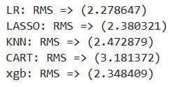
Here’s the output. It shows that linear regression has the lowest RMSE, so it’s the best choice for this prediction task.
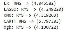
Exactly the same code is used on the 7-day interaction data, too. While the metrics show different values, they still show that the linear regression is the best for this data, too.
What It Does:
- Iterates through the list of regression models.
- Trains each model using
X_trainandy_train. - Predicts on the test set (
X_test) and calculates the Root Mean Squared Error (RMSE) for each.
4.3.4. Repeat Training & Evaluation for Capped Target
Project Code: The code repeats the steps 4.3.1., 4.3.2., and 4.3.3. for request_day_within_3d_capping
# Split data to train and test set
seed = 42
X_train, X_test, y_train, y_test = train_test_split(X, y['request_day_within_3d_capping'], test_size = 0.2, random_state = seed)

# Try to make a model with these algorithms
models = []
models.append(('LR', LinearRegression()))
models.append(('LASSO', Lasso(random_state=seed)))
models.append(('KNN', KNeighborsRegressor()))
models.append(('CART', DecisionTreeRegressor(random_state=seed)))
models.append(('xgb', xgb.XGBRegressor(random_state=seed)))

results = []
names = []
for name, model in models:
    # model
    regressor = model
    # fit model with train data
    regressor.fit(X_train, y_train)
    # predict after training
    y_pred=regressor.predict(X_test)
    # calc. root mean squre error
    rms = np.sqrt(mean_squared_error(y_test, y_pred))

    msg = "%s: RMS => (%f)" % (name, rms)
    print(msg)
Here’s the output. This iteration improved all models’ scores. Again, linear regression is the best-performing.
We do the same for request_day_within_7d_capping.
# Split data to train and test set
seed = 42
X_train, X_test, y_train, y_test = train_test_split(X, y['request_day_within_7d_capping'], test_size = 0.2, random_state = seed)

# Try to make a model with these algorithms
models = []
models.append(('LR', LinearRegression()))
models.append(('LASSO', Lasso(random_state=seed)))
models.append(('KNN', KNeighborsRegressor()))
models.append(('CART', DecisionTreeRegressor(random_state=seed)))
models.append(('xgb', xgb.XGBRegressor(random_state=seed)))

results = []
names = []
for name, model in models:
    # model
    regressor = model
    # fit model with train data
    regressor.fit(X_train, y_train)
    # predict after training
    y_pred=regressor.predict(X_test)
    # calc. root mean squre error
    rms = np.sqrt(mean_squared_error(y_test, y_pred))

    msg = "%s: RMS => (%f)" % (name, rms)
    print(msg)
All the models improved, and the linear regression remains the best.
What It Does: Same as earlier but using a capped version of the target.
4.4. Classification Models Building
We will now see how the classification models perform on this task. Here are the steps:
4.4.1 Train/test split for classification
4.4.2. Logistic regression model
4.4.3. Random forest classifier
4.4.1. Train/Test Split for Classification
Project Code: Here’s the split for categories_3day.
seed = 42
# Split data into train and test set
X_train, X_test, y_train, y_test = train_test_split(X, y['categories_3day'], test_size = 0.2, random_state = seed)

y['categories_3day'].value_counts()
Here’s the output.
This is the code for splitting the categories_3day data.
seed = 42
# Split data into train and test set
X_train, X_test, y_train, y_test = train_test_split(X, y['categories_7day'], test_size = 0.2, random_state = seed)

y['categories_7day'].value_counts()
Here’s the output.
Both outputs show that the cat_1_to_2 label dominates the datasets, making them imbalanced. This means the model might be biased towards predicting cat_1_to_2, and the accuracy as an evaluation metric might be misleading.
Because of the data imbalance, we will use precision, recall, and F1-score to evaluate the models. We first do it for the logistic regression model.
What It Does:
- Splits data for classification
- Checks class distribution
4.4.2. Logistic Regression Model
Project Code: Here’s the logistic regression model for the 3-day interactions.
# Logistic Regression
lr = LogisticRegression(solver='newton-cg')
lr.fit(X_train, y_train)
y_pred_lr_pro = lr.predict_proba(X_test)
y_pred_lr = lr.predict(X_test)

print(classification_report(y_test, y_pred_lr))
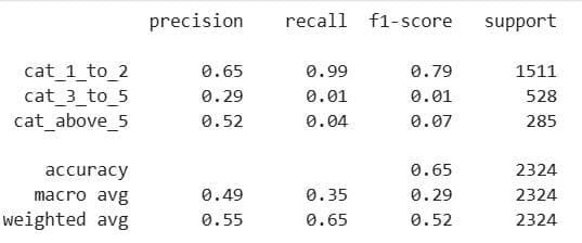
Here’s the output. It shows that the accuracy is 65%, which might sound like a good result. However, 65% of the data also belongs to cat_1_to_2, i.e., 1,511/(1511 + 528 + 285) ≈ 0.65. If the model simply always predicts cat_1_to_2, it will achieve 65% accuracy. It’s not doing anything smart; it merely guesses the most common class.
Because of this data imbalance, it’s better to use the weighted average F1-score of 0.52. This is a bad result, as generally everything below 0.6 can be considered unsatisfactory.
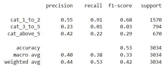
The same code is used for the 7-day interactions. Here’s the output. It shows the weighted average F1-score is 0.42; not good at all.
What It Does:
- Trains a logistic regression model
- Outputs predicted probabilities and class labels
- Evaluates with classification report
4.4.3. Random Forest Classifier
Project Code: Here’s the random forest classifier; the same code is used for both datasets.
# Random Forest
rfc = RandomForestClassifier(n_estimators=10, class_weight='balanced',random_state=42)
rfc.fit(X_train, y_train)
y_pred_rfc_pro = rfc.predict_proba(X_test)
y_pred_rfc = rfc.predict(X_test)
print(classification_report(y_test, y_pred_rfc)  )
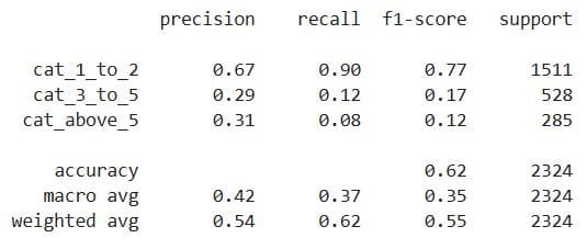
Here’s the output for 3-day interactions.
The weighted average F1-score is now 0.55%, which is still not good, but it’s at least better than the logistic regression. Nevertheless, we probably shouldn’t use classification here.
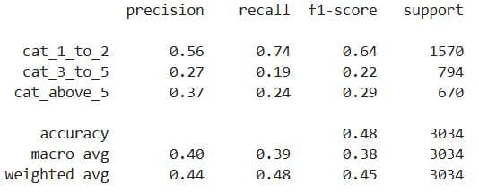
Here’s the output for 7-day interactions.
Yes, slightly better than logistic regression model, but still not good enough. Classification is a bad choice for this data, too.
What It Does:
- Initializes a
RandomForestClassifier:n_estimators=10: Uses 10 decision trees.class_weight='balanced': Adjusts for imbalanced classes by weighting inversely to class frequency.random_state=42: Ensures reproducibility.
- Fits the model to the training data (
X_train,y_train). - Generates predictions:
predict_proba: Outputs class probabilities (useful for thresholds or ROC).predict: Outputs final class labels.
- Prints a classification report: Includes precision, recall, f1-score, and support per class.
4.5. Deep Learning
We will try deep learning after regression and classification to see whether it will perform better than the algorithms we’ve used so far. We’ll try it only on the 3-day interactions, just as a test.
It will include these steps.
4.5.1. Prepare features and labels
4.5.2. Split data into train and test sets
4.5.3. Build and compile artificial neural networks model (ANN)
4.5.4. Train the ANN
Here we go.
4.5.1. Prepare Features and Labels
Project Code:
X = data_with_3days.drop(['request_day_within_3d',
                          'request_day_within_3d_capping',
                          'categories_3day'], axis=1)
y = data_with_3days[['request_day_within_3d', 'request_day_within_3d_capping', 'categories_3day']]
What It Does:
- Separates input features
Xand target variablesy. - Drops the 3 target columns from
Xto prevent data leakage.
4.5.2. Split Data Into Train and Data Sets
Project Code:
seed = 42
# Split data into train and test set
X_train, X_test, y_train, y_test = train_test_split(X, y['request_day_within_3d_capping'], test_size = 0.2, random_state = seed)
What It Does: Splits the data into training (80%) and testing (20%) subsets using the request_day_within_3d_capping column as the target.
4.5.3. Build and Compile Deep Learning Model (ANN)
Project Code:
import keras
from keras.models import Sequential
from keras.layers import Dense
from keras.layers import LeakyReLU, PReLU, ELU
from keras.layers import Dropout
# Create ANN model
model = Sequential()
model.add(Dense(512, activation='relu', input_shape=(X_train.shape[1],)))
model.add(Dense(512, activation='relu'))
model.add(Dense(1, activation='linear'))
model.compile(optimizer='adam', loss='mean_squared_error')
What It Does:
- Creates a basic deep neural network with two hidden layers, each with 512 neurons using ReLU activation.
- The output layer uses a
linearactivation for regression. - Compiles the model with Adam optimizer and MSE as the loss function.
4.5.4. Train the ANN
Project Code:
hist = model.fit(X_train, y_train, epochs=50)
Here’s the output. It shows that the loss steadily decreases, meaning the model is learning and improving. The final loss of 3.8303 is good, but linear regression is better because its RMSE is still lower.
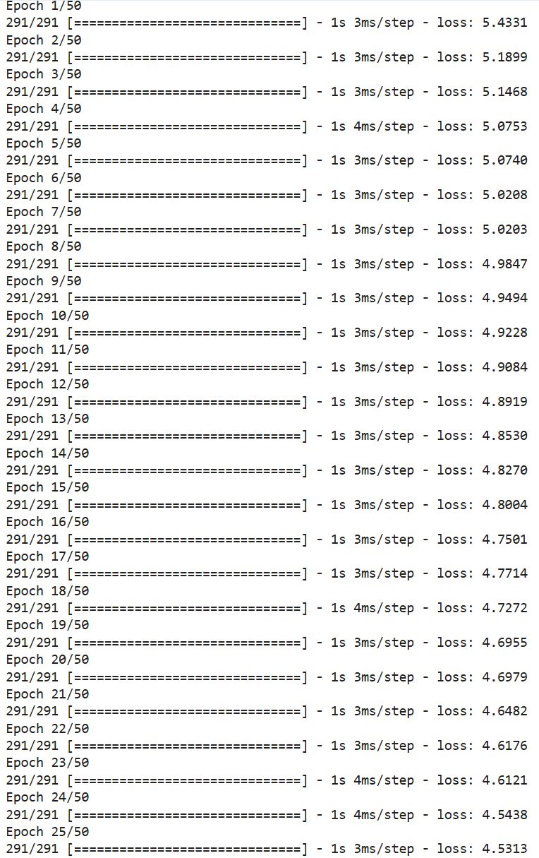
What It Does: Trains the ANN on the training data for 50 epochs.
5. Hyperparameter Tuning
Hyperparameters are external configuration parameters that define the learning process itself, as they’re set before model training and remain fixed during model fitting. They control aspects such as model complexity, regularization strength, optimization behavior, or algorithm-specific structure, e.g., the depth of a decision tree or the number of clusters in K-means.
Tuning these parameters encompasses a systematic search for the optimal combination of the hyperparameters to maximize generalization performance on unseen data.
Some techniques are grid search, random search, and Bayesian optimization. They are often used in conjunction with cross-validation to evaluate the model’s performance across a defined hyperparameter space.
How well this stage goes is usually the difference between a decent model and a production-ready model.
Example
As an example, we’ll perform hyperparameter tuning in the following steps:
5.1. Import required libraries
5.2. Prepare features and target variable
5.3. Train/test split
5.4. Define the random forest model
5.5. Set up hyperparameter grid
5.6. Configure grid search
5.7. Train model with grid search
5.8. Output best parameters and score
5.9. Evaluate best model on validation set
5.1. Import Required Libraries
Project Code:
from sklearn.ensemble import RandomForestClassifier
from sklearn.model_selection import GridSearchCV
from sklearn.metrics import classification_report
What It Does: Imports tools for classification (RandomForestClassifier), hyperparameter tuning (GridSearchCV), and evaluation (classification_report).
5.2. Prepare Features and Target Variable
Project Code:
# Target: Categorical classification
X = data_with_3days.drop(['request_day_within_3d',
                          'request_day_within_3d_capping',
                          'categories_3day'], axis=1)

y = data_with_3days['categories_3day']
What It Does:
- Drops all target columns from the feature set
X. - Selects
categories_3dayas the classification targety.
5.3. Train/Test Split
Project Code:
# Train-test split
from sklearn.model_selection import train_test_split
X_train, X_val, y_train, y_val = train_test_split(X, y, test_size=0.2, random_state=42)
What It Does: Splits the dataset into training (80%) and validation (20%) subsets.
5.4. Define the Random Forest Model
Project Code:
# Define model
rfc = RandomForestClassifier(random_state=42, class_weight='balanced')
What It Does: Creates a random forest classifier with a fixed random seed and balanced class weights.
5.5. Set Up Hyperparameter Grid
Project Code:
# Define parameter grid
param_grid = {
    'n_estimators': [50, 100, 200],
    'max_depth': [5, 10, None],
    'min_samples_split': [2, 5],
    'min_samples_leaf': [1, 3],
    'bootstrap': [True, False]
}
What It Does: Defines the hyperparameters to test during grid search.
5.6. Configure Grid Search
Project Code:
# Grid search with accuracy scoring (you can also try 'f1_weighted')
grid_search = GridSearchCV(
    estimator=rfc,
    param_grid=param_grid,
    scoring='f1_weighted',
    cv=3,
    verbose=2,
    n_jobs=-1
)
What It Does:
- Wraps the model in a GridSearchCV to perform exhaustive search over the hyperparameter space.
- Uses 3-fold cross-validation and F1-weighted score for evaluation.
5.7. Train Model With Grid Search
Project Code:
# Fit the model
grid_search.fit(X_train, y_train)
What It Does: Trains models for all hyperparameter combinations and selects the best one based on F1 score.
5.8. Output Best Parameters and Score
Project Code:
# Best parameters and score
print("Best Parameters:\n", grid_search.best_params_)
print("Best F1 Weighted Score:\n", grid_search.best_score_)
What It Does: Prints the optimal combination of hyperparameters and the corresponding best score from training.
5.9. Evaluate Best Model on Validation Set
Project Code:
# Predict and evaluate
best_clf = grid_search.best_estimator_
y_pred = best_clf.predict(X_val)
print(classification_report(y_val, y_pred))
Here’s the output. To be honest, we didn’t achieve much. The model is still biased toward the majority class. The weighted F1-score is 0.57, which is slightly better than before, but it’s still subpar.
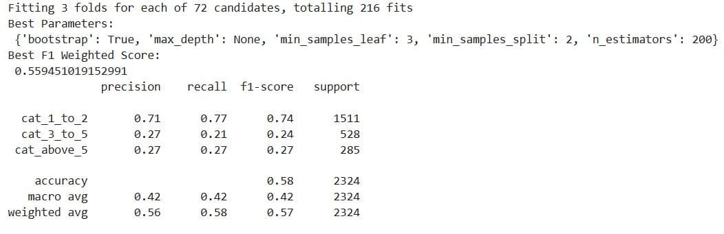
You could try SMOTE or class rebalancing, use XGBoost with class weights, and experiment with different scoring metrics or multi-objective optimization.
But, for the purpose of this article, we’ll stop here and conclude that classification really isn’t a good approach for this prediction task.
What It Does:
- Retrieves the best model and makes predictions on the validation set.
- Prints precision, recall, and F1-score per class.
6. Deployment & Monitoring
In this stage, your model becomes operational, meaning it generates predictions in a production environment, be it a batch or real-time environment.
This process typically involves these stages.
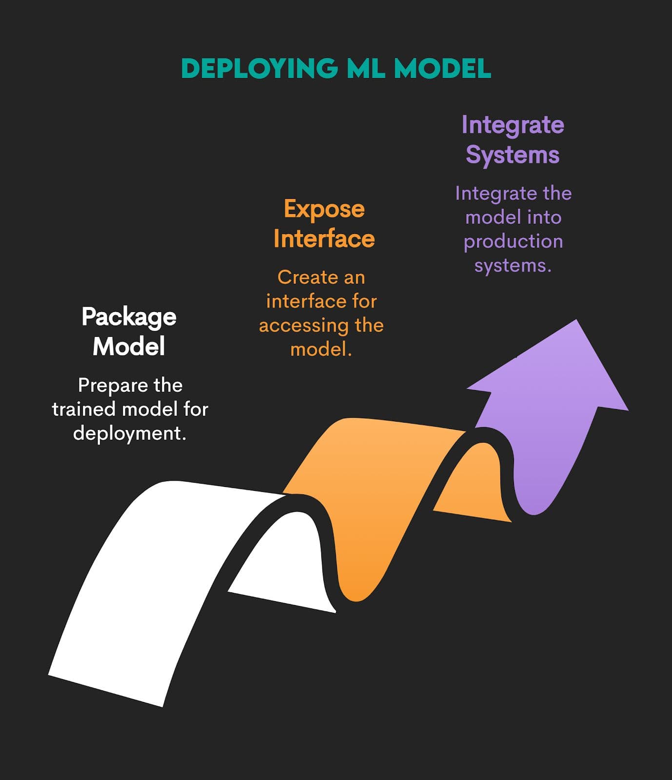
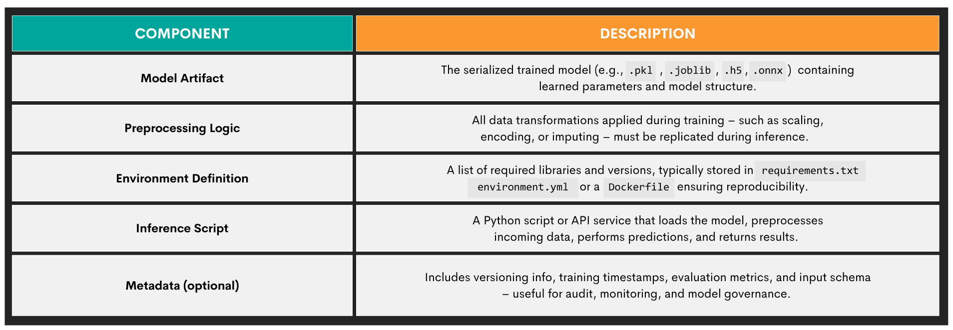
Packaging a Model
Packaging the trained model means taking it, along with everything it needs to run reliably, and preparing it for reuse, sharing, or deployment in another environment. Here’s an overview of a packaged ML model’s components.
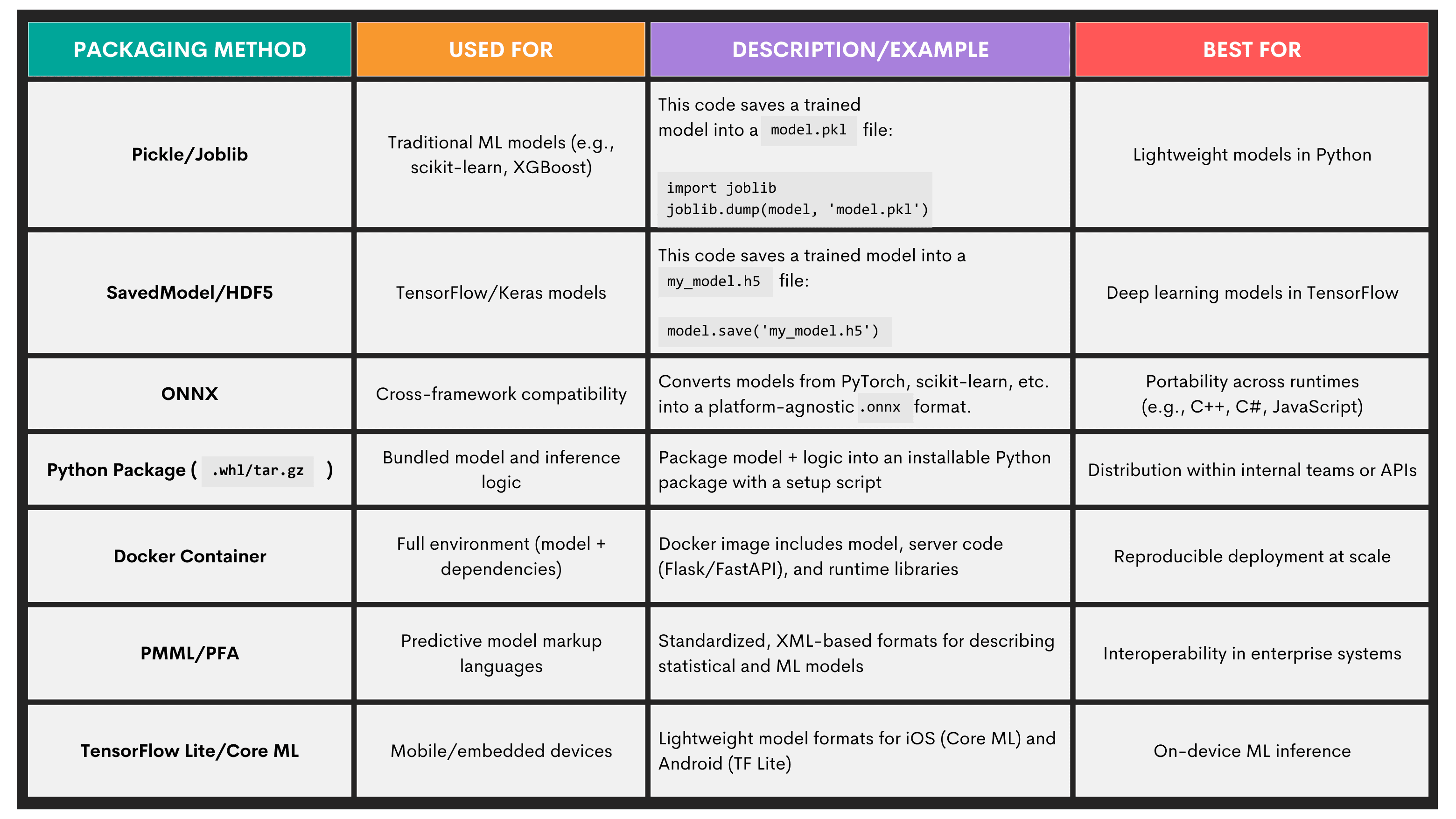
Commonly used model packaging methods are given below.
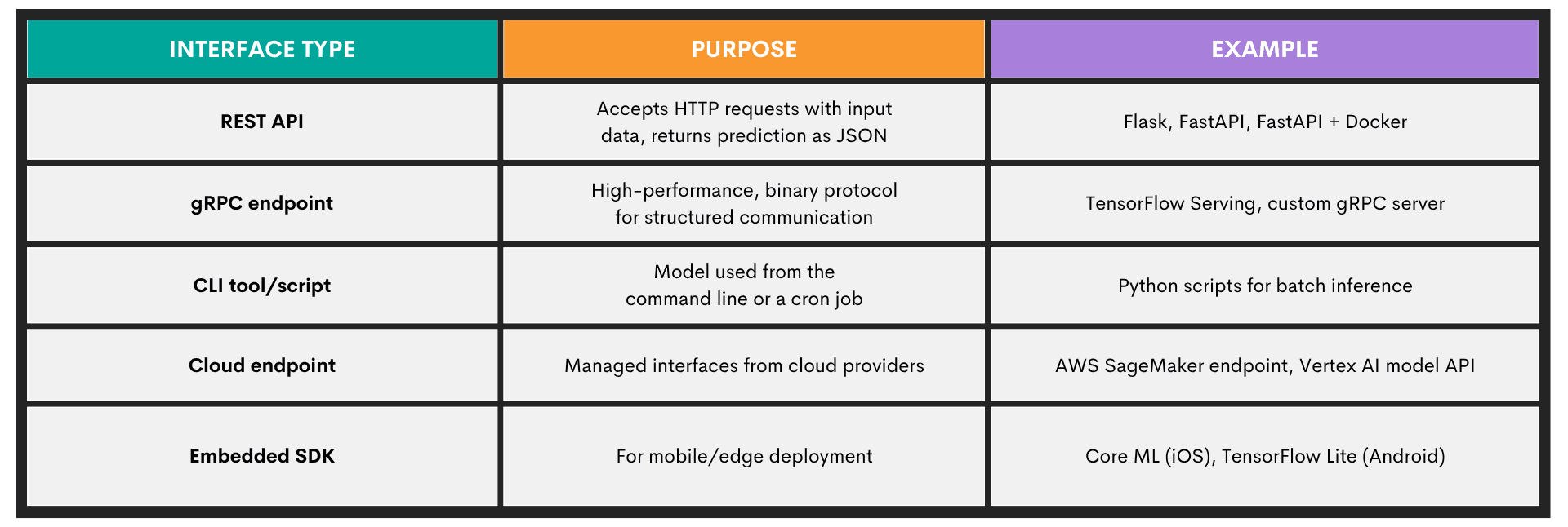
Exposing a Model Through an Interface
In this stage, the trained model becomes callable, as other systems can now talk to the model. Exposing a model is commonly done through different interface types, with an overview shown below.
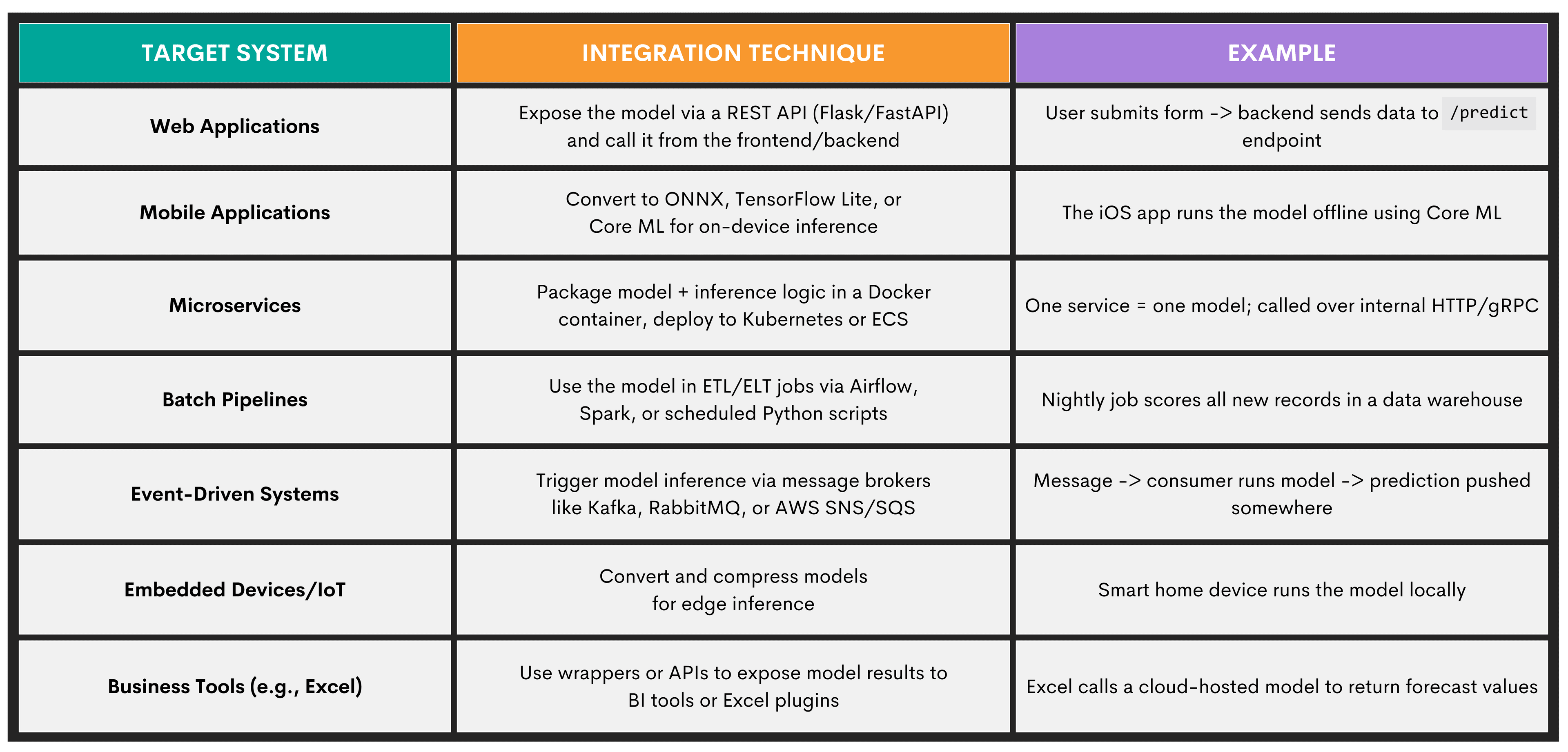
Integrating a Model Into Production Systems
This sub-stage of model deployment and monitoring is where you embed your trained model into a larger application or system so it can actually be used in real-world scenarios.
While this might sound the same as exposing a model through the interface, it’s not. The distinction is that interface exposure is about how others can reach the model; integration is about who is calling it, when, and why.
Here are some of the techniques you can use for integration.
Key Machine Learning Techniques
We’ll now present five fundamental machine learning paradigms. They all have specific purposes, statistical assumptions, optimization strategies, and data presentations.
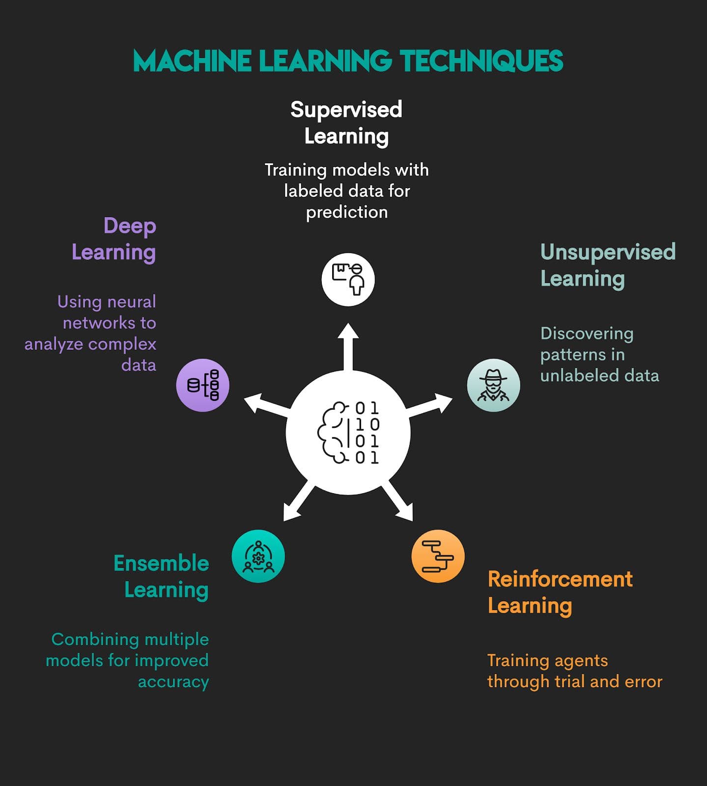
1. Supervised Learning
Supervised learning is a function approximation technique where an algorithm learns a mapping using labeled training data. Given an input feature set and corresponding outputs, the model infers patterns that minimize prediction error on unseen data.
Mapping is represented by this formula.
An input feature set is written like this.
The output is represented by this formula.
In simpler words, the model is fed input features and correct answers, and it learns to map the two.
Problem Types: Supervised learning is used for two types of problems:
- Classification – predicting discrete features (e.g., spam detection, where email is or is not spam)
- Regression – predicting continuous value (e.g., house price forecasting)
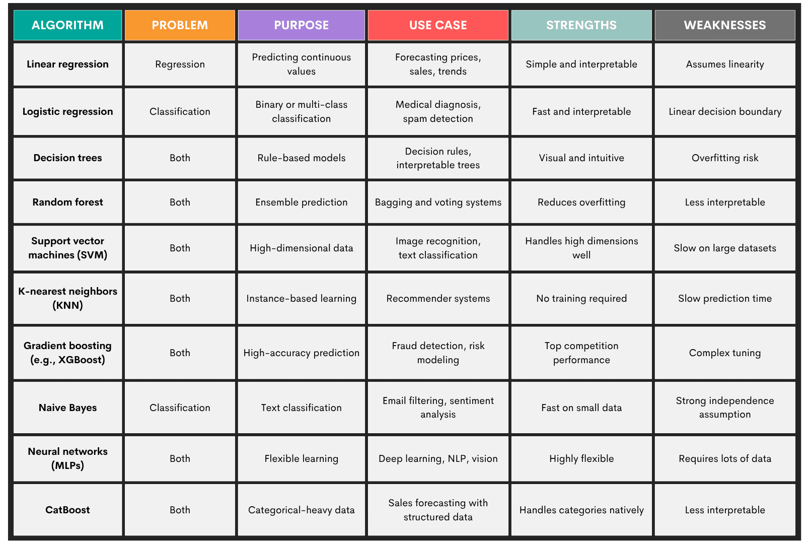
Algorithms: Some of the more popular supervised learning algorithms are:
- Linear regression
- Logistic regression
- Decision trees
- Random forest
- Support vector machines (SVM)
- K-nearest neighbors (KNN)
- Gradient boosting machines (e.g., XXBoost, LightGBM)
- Naive Bayes
- Neural Networks (MLPs)
- CatBoost
Here’s an overview of these algorithms.
2. Unsupervised Learning
Unsupervised learning means models don’t require human oversight, as they use datasets without predefined labels. These types of models uncover hidden structures and patterns within the data.
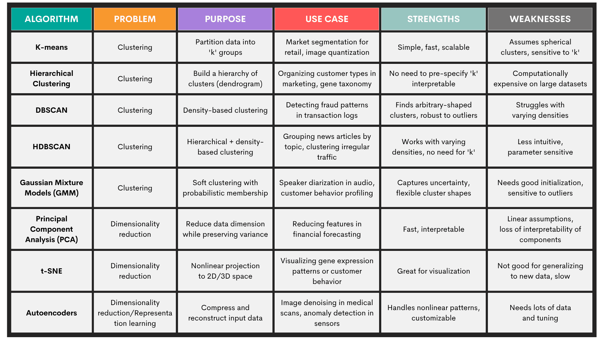
Problems: Unsupervised learning is used for:
- Clustering – identifying natural groupings (e.g., customer segmentation)
- Dimensionality reduction – projecting high-dimensional data into a lower-dimensional space while preserving structure
Algorithms: The most commonly used unsupervised learning algorithms are:
- K-means
- Hierarchical clustering
- DBSCAN
- HDBSCAN
- Gaussian mixture models (GMM)
- Principal component analysis (PCA)
- t-SNE
- Autoencoders
Here’s an overview of the algorithms.
3. Reinforcement Learning
In reinforcement learning (RL), an agent interacts with an environment and learns to make decisions by receiving rewards or penalties based on its actions.
It’s like training a dog. Only this “dog” uses a feedback loop to learn.
It means it observes a state s, takes an action a, transitions to a new state s', and receives a reward r.
The goal is to learn a policy that maximizes the expected cumulative reward over time.
The policy is written as:
The formula for the expected cumulative reward is:
This is the discount factor that prioritizes immediate rewards over future ones.
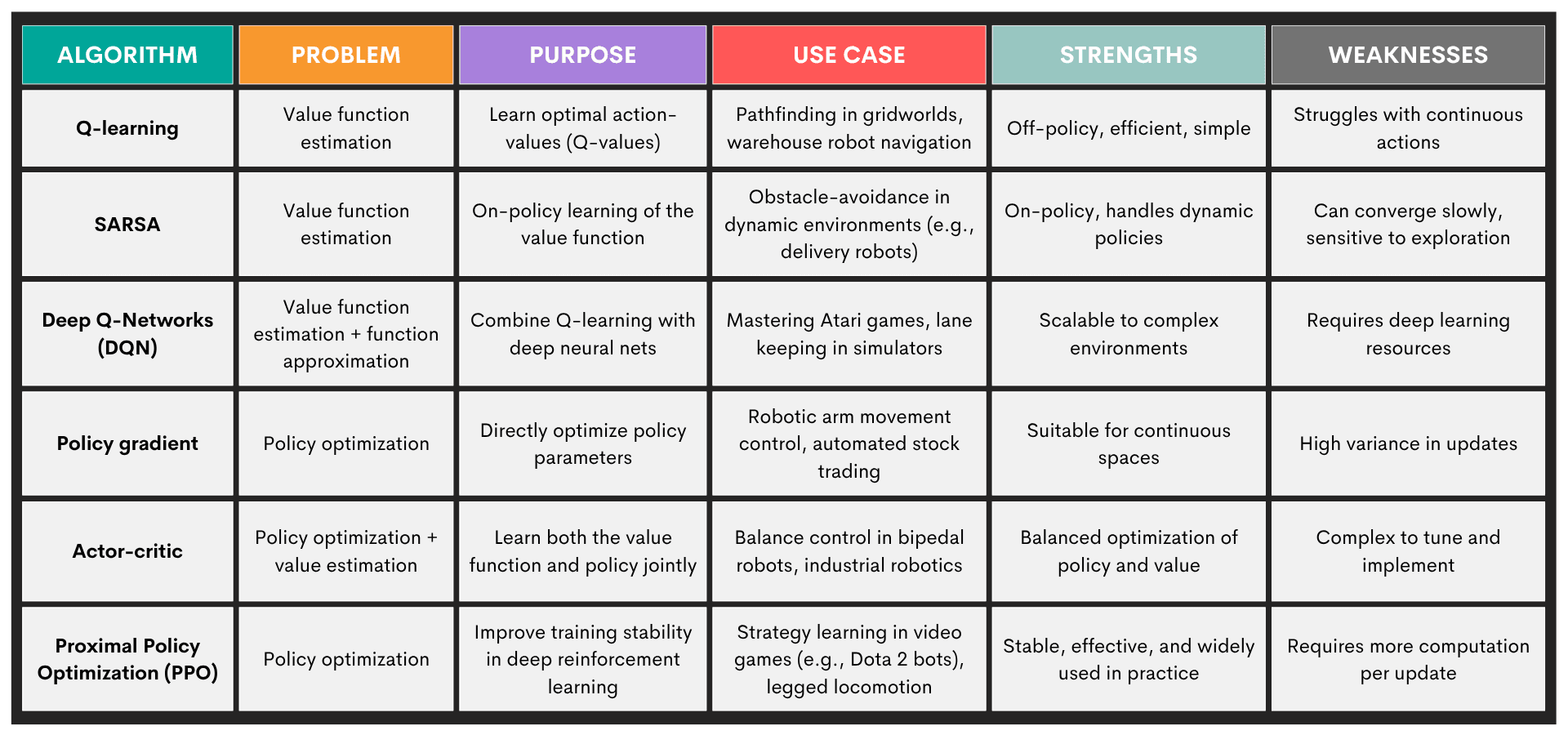
Problems: Typical problems solved by reinforcement learning are:
- Policy optimization – learning the best decision strategy (policy) to maximize reward
- Value function estimation – estimate how good a state (or state-action pair) is in terms of expected return
- Exploration vs. exploitation – balance trying new actions vs. using known rewarding actions
- Temporal credit assignment (TCA) – figuring out which past actions contributed to present rewards
Algorithms: The most common reinforcement learning algorithms are:
Here’s an overview of these algorithms.
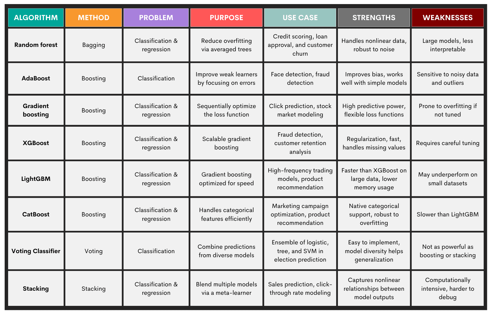
4. Ensemble Learning
Ensemble learning are techniques that combine multiple “weak learners” – models performing slightly better than random guessing – into a “strong learner”. The idea is to combine multiple machine learning models and produce more robust predictions than any single model would do.
Ensemble learning is especially beneficial when one model is overfitting or underfitting, or the data is noisy or high-dimensional.
Problems: Ensemble learning is primarily used in supervised learning tasks, so it’s again:
- Classification
- Regression
Methods: Here are some popular ensemble methods.
- Bagging (bootstrap aggregating) – trains multiple versions of a model on bootstrapped samples; aims to reduce variance
- Boosting – sequentially trains models, each correcting the previous one’s errors; aims to reduce bias
- Stacking – combines diverse models by training a meta-model on their outputs; aims to leverage model diversity
- Voting (hard/soft) – aggregates predictions via majority voting or averaged probabilities; aims for a simple combination of different classifiers
There are multiple algorithms within each method. You can find an overview of the most common algorithms in the table below.
5. Deep Learning
Deep learning techniques model complex patterns and relationships using multi-layered artificial neural networks. They learn hierarchical representations of data through many layers of nonlinear transformations, without manual feature engineering.
Problems: Typical problems solved by deep learning are:
- Image recognition – classifying objects, detecting faces, segmenting pixels (e.g., autonomous driving)
- Natural language processing (NLP) – language translation, text generation, sentiment analysis
- Speech recognition – converting audio to text, powering voice assistants
- Time series forecasting – predicting future trends from sequential data (e.g., stock prices, energy load)
- Anomaly detection – spotting outliers in high-dimensional sensor data or logs
Algorithms: Here are the most popular deep learning algorithms.
- Multilayer perceptrons (MLPs)
- Convolutional neural networks (CNNs)
- Recurrent neural networks (RNNs)
- Long Short-Term Memory (LSTM)
- Transformers
- Variational autoencoders (VAEs)
- Generative adversarial networks (GANs)
Here’s an overview of those algorithms.
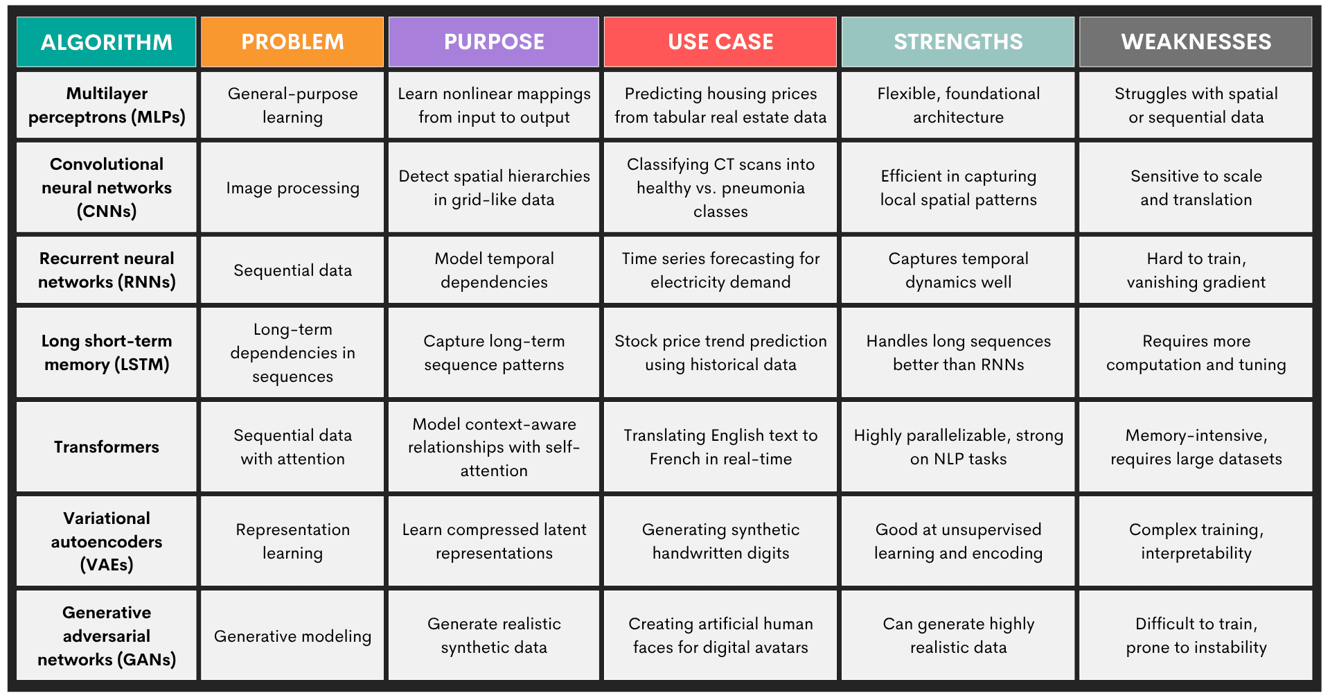
Challenges in Machine Learning Modeling
The possibilities of machine learning modeling sound immense in theory. However, when you meet the actual data and requirements, you’ll realize that challenges are also huge.
Here’s their overview to help you understand and mitigate them.
Best Practices for Machine Learning Modeling
Every individual machine learning modeling task is different. It depends on the requirements, data, time you have, and the goal of the task, just to name a few.
However, some best practices should be followed, no matter what. They will make machine learning modeling easier and more systematic, resulting in trustworthy, scalable, and maintainable systems.
Tools and Libraries for Machine Learning Modeling
In machine learning, you depend on the use of tools that support you throughout various stages of machine learning modeling. There are many specialized tools – and the number is growing almost daily – which makes it more difficult to choose the right one.
Most of the libraries and tools revolve around Python, which is a machine learning industry standard.
In the overview below, you will find essential libraries and platforms that have become industry standards in machine learning. These should get you covered in most tasks.
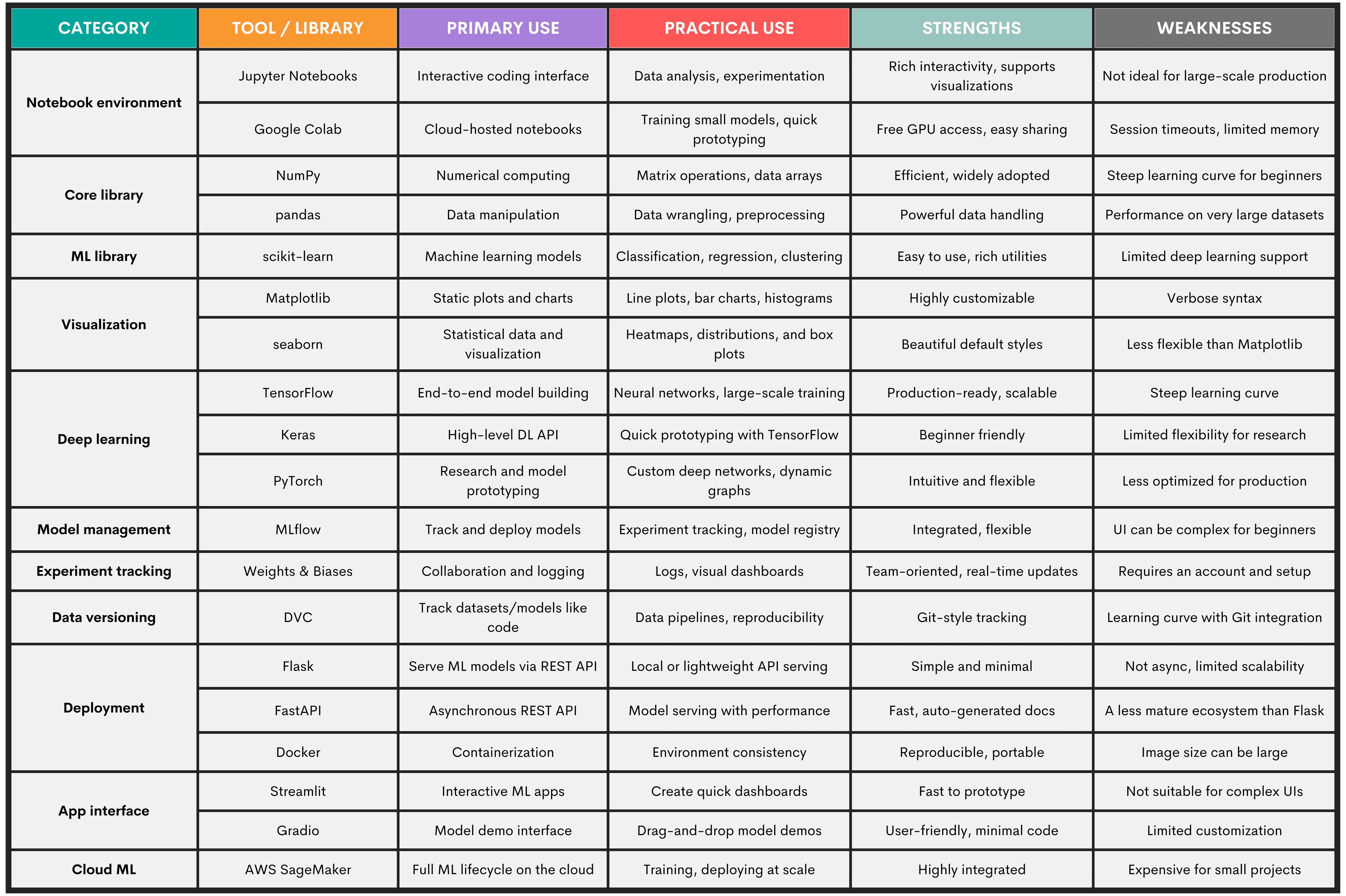
Conclusion
In this comprehensive guide, you learned about the five main machine learning techniques:
- Supervised learning
- Unsupervised learning
- Reinforcement learning
- Ensemble learning
- Deep learning
We talked about the algorithms, their practical uses, tools, challenges, and best practices in machine learning. More importantly, we went very deep into the machine learning modeling workflow. Not only did we talk in depth about each stage, but we also used a StrataScratch data project to show you how it all works in practice.
FAQs
1. What are the most commonly used machine learning models?
The most common models are:
- Logistic regression – great for binary classification
- Decision trees and random forests – used for classification and regression tasks when model interpretability or feature importance is needed
- K-nearest neighbors (KNN) – effective for low-dimensional, well-scaled data
- Support vector machines (SVM) – for classification in high-dimensional spaces
- Gradient boosting (XGBoost, LightGBM) – for structured/tabular data because of their high performance and fine-tuning flexibility
- Neural networks – for high-dimensional, unstructured data (e.g., images, audio, or text)
2. How do I choose the right algorithm for my data?
Start with your problem type (e.g., classification or regression), the data you have, and the task's goals, such as interpretability.
Visualize your data, as visualizations will often suggest the right approach. For example, linear relationships in pairplots or correlation heatmaps indicate that linear or logistic regression will be the right choice.
Then try multiple models and evaluate them using cross-validation, with scalability in mind.
3. What tools are best for beginners in machine learning modeling?
- Pandas and NumPy – data wrangling
- Scikit-learn – models and preprocessing
- Matplotlib and seaborn – plotting
- Google Colab or Jupyter Notebooks – coding
- Keras – deep learning
Share