Understanding the Pandas diff() Function: A Guide for Data Analysts


 Written by:
Nathan Rosidi
This guide explores the Pandas diff() function, detailing its utility in data trend analysis and predictive modeling with practical examples.
Have you ever encountered a situation in data analysis where understanding the difference between consecutive rows or columns was highly important?
In this one, we're going into the Pandas diff() function, a vital tool for data analysts. First, We'll explore how this function sheds light on the unknowns, and provide a full overview of its applications, syntax, and practical examples.
Get ready to add a powerful function to your skillset! Let’s start!
What is Pandas diff() Function?
Pandas diff() function calculates the difference between consecutive elements in a DataFrame or Series. It becomes invaluable in scenarios where changes or differences over time or position are significant.
It can commonly be used in financial data analysis, weather data interpretation, and many other fields. We will go into its syntax in the later sections.
Pandas diff() in data analysis
Before going into much technical details, you should know that the diff() function has diverse applications. For instance, in stock market analysis, it helps in identifying the day-to-day change in stock prices.
Similarly, in meteorological data, it can track temperature changes over consecutive days. Another application is in e-commerce, where diff() can analyze daily changes in product prices or sales figures. Let’s see different example scenarios;
Example Scenarios
- Finance: Calculating daily returns on stocks.
- Weather Forecasting: Assessing temperature or pressure changes over time.
- E-Commerce: Monitoring daily changes in product demand or pricing.
These examples highlight diff() as a critical tool for deriving meaningful insights from sequential data in various industries. You will see much more examples in this article, but before going to deeper, let’s see the basic syntax of it at first.
Basic Syntax of Pandas diff() Function
The syntax of the Pandas diff() function is straightforward. It's used as follows:
import pandas as pd

DataFrame.diff(periods=1, axis=0).
Here, DataFrame is your data, periods refers to the number of periods to calculate the difference over, and axis specifies the axis to operate on (0 for rows and 1 for columns).
import pandas as pd

# Sample DataFrame
data = {'Price': [100, 110, 105, 115, 120]}
df = pd.DataFrame(data)

# Using diff() to calculate change in price
df['Price Change'] = df['Price'].diff()
print(df)
Let’s see the output.

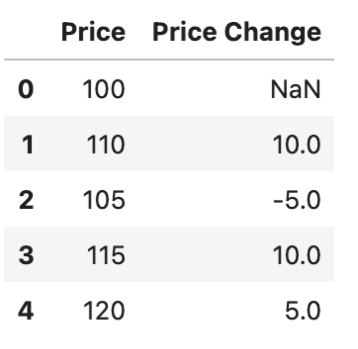
This code snippet shows how Pandas diff() can be used to calculate the change in price from one row to the next in a simple DataFrame.
Explanation of each parameter of the Pandas diff() function
The 'periods' parameter in the diff() function controls the number of periods over which the difference is calculated. By default, it's set to 1, meaning the function computes the difference with the immediately preceding element.
# Calculating difference over 2 periods
df['Price Change 2 Periods'] = df['Price'].diff(periods=2)
This code calculates the difference in price over every two rows.
The 'axis' parameter dictates whether the difference is calculated row-wise (0) or column-wise (1). This is particularly useful in multi-dimensional data.
# Calculating difference column-wise
df_diff_col = df.diff(axis=1)
This example computes the difference along columns in a DataFrame. These parameters offer flexibility, allowing analysts to tailor the function to specific data analysis needs.
Weather Prediction in Seattle
Now, to see how the diff() function works, we are going to use the Seattle weather collection, designed to predict conditions like rain, sun, snow, and fog. It includes data on precipitation, as well as daily maximum and minimum temperatures, along with wind speed.
You can download it from here: https://www.kaggle.com/datasets/ananthr1/weather-prediction/data
Data Exploration
Before going into the complexities of weather forecasting and data analysis, it's essential to become familiar with the dataset at hand.
Data exploration is the first step where we sift through the data, looking for patterns, anomalies, and basic properties. It sets the stage for a more detailed analysis and ensures we understand the data's structure, content, and potential challenges it may present.
Let's take a closer look at the Seattle weather dataset to see what insights and knowledge we can glean from its exploration.
import pandas as pd

# Load the dataset
file_path = 'seattle-weather.csv'
weather_data = pd.read_csv(file_path)

# Exploring the dataset
info = weather_data.info()
describe = weather_data.describe()
head = weather_data.head()

(info, describe, head)
Here is the output.

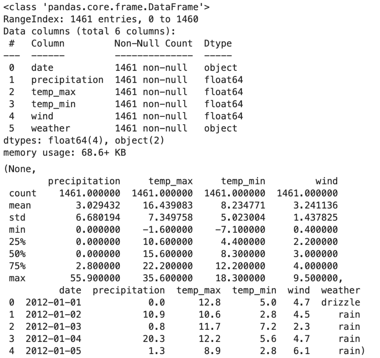
Exploration Insights
- Total Entries: 1461.
- Columns: Date, precipitation, temp_max, temp_min, wind, and weather.
- Missing Values: The dataset is complete with no missing entries.
- Variety: Includes conditions like drizzle, rain, sun, snow, and fog.
- Columns with Numerical Data: Precipitation, temp_max, temp_min, and wind.
- Data Characteristics: These columns have varying ranges and standard deviations.
Check out this Pandas Cheat Sheet, to easily reach the functions that you can use to analyze different datasets.
Data Visualization
“A picture is worth a thousand words" rings particularly true in data analysis. Data visualization transforms numbers and datasets into visual narratives that are often more accessible and understandable than raw data.
Through the use of visual tools, we can uncover trends, identify outliers, and communicate complex information effectively.
By visualizing the day-to-day changes in Seattle's weather data, we can begin to perceive the subtle and not-so-subtle forces of nature at play. Let's turn these data-driven insights into visual formats that can inform and enlighten.
Here is the code.
import matplotlib.pyplot as plt

# Using diff() function to find day-to-day changes
weather_data['date'] = pd.to_datetime(weather_data['date'])  # Converting date to datetime
weather_data['temp_max_diff'] = weather_data['temp_max'].diff()
weather_data['temp_min_diff'] = weather_data['temp_min'].diff()
weather_data['wind_diff'] = weather_data['wind'].diff()

# Selecting a sample for visualization to avoid clutter
sample_data = weather_data.head(30)

# Plotting the differences
fig, axes = plt.subplots(3, 1, figsize=(12, 15))

# Max Temperature Difference
axes[0].bar(sample_data['date'], sample_data['temp_max_diff'], color='orange')
axes[0].set_title('Daily Max Temperature Change')
axes[0].set_xlabel('Date')
axes[0].set_ylabel('Temperature Change (°C)')

# Min Temperature Difference
axes[1].bar(sample_data['date'], sample_data['temp_min_diff'], color='blue')
axes[1].set_title('Daily Min Temperature Change')
axes[1].set_xlabel('Date')
axes[1].set_ylabel('Temperature Change (°C)')

# Wind Speed Difference
axes[2].bar(sample_data['date'], sample_data['wind_diff'], color='green')
axes[2].set_title('Daily Wind Speed Change')
axes[2].set_xlabel('Date')
axes[2].set_ylabel('Wind Speed Change (mph)')

plt.tight_layout()
plt.show()

# Save the plot as an image file
fig.savefig('weather_data_changes.png')
Here is the output.

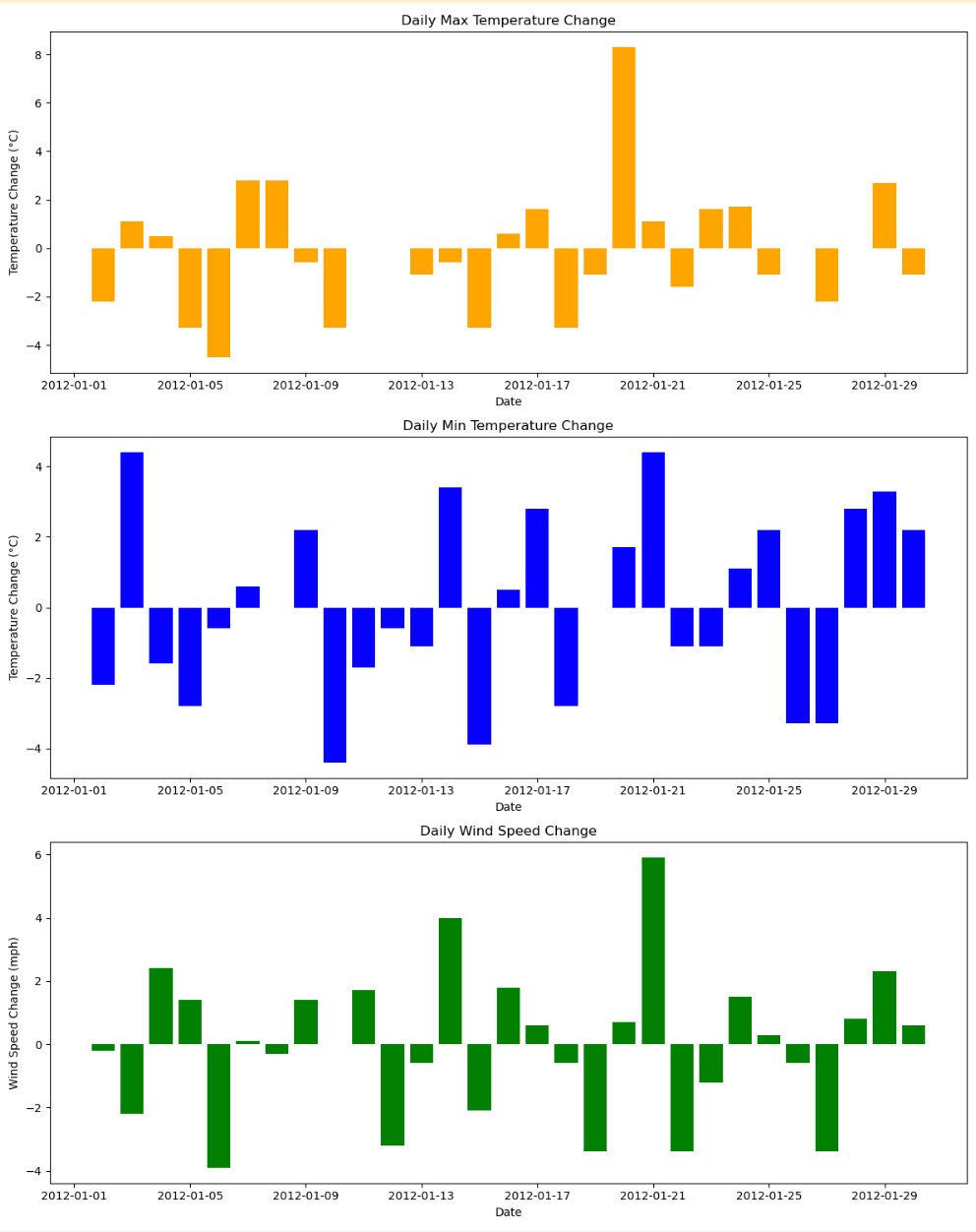
Insights
The bar charts above display the day-to-day changes in maximum temperature, minimum temperature, and wind speed for the first 30 days in the dataset. Each chart shows the variation from the previous day:
- Orange Chart: Daily change in maximum temperature.
- Blue Chart: Daily change in minimum temperature.
- Green Chart: Daily change in wind speed.
These visualizations help in understanding the variability in weather conditions and can be valuable in further analysis.
These codes might be challenging for beginners, if you think you have to improve your skills, check out these Pandas Interview Questions, which will help increase your Pandas skill.
Machine Learning
Now even if it is not necessary to build a machine learning algorithm, to understand our function, but let’s finish what we have started.
Here, let’s split the code into the following steps, and then see the whole code.
Objective
Our goal is to predict the day-to-day differences in maximum temperatures (temp_max_diff). This approach focuses on forecasting how much the maximum temperature will change from one day to the next, rather than predicting the absolute temperature values directly.
Data Preparation
We'll use features like precipitation, wind, and the differences in temperature and wind from the previous days (temp_max_diff, temp_min_diff, wind_diff) as predictors. These features are chosen because they can influence daily temperature changes.
The target variable for our model is temp_max_diff, which represents the change in maximum temperature from the previous day.
It's important to note that we exclude the actual temp_max and temp_min values from our predictors to prevent data leakage and ensure our model is learning to predict changes, not absolute values.
from sklearn.ensemble import RandomForestRegressor
from sklearn.metrics import mean_squared_error, r2_score
import numpy as np
import matplotlib.pyplot as plt

# Preparing data for regression model (predicting temp_max_diff)
# Selecting relevant features, excluding temp_max and temp_min
X_regressor = weather_data_cleaned[['precipitation', 'wind', 'temp_max_diff', 'temp_min_diff', 'wind_diff']].fillna(0)
y_regressor = weather_data_cleaned['temp_max_diff']

# Splitting the data
X_train_reg, X_test_reg, y_train_reg, y_test_reg = train_test_split(X_regressor, y_regressor, test_size=0.3, random_state=42)
Model Building
A Random Forest Regressor is chosen for this task. This model is suitable for regression tasks and can handle non-linear relationships between features and the target variable.
The data is split into training and testing sets, and feature scaling is applied to normalize the data, which is particularly important for distance-based models.
# Feature scaling
scaler_reg = StandardScaler()
X_train_reg_scaled = scaler_reg.fit_transform(X_train_reg)
X_test_reg_scaled = scaler_reg.transform(X_test_reg)

# Building and training the Random Forest Regressor
rf_regressor = RandomForestRegressor(n_estimators=100, random_state=42)
rf_regressor.fit(X_train_reg_scaled, y_train_reg)
Prediction and Visualization
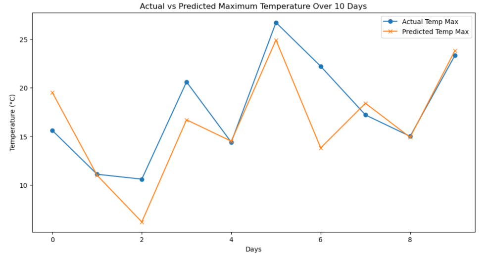
After training, the model predicts temp_max_diff for the test data.
We then add these predicted differences to the previous day's actual temp_max values to calculate the predicted maximum temperature for each day in the test set.
Finally, we visualize the results by plotting both the actual temp_max values and the predicted temp_max values over a period of 10 days. This visualization helps us assess the model's performance and understand how well it captures the day-to-day temperature variations.
# Predicting temp_max_diff
y_pred_reg = rf_regressor.predict(X_test_reg_scaled)

# Calculating the predicted temp_max values
# Adding the predicted diff to the previous day's temp_max
predicted_temp_max = weather_data_cleaned['temp_max'].iloc[X_test_reg.index - 1].values + y_pred_reg

# Selecting a subset of 10 days for visualization
subset_index = X_test_reg.head(10).index
actual_temp_max = weather_data_cleaned['temp_max'].iloc[subset_index]
predicted_temp_max_subset = predicted_temp_max[:10]

# Plotting the actual and predicted temp_max values
plt.figure(figsize=(12, 6))
plt.plot(actual_temp_max.values, label='Actual Temp Max', marker='o')
plt.plot(predicted_temp_max_subset, label='Predicted Temp Max', marker='x')
plt.title('Actual vs Predicted Maximum Temperature Over 10 Days')
plt.xlabel('Days')
plt.ylabel('Temperature (°C)')
plt.legend()
plt.show()
Here is the whole code.
from sklearn.ensemble import RandomForestRegressor
from sklearn.metrics import mean_squared_error, r2_score
import numpy as np
import matplotlib.pyplot as plt

# Preparing data for regression model (predicting temp_max_diff)
# Selecting relevant features, excluding temp_max and temp_min
X_regressor = weather_data_cleaned[['precipitation', 'wind', 'temp_max_diff', 'temp_min_diff', 'wind_diff']].fillna(0)
y_regressor = weather_data_cleaned['temp_max_diff']

# Splitting the data
X_train_reg, X_test_reg, y_train_reg, y_test_reg = train_test_split(X_regressor, y_regressor, test_size=0.3, random_state=42)

# Feature scaling
scaler_reg = StandardScaler()
X_train_reg_scaled = scaler_reg.fit_transform(X_train_reg)
X_test_reg_scaled = scaler_reg.transform(X_test_reg)

# Building and training the Random Forest Regressor
rf_regressor = RandomForestRegressor(n_estimators=100, random_state=42)
rf_regressor.fit(X_train_reg_scaled, y_train_reg)

# Predicting temp_max_diff
y_pred_reg = rf_regressor.predict(X_test_reg_scaled)

# Calculating the predicted temp_max values
# Adding the predicted diff to the previous day's temp_max
predicted_temp_max = weather_data_cleaned['temp_max'].iloc[X_test_reg.index - 1].values + y_pred_reg

# Selecting a subset of 10 days for visualization
subset_index = X_test_reg.head(10).index
actual_temp_max = weather_data_cleaned['temp_max'].iloc[subset_index]
predicted_temp_max_subset = predicted_temp_max[:10]

# Plotting the actual and predicted temp_max values
plt.figure(figsize=(12, 6))
plt.plot(actual_temp_max.values, label='Actual Temp Max', marker='o')
plt.plot(predicted_temp_max_subset, label='Predicted Temp Max', marker='x')
plt.title('Actual vs Predicted Maximum Temperature Over 10 Days')
plt.xlabel('Days')
plt.ylabel('Temperature (°C)')
plt.legend()
plt.show()
Here is the output.

Insights
Let’s evaluate our results.
- Prediction Accuracy: There are points where the predicted and actual values are very close, suggesting the model has made accurate predictions for those days. However, there are also instances where the predicted values deviate from the actual ones.
- Consistency: The consistency of the predictions across all 10 days isn't uniform. Some predictions are more accurate than others, which is common in predictive modeling.
- Potential Overfitting: While this single graph does not provide enough information to conclusively determine if overfitting is present, the close tracking suggests that the model may be fitting quite well to this particular set of data. To truly assess overfitting, we'd need to evaluate the model's performance over a broader range of data or through cross-validation.
- Performance Metrics: To quantitatively evaluate the model's performance, metrics like RMSE (Root Mean Squared Error) and MAE (Mean Absolute Error) should be computed, as these will provide numerical values that indicate the average magnitude of the model's prediction errors.
Future Enhancements
In machine learning, there will be often room for improvement. So let’s see them.
1. Feature Engineering
- More sophisticated features could be engineered to capture other factors that influence temperature changes, such as humidity, time of year, or lag features that take into account not just the previous day's temperature but several days prior.
2. Model Complexity
- Exploring models with different complexities can be beneficial. If the current model is too simple, it might not capture all the patterns in the data.
3. Ensemble Methods
- Combining the predictions from multiple models can often lead to better performance than any single model alone, like bagging, boosting, or stacking are worth exploring.
4. External Data Sources
- Incorporating external data sources such as regional weather patterns, geographical data, or even global climate trends might provide additional context that could enhance predictive accuracy.
5. Regularization Techniques
- Applying regularization methods can help prevent overfitting by penalizing overly complex models, thus improving the model's generalization capabilities.
6. Hyperparameter Optimization
- Systematic hyperparameter tuning using approaches like grid search, random search, or Bayesian optimization can help in finding the optimal settings for the model.
7. Model Interpretability
- Improving model interpretability could also indirectly help performance by making it easier to understand and trust the model's predictions, leading to better decisions about how to refine it.
Common Use Cases
The diff() function, which calculates the difference between consecutive data points, is a powerful tool across various industries and applications. Let’s see some of them.
1. Finance
- Market Analysis: Used to determine the change in stock prices, trading volumes, or economic indicators over time, which is fundamental in financial modeling and trading algorithms.
- Risk Management: Helps in assessing the volatility of assets by looking at the day-to-day variations in prices or interest rates.
2. Healthcare
- Patient Monitoring: Tracking changes in patient vital signs (like heart rate or blood pressure) over time to detect early signs of deterioration or improvement.
- Epidemiology: Analyzing the spread of diseases by calculating the day-to-day increase in cases, which can be vital for public health responses.
3. Retail and Sales:
- Demand Forecasting: Assessing changes in product sales to understand consumer behavior and to adjust inventory management.
- Price Optimization: Monitoring the changes in product prices over time to develop dynamic pricing strategies.
4. Meteorology:
- Weather Forecasting: Evaluating changes in weather data like temperature, pressure, or humidity to forecast weather conditions.
5. Energy Sector:
- Load Forecasting: Calculating changes in energy consumption to predict future energy needs and to manage supply effectively.
- Price Analysis: Tracking fluctuations in energy prices, which can influence trading and hedging decisions.
6. Manufacturing
- Quality Control: Monitoring changes in production process metrics to identify potential issues or deviations from the standard.
- Supply Chain Management: Observing the variation in the time it takes for goods to move through the supply chain to optimize processes.
7. Technology and Computing
- Performance Monitoring: Tracking changes in system performance metrics over time to anticipate maintenance needs or upgrades.
- User Growth Analysis: Measuring the growth rate of user base or website traffic by comparing consecutive time periods.
8. Sports Analytics
- Performance Improvement: Analyzing athletes' performance data over time to tailor training programs.
- Game Strategy: Understanding changes in team performance metrics across games to inform coaching strategies.
Of course, there might be more areas, that you can use Pandas diff() function, but you get the idea.
Tips and Tricks
Using the diff() function effectively involves understanding its nuances and potential pitfalls. Here are some tips and best practices to consider:
1. Understanding Data Context
- Always be aware of the context of your data. diff() assumes a logical sequence, so it's crucial that your data is sorted appropriately, especially with time-series data.
2. Handling Missing Values
- Before applying diff(), ensure that your dataset handles missing values appropriately. diff() will return NaN for any operation involving a NaN.
3. Adjusting Periods
- The periods parameter is powerful. Apart from the default of 1, consider using different periods to calculate changes over various time spans to uncover different insights.
4. Be Cautious with Boundaries
- The first calculation of diff() will always result in a NaN because there's no previous data point. Plan for how to handle this in your analysis.
5. Axis Awareness
- Remember that diff() can operate both row-wise and column-wise. Ensure you're using the correct axis for your analysis.
6. Use with GroupBy
- When used in conjunction with groupby(), diff() can calculate changes within groups, which is useful for panel data or grouped time-series analysis.
7. Avoid Look-Ahead Bias
- In financial analysis or predictive modeling, ensure that you're not introducing look-ahead bias by using future data inadvertently.
8. Combining with Other Functions
- diff() can be combined with functions like cumsum() to reconstruct a series from differences, which can be useful in anomaly detection or data compression.
9. Regular Intervals
- diff() is most effective when the data points are evenly spaced in time or space. If your data is irregular, consider resampling or interpolating beforehand.
10. Performance Considerations
- For large datasets, performance can be an issue. Efficient use of memory and vectorized operations can help in managing large-scale computations.
By keeping these tips in mind, you can leverage the Pandas diff() function more effectively and avoid common mistakes that could lead to incorrect analyses or conclusions.
Conclusion
In this article, we've explored the Pandas diff() functions. Let's see the key points we covered;
- Function Overview: diff() calculates the difference between consecutive data points, which is fundamental in identifying trends and changes over time.
- Use Cases: We discussed its applications across various industries, from finance to healthcare, highlighting its ubiquity and utility in different analytical contexts.
- Practical Application: Using a real-world weather dataset, we demonstrated how Pandas diff() can be used to predict temperature changes, showcasing its potential in time-series forecasting.
- Tips and Tricks: Best practices were shared to maximize the effectiveness of the diff() function while avoiding common pitfalls.
Gaining proficiency in the Pandas diff() function can enhance your data analysis skills and improve your decision-making capabilities. It's important to remember that practical experimentation is key to reinforcing your understanding. The most effective learning method is through hands-on experience. Therefore, we urge our readers to actively engage with the diff() function by applying it to datasets found on StrataScratch, encouraging deeper comprehension and skill advancement.
Share