Statistics Cheat Sheet: Data Collection and Exploration

Categories:
 Written by:
Vivek Sankaran
This Statistics Cheat Sheet includes the concepts that you must know for your next data science or analytics interview presented in an easy-to-remember manner.
Statistics is the foundation of Data Analysis and Data Science. While a lot of aspirants concentrate on learning fuzzy algorithms with arcane names, they neglect the fundamentals and end up messing up their interviews. Without an in-depth understanding of statistics, it is difficult to make a serious career in data science. One need not be a Ph.D., but one must be able to understand the basic math and intuition behind the statistical methods in order to be successful. In this series, we will go through the fundamentals of statistics that you must know in order to clear your next Data Science Interview.
What is Statistics
Statistics is the science pertaining to the collection, analysis, interpretation or explanation, and presentation of data. There are three main pillars of statistics.
- Data Collection and Exploration
- Probability
- Statistical Inference
In this three-part series, we will look at major areas of statistics relevant to a budding Data Scientist. In this part, we will look at Data Collection and Exploration. We have a fantastic set of statistics blog articles that you can find here. Some of the articles that are recommended are.
- A/B Testing for Data Science Interviews
- Basic Types of Statistical Tests
- Probability Interview Questions
Also, check out our comprehensive “statistics cheat sheet” that goes beyond the very fundamentals of statistics (like mean/median/mode).
Sample vs Population
In order to analyze data, it is important to collect it. In statistics, we usually set out to examine a population. A population can be considered to be a collection of objects, people, or natural phenomena under study. For example, the income of a graduate fresh out of college, the weight of a donut, or the time spent on smartphones. Since it is not always possible or it is prohibitively expensive (or both) to collect data about the entire population, we rely on a subset of the population.
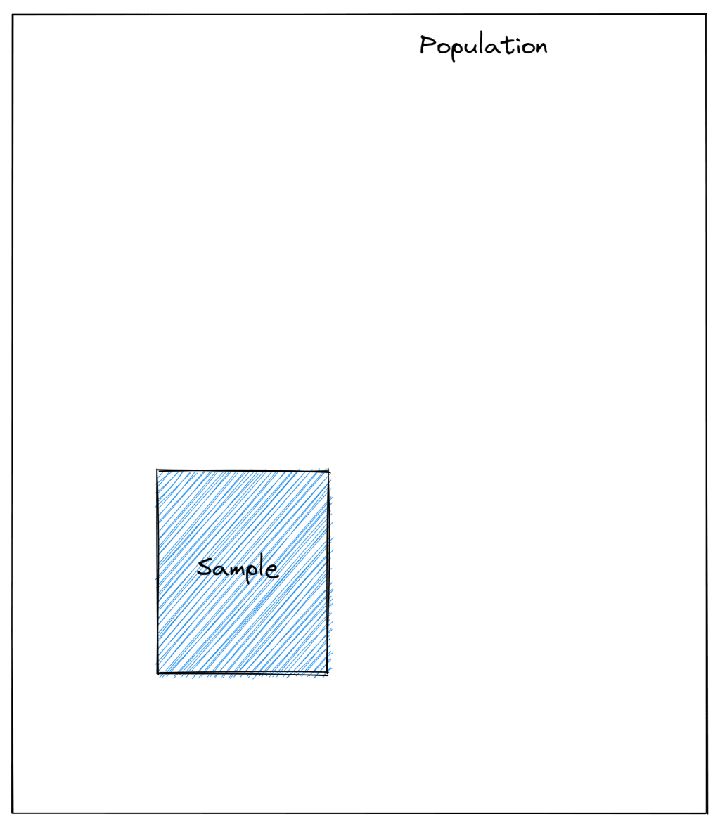
This subset (or sample), if chosen properly, can help us understand the entire population with relative surety and make our decisions. From this sample data (for example, the incomes of people), we calculate a statistic (for example, the typical income). This statistic represents a property of a sample. The statistic is an estimate of a population parameter (the typical income of all Americans).
Sampling Methods
For a sample to be representative of the population, it should have the same characteristics as the rest of the population. For example, if one were to survey the attitudes of Americans towards conservative values, then the students of the liberal arts department from a Blue state college might not be the best representation. Statisticians use multiple ways to ensure that the sample is random and truly representative of the entire population. Here we look at some of the most common methods used for Sampling. Each method has its pros and cons, we will look into those as well.
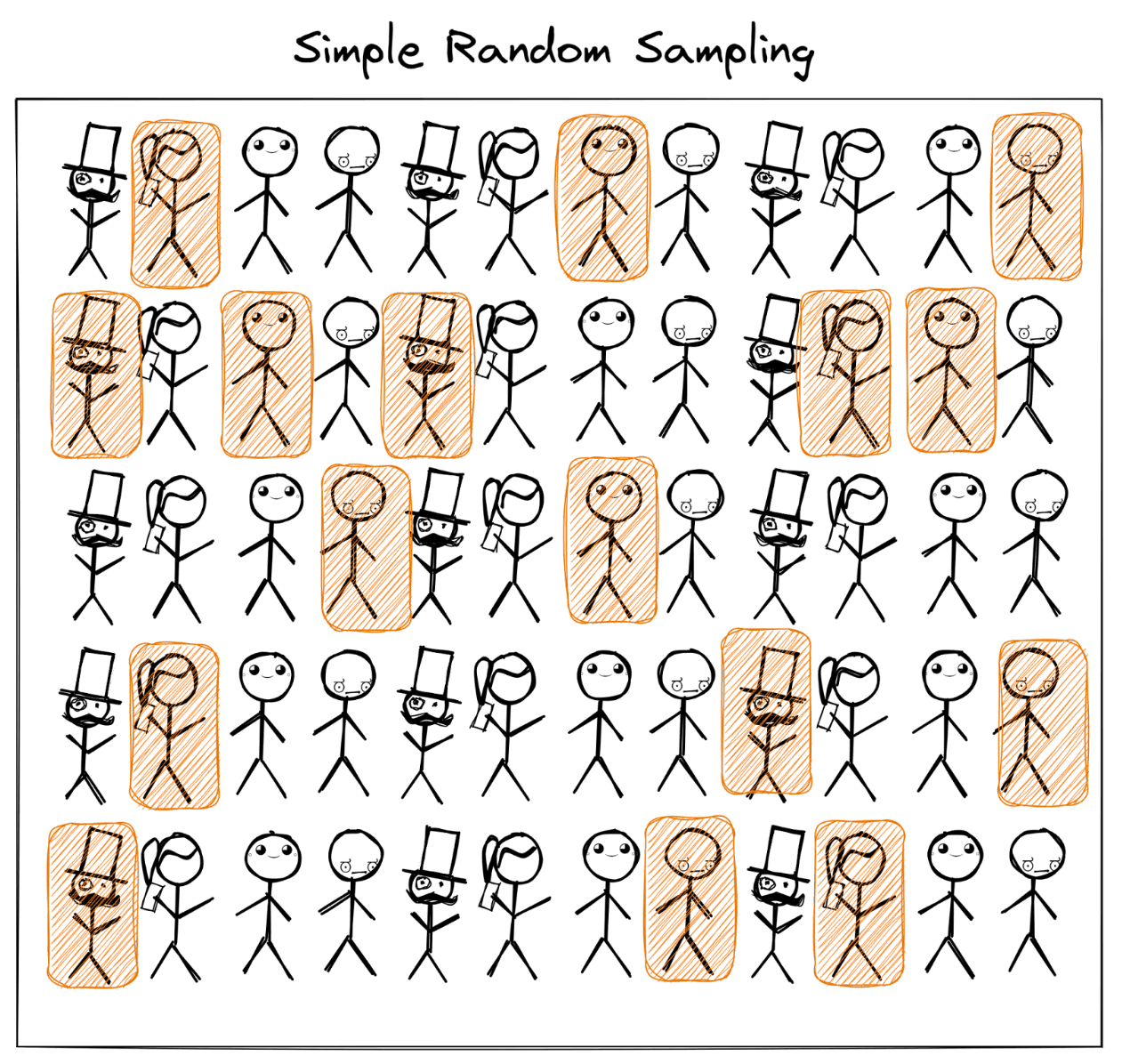
Simple Random Sample
The easiest way of sampling methods is a simple random sample. One randomly picks a subset of the entire population. Each person is equally likely to be chosen as every other person. In other words, each person has the same probability of being chosen.
where n is the size of the population.
A simple random sample has two properties that make it the standard against which we compare all the other sampling methods
- Bias: A simple random sample is unbiased. In other words, each unit has the same chance of being chosen as every other unit. There is no preference given to a particular unit or units
- Independence: The selection of one does not influence the chances of selection of another unit.
However, in the real world, a completely unbiased and independent sample is very difficult (if not impossible) to find. One of the most common instances is the underrepresentation of less educated voters in the samples used for the 2016 Election Polling. While it is possible to generate a list of completely random respondents, the final results might be skewed because people may not respond, thus skewing the sample and diverging from population characteristics. There are more effective and efficient ways to sample a population if we know something about the population.
Stratified Sample
In a stratified sample, we divide the population into homogeneous groups (or strata) and then take a proportionate number from each stratum. For example, we can divide a college into various departments and then take a random sample from each department in the proportion of the strengths of each department.
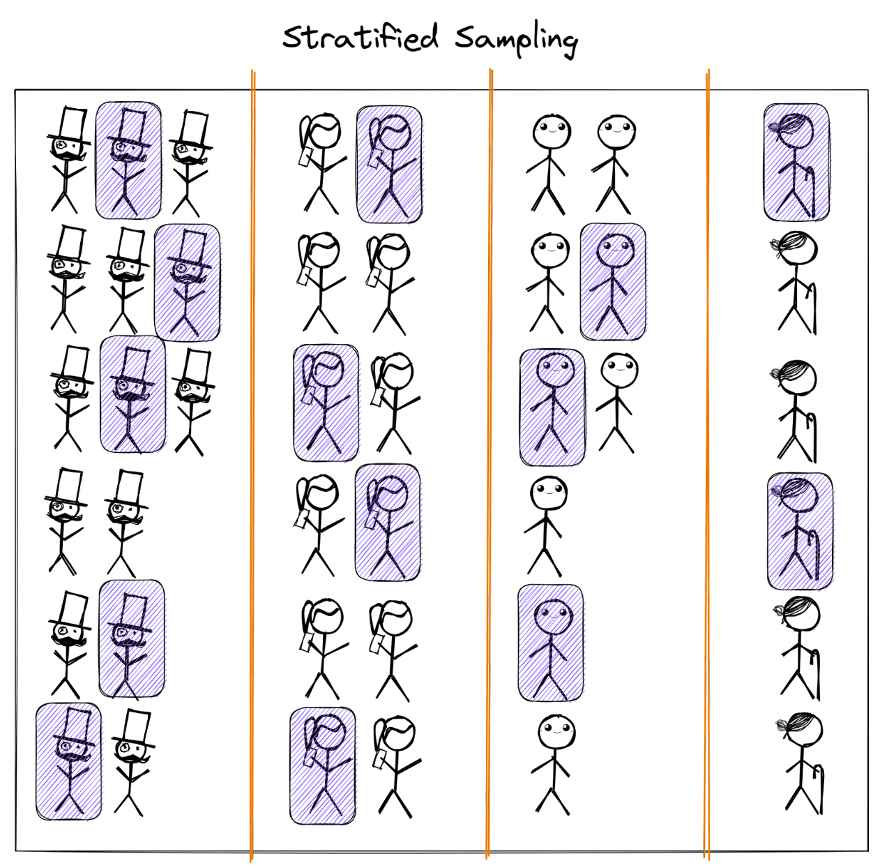
An example of how stratified sampling could look like
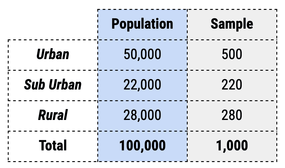
Here the sample represents 1% of each region. A more complex example can be when we introduce multiple characteristics. For example, let us bifurcate each region by gender as well. The sampling process would look something like this.
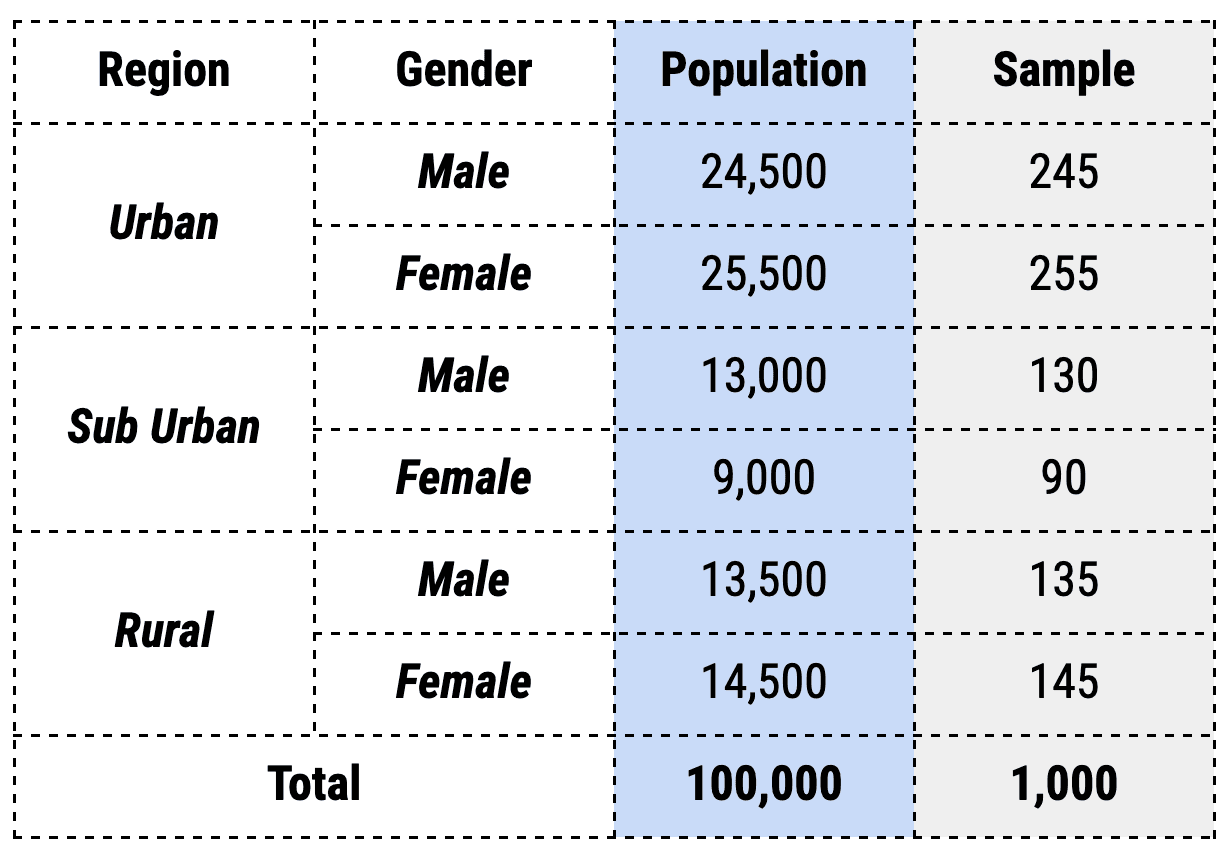
The major advantage of stratified sampling is that it captures the key characteristics of the population in the sample. As with a weighted average, stratified sampling produces characteristics that are proportional to the overall population. However, if the strata cannot be formed, then the method can lead to erroneous results. It is also time-consuming and relatively more expensive as the analysts have to identify each member of the sample and classify them into exactly one of the strata. Further, there might be cases where the members might fall into multiple strata. In such a scenario, the sample might misrepresent the population.
Cluster Sample
Sometimes it is cost-effective to select survey respondents in clusters. For example, instead of going through each building in a town and randomly sampling the respondents, one could randomly select some of the buildings (clusters) and survey all the residents living in them.
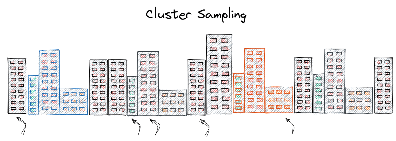
This can result in an increase in speed and greater cost savings on account of lesser logistical requirements. The cluster sample method’s effectiveness depends on how representative the members of the chosen clusters are when compared to the population. To alleviate this, the sample size for cluster sampling is usually larger than that for simple random sampling, as the characteristics of the members in a cluster usually tend to be similar and may not capture all the population characteristics. However, the cost savings on account of reduced travel and time might still mean that even with the additional sample size, cluster sampling turns out to be the cheaper option.
Cluster sampling can be further optimized by using multi-stage clustering. As the name suggests, in a multi-stage clustering, once the clusters are chosen, they are further clustered in smaller units, thus reducing the costs further. For example, if we wanted to find the learning abilities of students across the country. We start off clustering on the basis of states. Further, in these states, we cluster on the basis of schools and choose a random sample of the schools in the sector and survey the students in these schools. This is usually used for national surveys for employment, health, and household statistics.
Systematic Sample
Another widely used sampling method for large population sizes is Systematic Sampling. In this process, using a random starting position, every kth element is chosen to be included in the sample.
For example, we might choose to sample every third person entering a building.
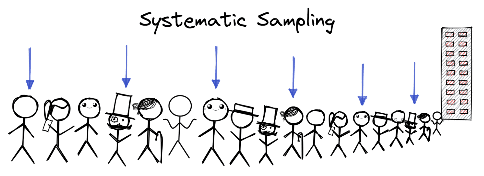
It is a quick and convenient method and gives a result similar to a simple random sample if the interval is chosen carefully. This method is used very widely as it is simple to implement and explain. One of the use cases of systematic sampling is for conducting exit polls during elections. A systematic sample makes it easier to separate groups of voters who might all be voting for the same person or party.
Convenience Sample
Another method not usually recommended but used because of circumstances is convenience sampling. Also known as grab sampling or opportunity sampling, the method involves grabbing whatever sample is available.
For example, on account of lack of time or resources, the analyst might choose to sample only from their neighboring homes and offices instead of trying to finding respondents from across the entire city.
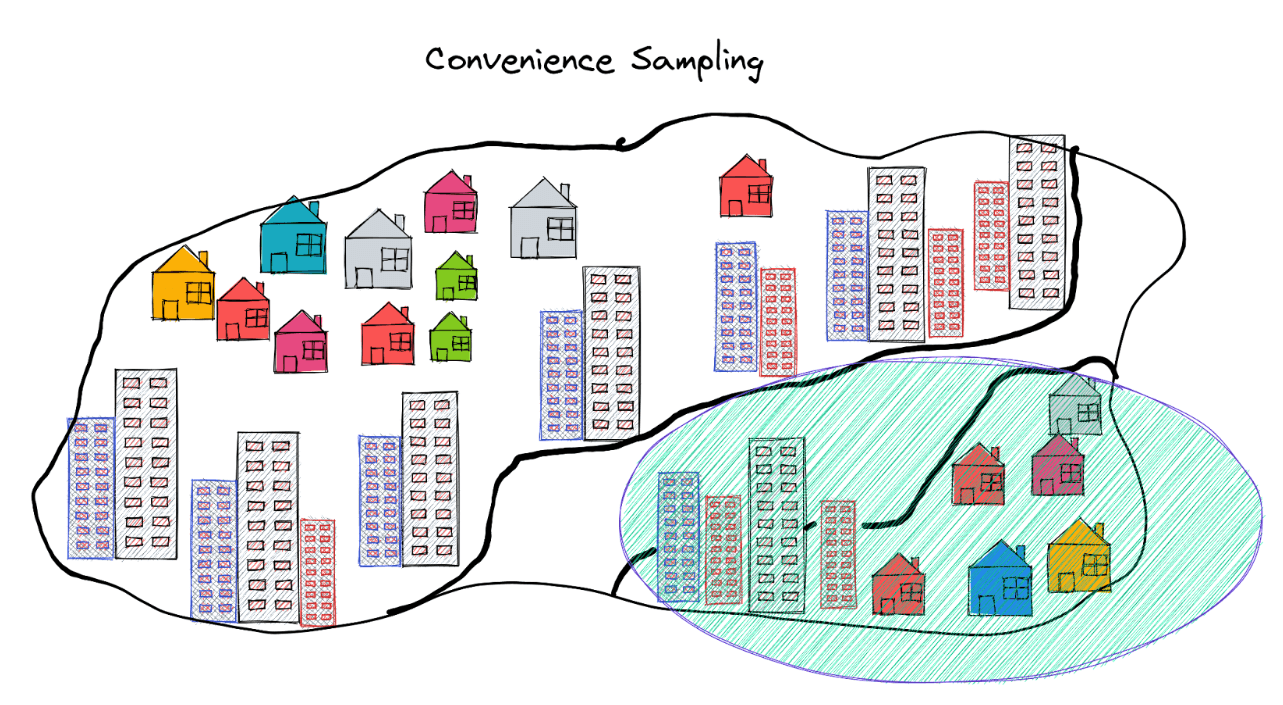
As you might anticipate, this method can be unreliable and hence not recommended. However, it might be the only way to collect data sometimes. For example, instead of trying to contact all the users of marijuana, one might choose to just go to the nearest college dorm and survey the attendees of a party.
The advantages of this method include convenience, speed, and cost-effectiveness. However, the collected samples may not be truly random or representative of the population. However, it does provide some information as opposed to just hunches from the analyst. This method is widely used in pilot testing or MVPs for testing and launching new products.
Descriptive Statistics
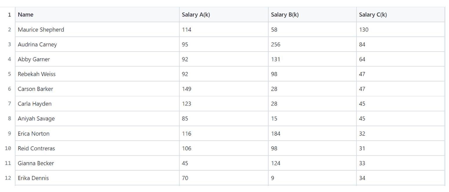
Now that we have found out how to collect the data, let us move to the next step - analyzing the collected data. Displaying and describing the collected data in the forms of graphs and numbers is called Descriptive Statistics. Let us use some data points to analyze this. We use a hypothetical dataset of 200 students from a program with salary offers from three companies A, B, and C. You can find the dataset here.
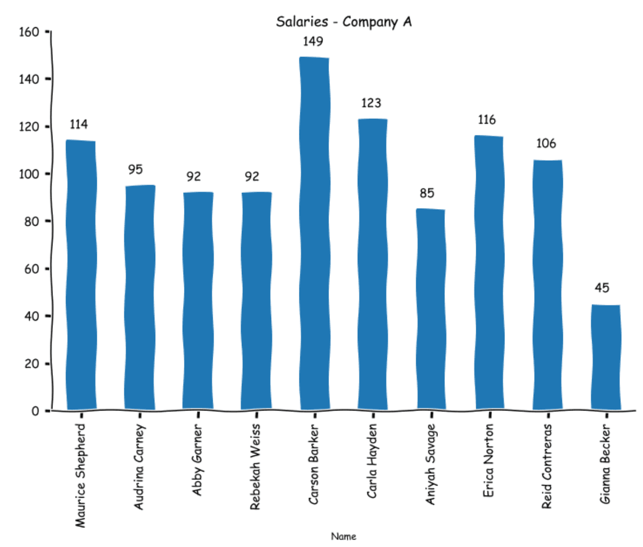
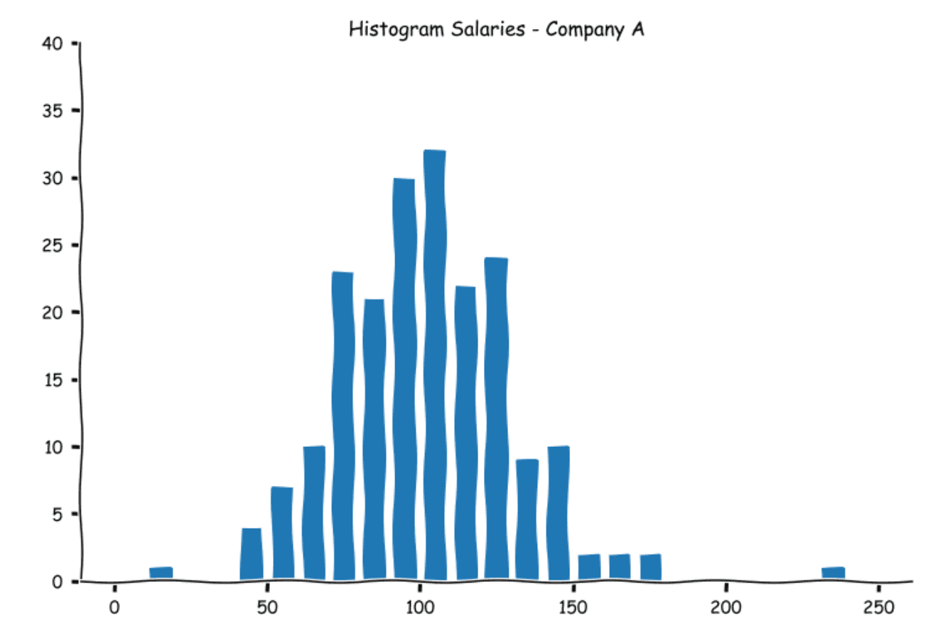
If we had a limited number of data points, we could have simply plotted a bar graph like this.
However, if we try to do this for our full dataset, we will end up with something like this
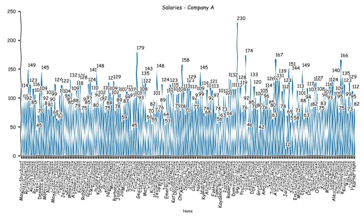
As you see, if we were to look at each student one by one, the process can become quite tedious and overwhelming. An easier way is to summarize the data. That is where descriptive statistics come into play. Let us look at a couple of ways.
Stem and Leaf Plot
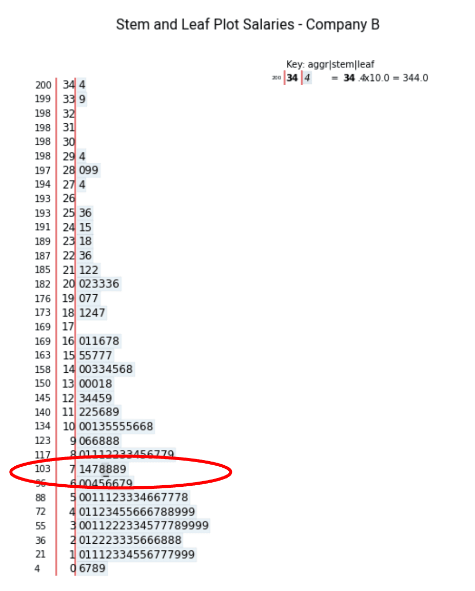
One of the oldest plots was the stem and leaf plot. The idea is to divide the values into a stem and leaf. The last significant digit is the leaf, the remaining number is the stem. For example, in the case of the number 239, 9 is the leaf, and 23 is the stem. For the number 53, 3 is the leaf, and 5 is the stem. To draw the plot, we write the stems in order vertically and then write each of the leaves in ascending order. For our salary dataset, the stem and leaf plot for Salary A will look like this.
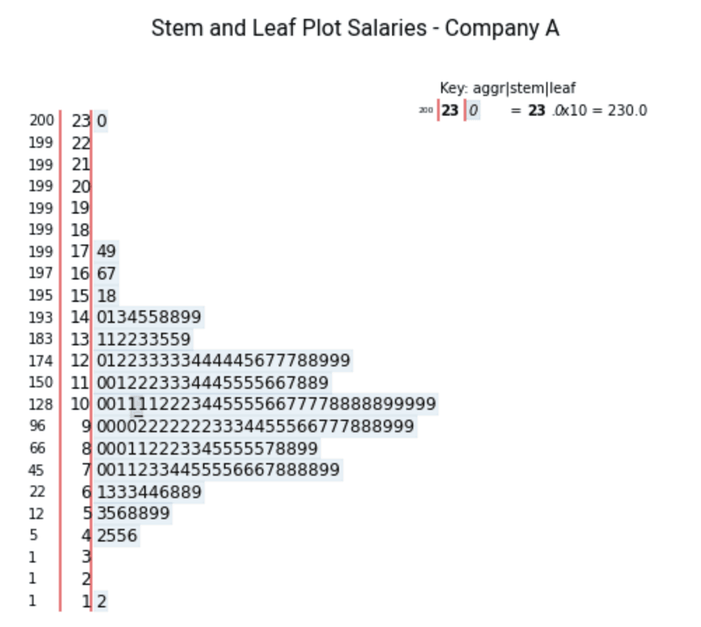
The above graph shows that there is one observation in the range 10 - 19, which is 12. In the range 40 - 49, we have four observations 42, 45, 45, and 46. The cumulative frequency is also shown in the leftmost column.
We can similarly plot the stem graphs for Company B and Company C's salaries as well.
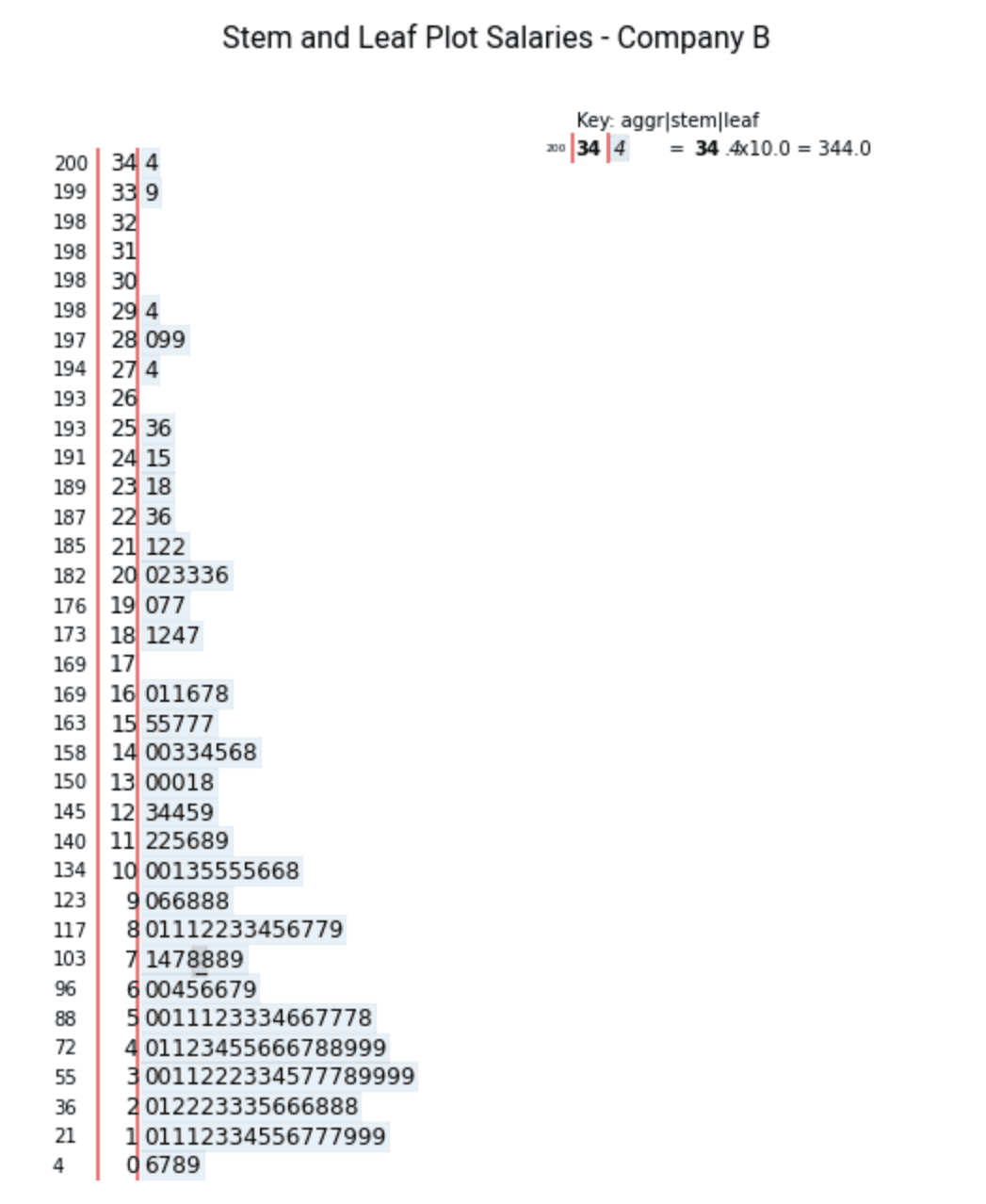
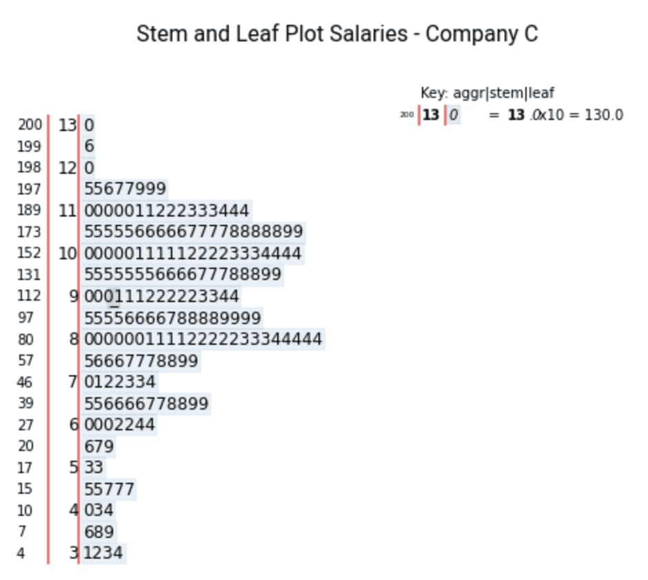
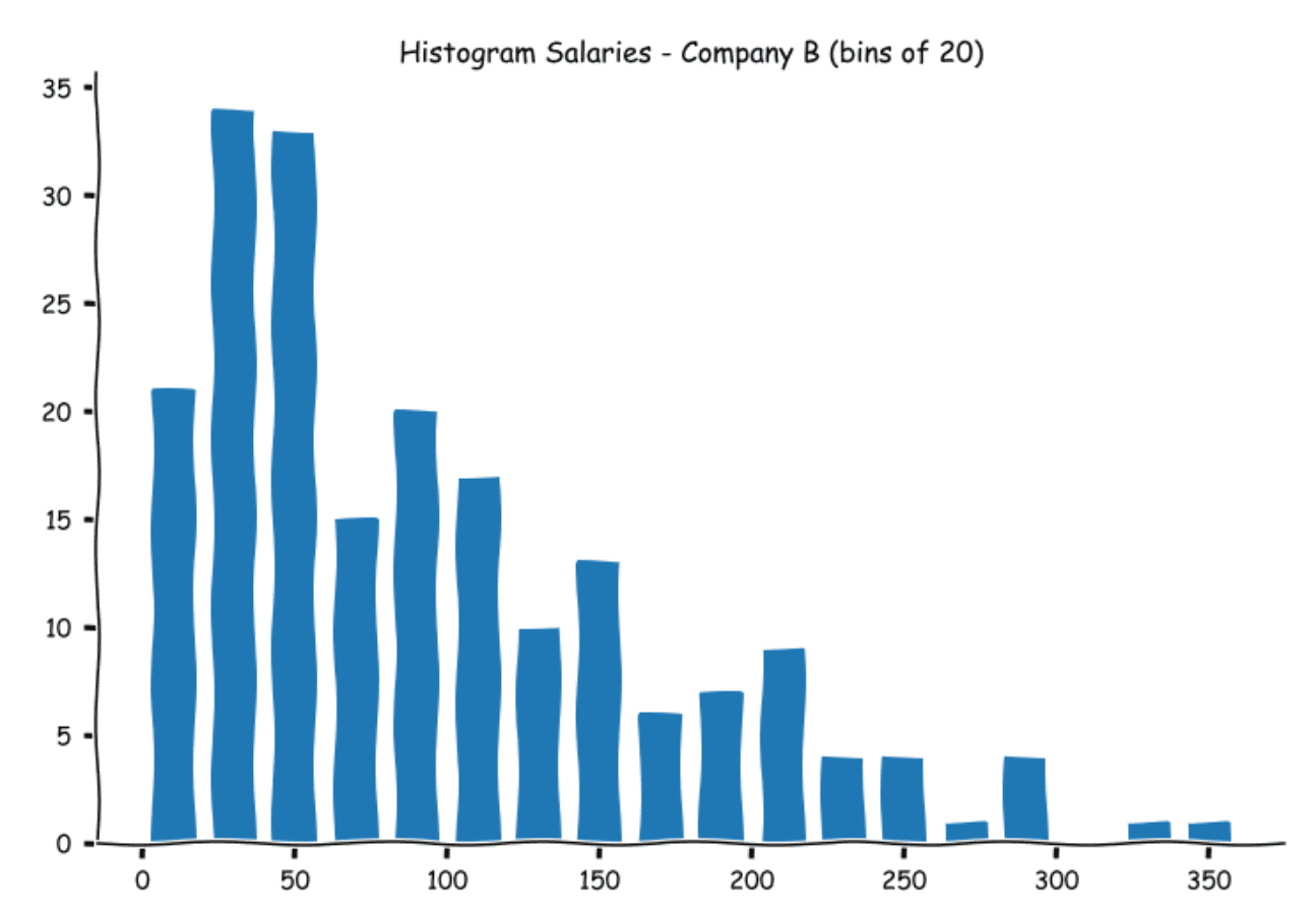
With larger datasets and a variety of values, it becomes unwieldy, as you can see in the case of Salaries for Company B. To alleviate these problems, we have a histogram.
Histograms
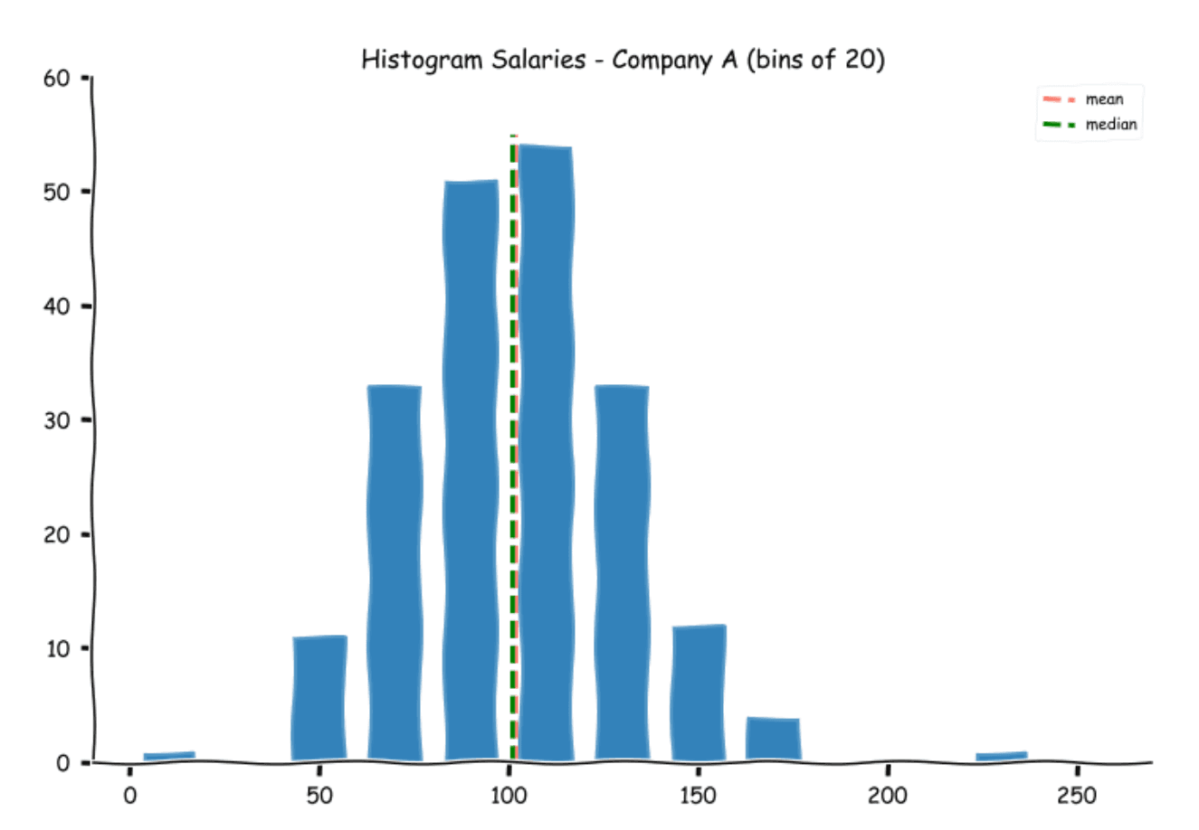
Histograms extend the concept of stem and leaf plots with the difference being that instead of dividing the numbers into tens, we can decide how we want to group these numbers. As with the stem and leaf plot, we first decide the bins (or buckets) that we would like the numbers to be in. We then count the frequency in each bin and then plot the values in a bar graph. So if we decide to bin the numbers in 10s, we will get the same graph as the stem and leaf plot.
We can also create bins in the 20s. This is what the graph will look like.
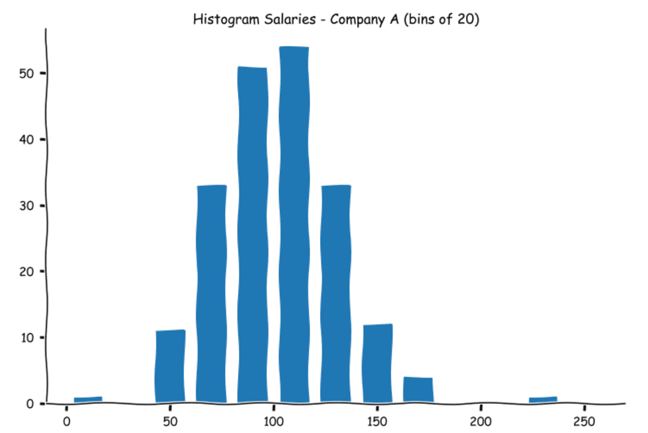
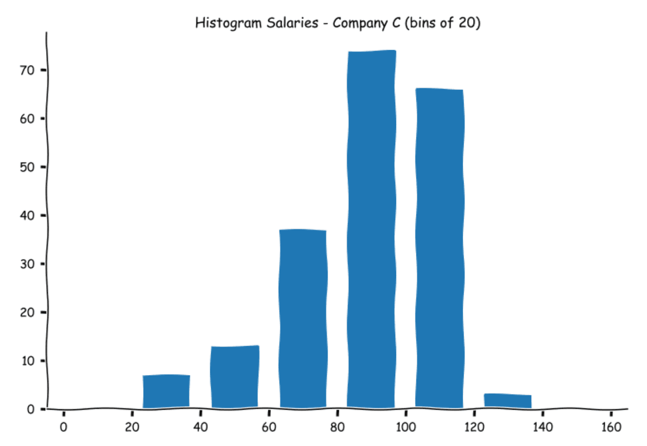
As you can observe, the numbers are higher in each bin. This is natural as we will have a greater number of observations now as the bin widths have widened. As with a stem and leaf plot, the histograms are a good way to examine the spread of the data. Let us look at how the other histograms of the other company salaries look.
While examining data visually is helpful, we need some measurements to provide us with information about the characteristics of the data. The most vital set of measurements are the central tendency (a typical value that describes the data) and the spread of the values in the dataset. Let us look at the commonly used numerical statistics used to describe a dataset.
Measures of Central Tendency
The measures of central tendency describe what a typical value in the data would look like. In the case of our salaries, think of it as what a typical salary from the three companies looks like. There are three commonly used measures of central tendency - the mean, median, and mode. Let us look at these in detail.
Mean
Mean (or average) is the most widely used measure of central tendency. The mean for a data set is calculated by dividing the sum of all observations in the dataset by the number of observations.
For a dataset with n values, the mean usually denoted by x̄ is given by
the mean usually denoted by
is given by
In simple words,
Let us calculate the means of each of the three companies’ salaries. If you are using spreadsheet software, you can use the AVERAGE function to calculate means.
Salary A(k) 101.525
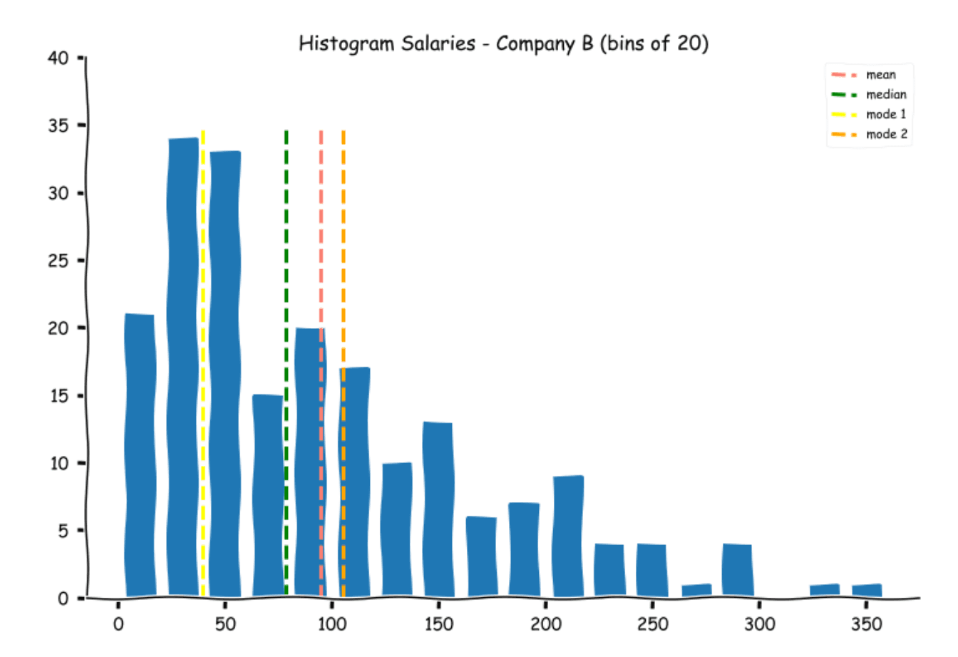
Salary B(k) 94.760
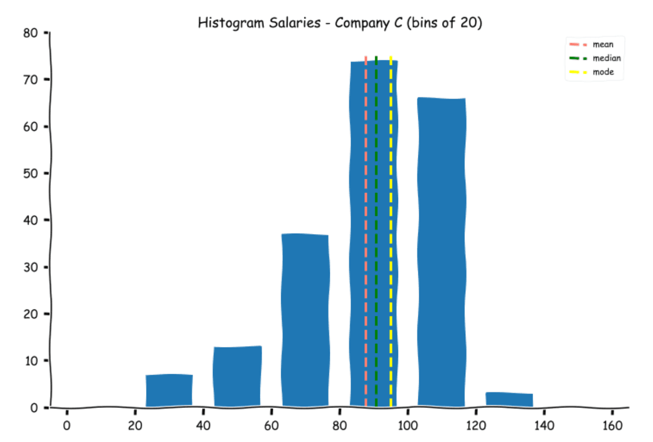
Salary C(k) 87.590
Let us see where the mean lies on the histograms
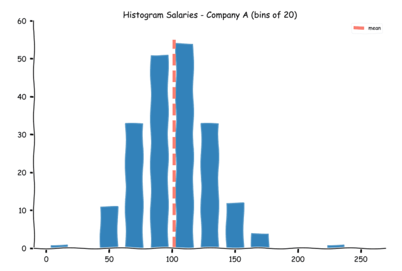
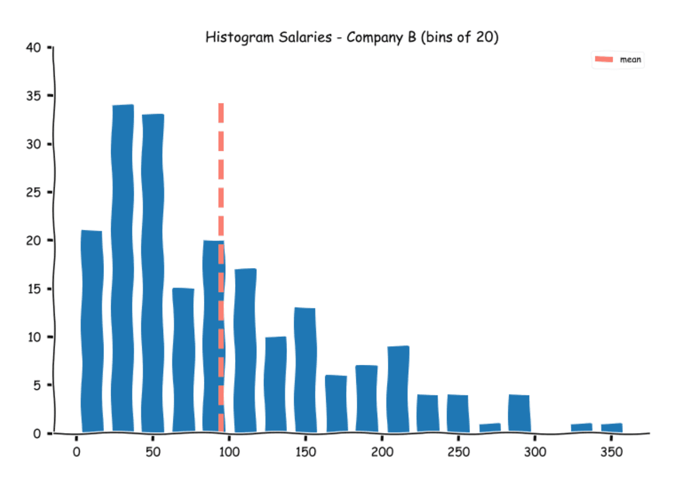

While the means for Companies A and C appear alright, at first glance, the mean for companies B appears a bit misleading.
If one does a quick visual calculation (or uses the stem and leaf plots), more than half the number of students (100) was offered a salary of 70k and lower. While the calculated mean was around 95k.
This is one of the problems with means. For a balanced dataset, the mean represents the middle value, for an asymmetrical distribution, the mean appears to be misleading as a few extreme values can shift the mean away. If you observe, there are seven students who were offered salaries in excess of 250k. To alleviate this problem, we cannot always rely on the mean alone. This nicely leads us to the next measure - the median.
Median
The median is quite simply the middle value of the dataset when the observations are ordered. To calculate the median, we simply arrange the values in ascending or descending order and pick the middle value. For example, for observations 18, 35, 7, 20, and 27, we start by arranging them.
7, 18, 20, 27, 35
Now we pick the middle value, which in this case is 20. If we have an even number of values, then we pick the average of the two middle values. For example, if we add another observation 42 to the above, we will get the following ordered values.
7, 18, 20, 27, 35, 42
In this case, the median will be the average of the two middle values, 20 and 27.
Therefore,
Note: The median divides the dataset into two halves each containing the same number of observations.
Let us find the medians for the three datasets and plot them on the histograms.
Salary A(k) 101.0
Salary B(k) 78.0
Salary C(k) 90.5
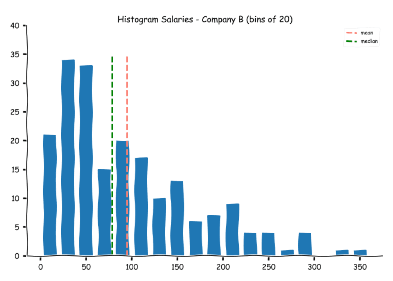
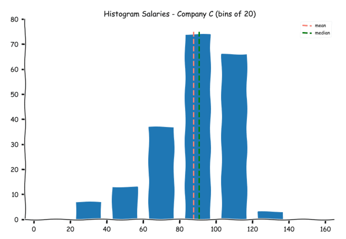
As we had expected, the medians for Companies A and C are pretty close to their means, but the median for B is separated from its median by almost a full bin. One of the advantages of the median is that it is not easily impacted by extreme values. It is therefore preferred in datasets that are not balanced (roughly equal spread of observations on either side of the mean).
Mode
Another measure that is widely used is the Mode. The mode represents the most frequent observation in the dataset. Let us calculate mode with a simple example.
Suppose the ages of a group of five students are 23, 21, 18, 21, and 20, then the mode for this data is 21 since it appears the maximum number of times. A dataset can have multiple modes as well. For example if the ages were 18, 23, 21, 23 and 18, then the dataset has two modes 18 and 23 since both the values appear twice. Such data is called multi-modal data.
Let us calculate the mode and plot them on the histograms.
Salary A(k) 92
Salary B(k) 39, 105
Salary C(k) 95
Note for Salaries offered by Company B, there are two values that appear the most number of times (39 and 105).

Measures of Spread
In statistics, spread (or dispersion or variability or scatter) is the extent to which the data is stretched or squeezed. Think of it as a measure of how far from the center the data tends to be present. For instance, if everyone was offered the same salary, the spread will be 0. We can evaluate the spread using a histogram. For thinly spread data, the histogram will be skinny, for example, Salaries offered by Companies A and C. Whereas, for dataset with a greater range of values, the histogram will be wider as in the case of Company B. Let us look at the mathematical measures used to evaluate the spread.
Range
The range of the dataset is the difference between the highest and the lowest values. The range of three datasets is as follows:
Salary A(k) 218
Salary B(k) 338
Salary C(k) 99
This is in line with what we saw visually.
Interquartile Range (IQR)
While the range gives a good idea about the spread of the dataset, as with the mean, the range is prone to be influenced by extreme values on either side of the spectrum. We, therefore, use a more nuanced version of the range called the Interquartile Range (or IQR for short). Quartiles are an extension of the concept of the median. Just as the median divides the dataset in two, each containing an equal number of observations, Quartiles divide the dataset into four, each containing an equal number of observations. Each of these quarter boundaries are represented by Q1, Q2, Q3, and Q4 or the first, second, third, and fourth quartile, respectively.
The first quartile represents the maximum value for the bottom 25% of the values (by magnitude), the second quartile contains the next 25%, and so on. Let us plot the four quartiles on the histogram of the Salaries offered by the company A.
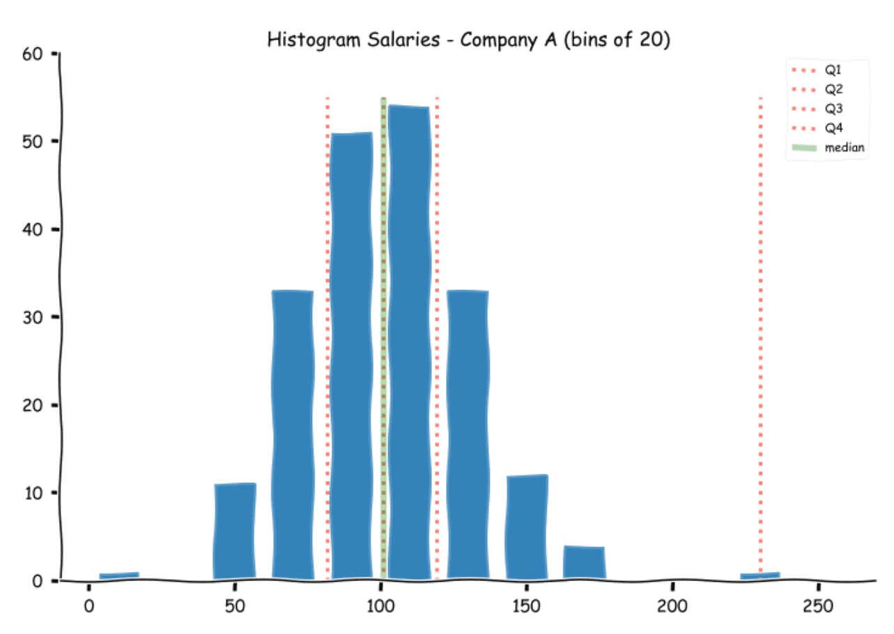
As you might have guessed, the median is the second quartile (Q2). The numerical values are:
Q1: 81.75
Q2: 101
Q3: 119.25
Q4: 230
IQR measures the spread between the first and the third quartiles or the range of the middle 50% of the values excluding the top 25% and bottom 25% of the observations.
IQR = Q3 - Q1
Let us calculate the IQR for the three salaries.
Salary A(k): 37.5
Salary B(k): 100.5
Salary C(k): 27.5
The trend is similar to what we saw earlier, but this also shows that the middle 50% values for Company A are relatively closely packed.
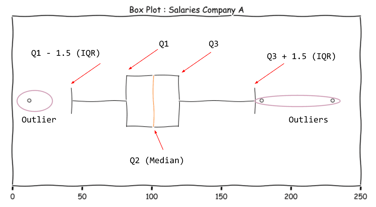
The IQR value is used for constructing the box plot (also called the box and whiskers plot).
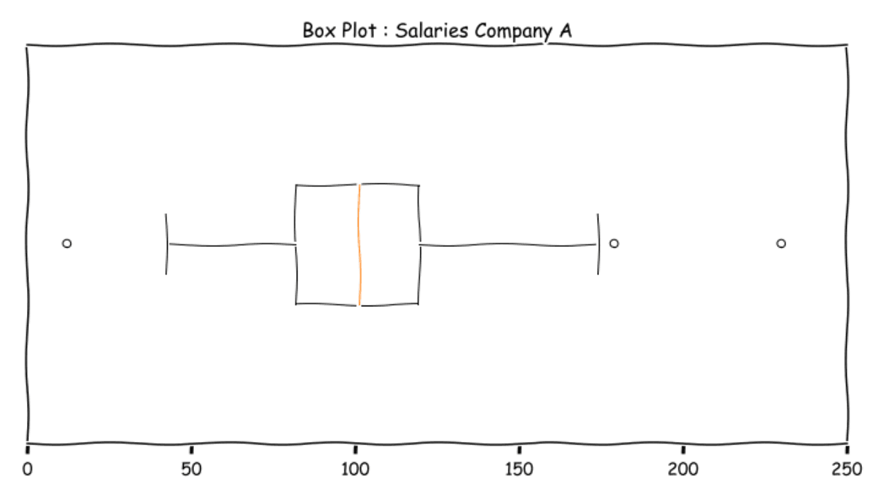
Let us deconstruct the box-plot.
The Box represents the middle 50% of the data. The ends are Q1 and Q3. The line inside the box is the Median. The boundaries of the whiskers are 1.5 IQR to the left and right of Q1 and Q3 respectively. The range of values from Q1 - 1.5 IQR and Q3 + 1.5 IQR is popularly known as the fence. This is the acceptable value for balanced distributions. Values outside this fence are outliers (extreme values)
Variance and Standard Deviation
Till now we have used only the extreme and quartile values to measure the spread. The most widely used measure for spread is the standard deviation (along with variance). The standard deviation measures the difference of each value from the mean of the dataset and calculates a single number that represents the spread of the data.
Let's take a simple dataset to show the calculations involved. Suppose I observe the following temperatures over the course of five days (in Fahrenheit) : 82, 93, 87, 91 and 92. The average of these values will be
We need to find how much each value differs from the mean. We can find this by subtracting the mean from each value. We get the following.
(82 - 89), (93 - 89), (87 - 89), (91 - 89) and(92 - 89)
or -7, 4, -2, 2, 3
These values are called residuals or deviations from the mean or simply deviations. Since we would like one single value, let us try to calculate the mean of these values. If you calculate that, you will find that the sum of these values adds up to zero. This is the basic property of the mean. To overcome this, we need to remove the sign from the deviations. The most common way to do this is to square the values. Since the square of a real number is always positive, we are now guaranteed to get a positive value.
We now take the mean of this and get
This value is called the variance of the data.
However, if you notice carefully, the units are also squared now, so 16.4 is not in Fahrenheit, rather it is in Fahrenheit squared!! To bring it back to the original units, we take the square root.
The number 4.05 is considered the standard deviation of the dataset.
There is, however, one twist. This number will be the standard deviation if the dataset were the entire population. Since this is not the case, we need to adjust the formula to get the sample variance and standard deviations. To do this, we use n - 1 instead of n in the divisor. This is called the Bessel’s correction. This largely stems from the fact that a sample variance will always be lesser than the population variance. You can see a wonderful explanation here.
Therefore sample variance usually denoted by s2 =
And sample standard deviation s =
As an exercise try to calculate the standard deviations and variations for the Salaries offered by the three companies. You can use a simple spreadsheet program to do this. Also try to calculate the values without using the built-in formula.
Conclusion
Now that we are armed with the basic tools for finding the center and the spread of the samples, we will extend this in the next part, where we look at another key aspect of statistics - Probability and Random Events.
In this article, we looked at the various ways of collecting data samples for analysis. We used a hypothetical salaries data set and learned how to plot graphs like histograms and box plots. We also learned about the measures of central tendency and the measure of spread. This will set us up nicely for the next two parts. In preparation for statistics, you can use the StrataScratch platform, where we have a community of more than 20,000 aspirants aiming to get into the most sought-after Data Science and Data Analyst roles at companies like Google, Amazon, Microsoft, Netflix, etc. Join StrataScratch today and turn your dream into a reality.
Share