Overview of Machine Learning Algorithms: Unsupervised Learning


 Written by:
Nathan Rosidi
This article is useful to help you get more familiar with the unsupervised learning algorithms in machine learning.
This article is the third article of the Machine Learning algorithms series, with the two previous articles mainly discussing Regression Algorithm and Classification Algorithm problems. The algorithms within regression and classification normally lie in the spectrum of supervised learning, which means that we provide those algorithms with the true label of every data point during the training process. Check out Supervised vs Unsupervised Learning to find the differences and similarities between these two main paradigms in the machine learning domain.
This article will discuss algorithms within the spectrum of unsupervised learning. As the name suggests, unsupervised learning algorithms refer to an approach in machine learning where we train our machine learning model without providing the corresponding true label of each data point. This means that we let our machine learning models learn the pattern of our training data by themselves and let them make a decision on an unseen data point based on the pattern that they learned from the training data.
An unsupervised learning method is very essential in machine learning because it allows for a wide range of applications and due to the fact that most of the real-world data are unlabeled. Let’s take a look at the common use cases where unsupervised learning algorithms would be beneficial:
- We have an E-Commerce business and we want to segment our customers to create personalized recommendations for each of them.
- We work in a credit card company and we want to detect unusual behavior in the credit card consumption of our customers.
- We have data with a lot of predictors and we want to create a visualization in 2D or 3D.
Article Outline
In this article, we will cover the most commonly used methods to solve each of the use cases above. Specifically, these are the unsupervised learning algorithms that we’re going to learn in this article:
- Dimensionality reduction
- Clustering method
- Anomaly detection
So let’s start with our first topic, which is dimensionality reduction.
Unsupervised Learning Algorithms: Dimensionality Reduction
From the previous two articles about regression and classification, we know that we need to train our machine learning models with training data that consists of at least one predictor. Oftentimes, the more predictors we have the more robust our machine learning model will be.
However, it also comes with several drawbacks. If we have a lot of predictors, the training process would be slower. Not only that, they will make it more difficult for us to find a good solution for our problem. This is because a dataset with a high number of predictors tends to be very sparse, i.e each data point is likely to be separated far away from the other data points. This also means that if we have an unseen data point, it will be separated far away from our training data points, thus making the prediction of the model becomes less reliable. This problem is commonly called the curse of dimensionality.
To alleviate all of these problems, what we can do is that we increase the training data such that it reaches the required density to fill up the high-dimension space. However, this is often not feasible in real life. Let’s say we have 100 predictors, we need an almost infinite amount of training data to make sure that it reaches the required density.
The more feasible way to alleviate these problems is by reducing the dimensionality of our predictors. As an example, let’s say we have 100 predictors, which means that we’re dealing with 100-dimensional data. Dimensionality reduction works by, as the name suggests, reducing the dimension of the data such that we can represent that data in a lower dimension.
This technique is particularly useful if we want to speed up the training process or if we simply want to visualize each data point on our training instances. However, it is important to note that the dimensionality reduction technique causes information loss, which most likely will cause degradation in the model performance. Thus, if you just want to speed up the training process, then try to use another method first before using the dimensionality reduction technique.
Before we delve into different algorithms for dimensionality reduction, it’s better for us to learn more about different approaches that are commonly applied for dimensionality reduction.
Dimensionality Reduction Approaches
In general, there are two different approaches that are commonly applied for dimensionality reduction: projection and manifold learning. So, let’s get started with projection.
Projection
Imagine we have a dataset in a high-dimensional space, i.e we have a lot of predictors. Most of the time, we have predictors that are constant and highly correlated to each other. This means that the training data are placed closely within a lower-dimensional subspace of the high-dimensional space.
To make this description clearer, let’s say we have 3D data points as you can see in the image below.


If we take a look closely, the data points are all placed closely that we can draw a 2D plane, as we can see below:

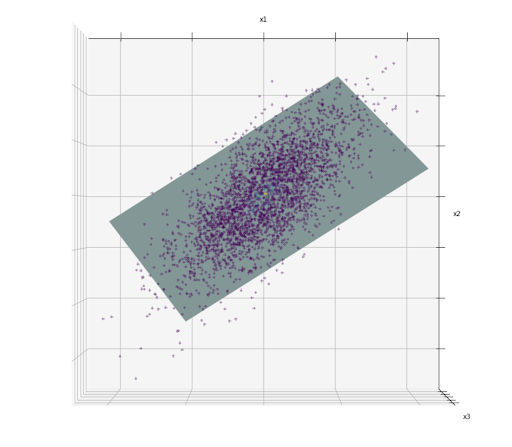
The hyperplane drawn in the image above is an example of a lower-dimensional subspace (2D) within high-dimensional space (3D). Now, if we project each of the data points perpendicular to this 2D subspace, then we have the 2D representation of the data like the one in the image below:


In the image above, we basically just did a dimensionality reduction from 3D to 2D. The problem is, projection might not be the best dimensionality reduction approach that we can implement.
This is because in real-world data, normally we have data points that are placed with a so-called twist and turn in the subspaces, as you can see in the following image:

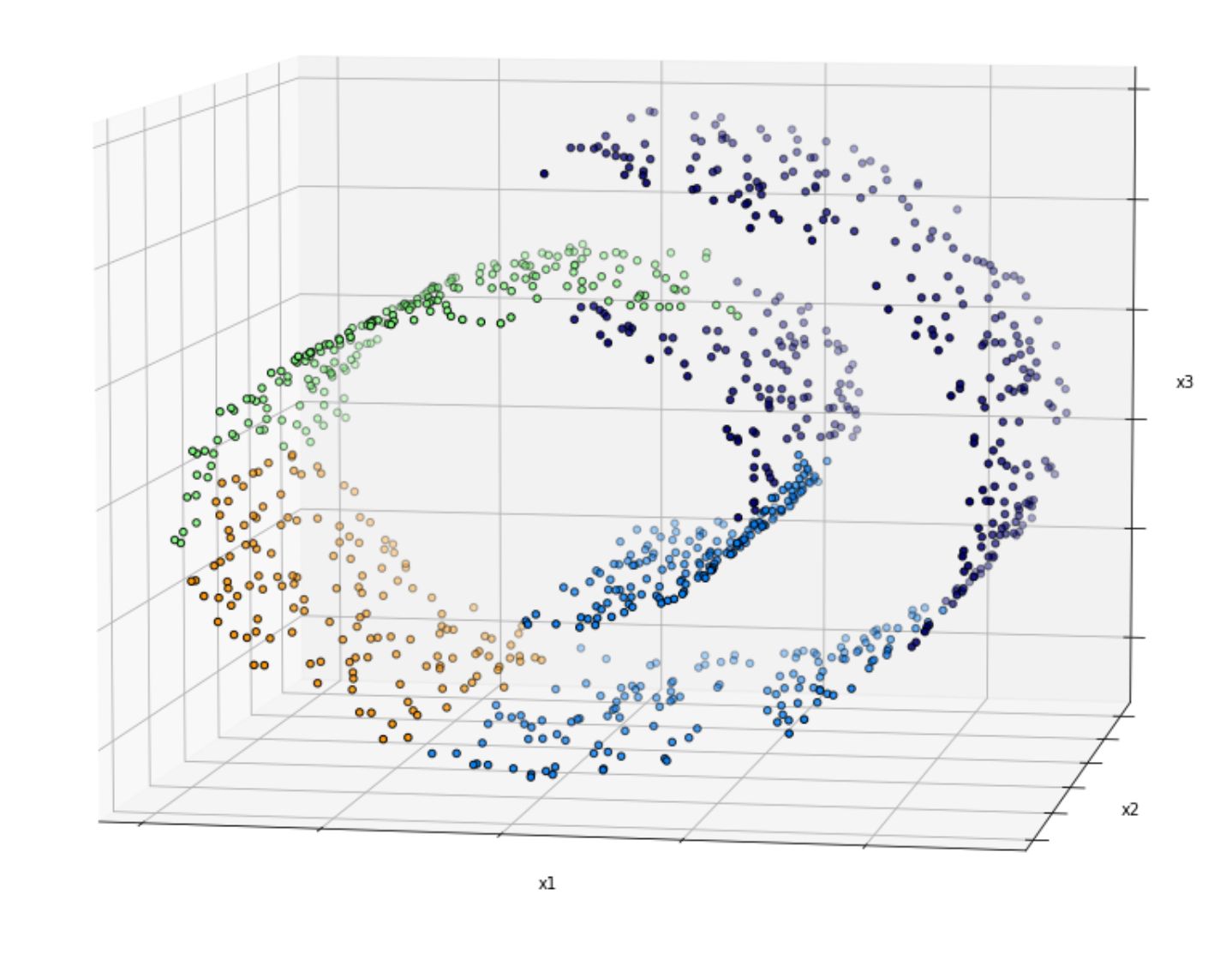
Simply dropping the third dimension (e.g x3) yields to the following visualization:

As you can see above, you can’t tell the separation of each class within the dataset as the data points are squashed together. Thus, in this case, projection is not the best approach to reduce the dimension of our dataset.
Manifold Learning
The example with a twist and turn of data points in the subspaces above is an example of a 2D manifold, which is a 2D shape that can be bent and twisted in a higher-dimensional space. And this is where it can be useful to use manifold learning, where this approach is considered a non-linear dimensionality reduction.
Manifold learning aims to generalize a linear approach for dimensionality reduction like PCA (more of this in the following section) to put more emphasis on the non-linear structure of data. This approach is classified as an unsupervised method, as it will learn the high-dimensional structure of the data from the data itself.
There are several dimensionality reduction methods that use a manifold learning approach, such as:
- t-SNE
- Locally Linear Embedding (LLE)
- Hessian Locally Linear Embedding (Hessian LLE)
- Modified Locally Linear Embedding (Modified LLE)
- Local Tangent Space Alignment (LTSA)
- Isomap
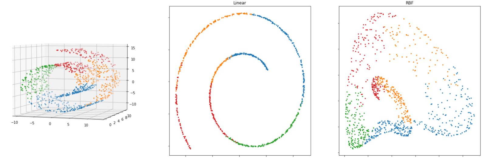
Below is the visualization of how the Swiss roll data above will look like after we apply each of the algorithms mentioned above.

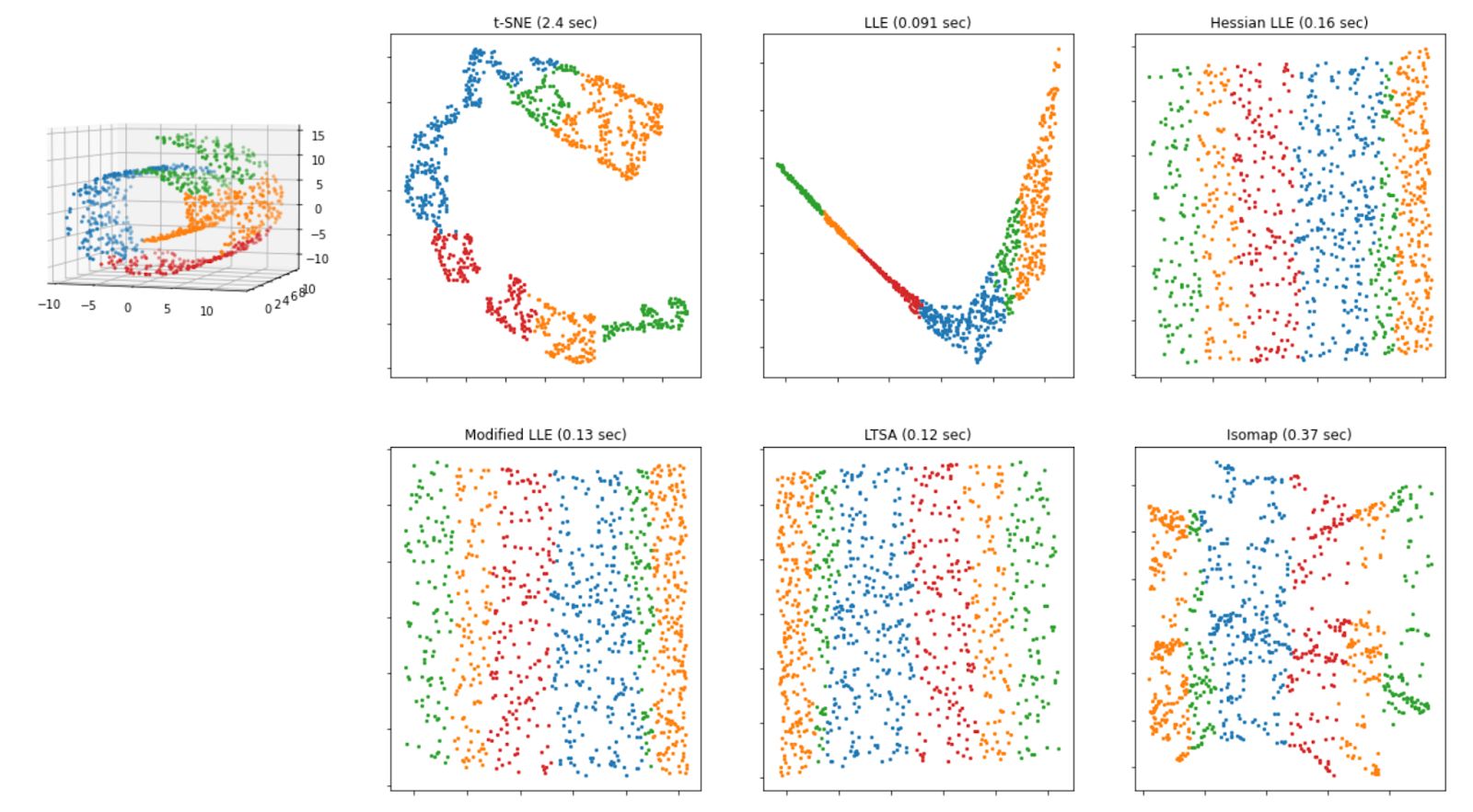
As we can see from the visualization above, all of the methods that are based on manifold learning perform much better than projection-based methods, as we can see the separation of each class clearly on Swiss-roll data.
We will discuss each of these manifold learning-based methods in a deeper sense in the following sections. But for now, let’s first talk about one of the most famous dimensionality reduction techniques first, which is the Principal Component Analysis (PCA)!
Principal Component Analysis (PCA)
When you’re dealing with dimensionality reduction, the first algorithm that mostly you’ll probably hear first is the Principal Component Analysis (PCA). PCA projects the data into the axis that preserves the maximum amount of variance.
But what does this mean? Let’s take a look at the 2D scatter data points below.

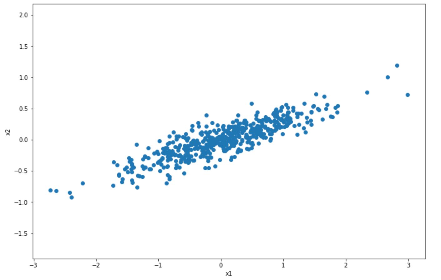
In the visualization above, we have normal 2D scatter data points and we want to project it into 1D with PCA. How does PCA choose which axis to project? It will try to find the axis that will preserve as much information from original data points, such that we’re not losing a lot of information after the projection.
The result of this step is the following:

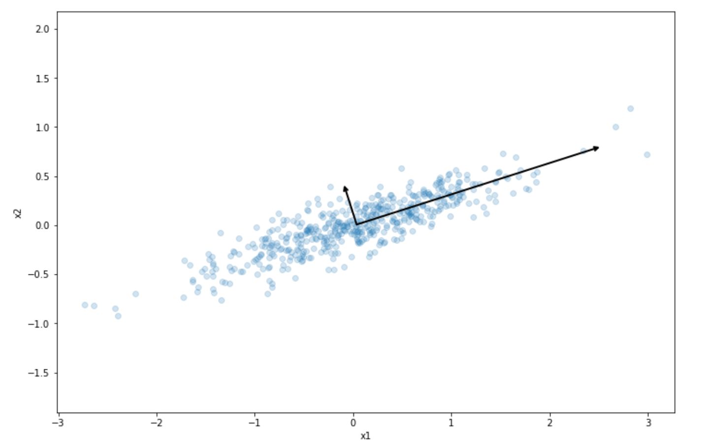
As we can see, the projection into the long line vector above preserves the most variance of our initial dataset compared to the short line vector. This is what PCA does in a nutshell. It tries to project our dataset into the one that preserves the variance of our dataset the most.
PCA will also try to find the second axis that is orthogonal to the selected projection that also preserves the remaining variance. In the 2D dataset above, the orthogonal line would be the short line vector, as there is no other choice. If we have 3D or higher-order dimension data, then it will also try to find the third axis and so on.
These axes are usually called the principal components of the data. In our toy dataset above, the long line vector can be called the first principal component and the short line vector can be called the second principal component.
Once all of the principal components have been identified for our data, then we can reduce the dimension of our data, as shown in the dark blue line below:


Let’s say that we have 4D data and we want to reduce its dimension to 2D. To do this, PCA algorithm will project it onto the hyperplane defined by the first two principal components, such that it will preserve the variance of our dataset as large as possible.
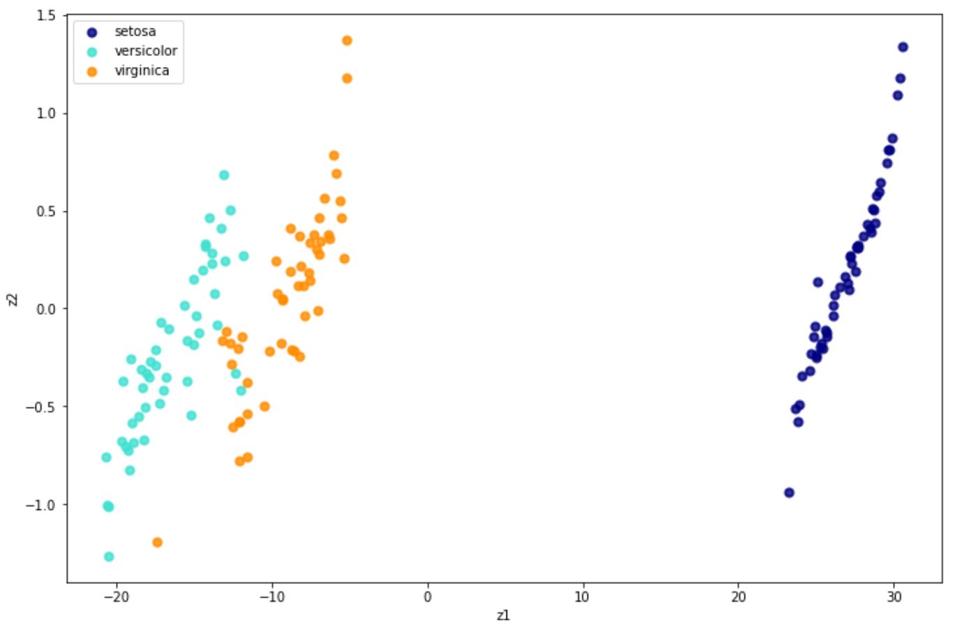
Implementing PCA with Python can be easily done with the scikit-learn library. In the example below, we’re going to use PCA to project the iris dataset into its 2D representation.
import matplotlib.pyplot as plt
from sklearn import datasets
from sklearn.decomposition import PCA

iris = datasets.load_iris()

X = iris.data
y = iris.target
target_names = iris.target_names

pca = PCA(n_components=2)
X_new = pca.fit(X).transform(X)


plt.figure(figsize=(12,8))
colors = ["navy", "turquoise", "darkorange"]
lw = 2

for color, i, target_name in zip(colors, [0, 1, 2], target_names):
    plt.scatter(
        X_new[y == i, 0], X_r[y == i, 1], color=color, alpha=0.8, lw=lw, label=target_name
    )

plt.legend(loc="best", shadow=False, scatterpoints=1)
plt.xlabel("z1")
plt.ylabel("z2")
plt.show()

As we can see, PCA does a good job in separating data points with different classes on iris dataset.
A very useful feature to assess how much each principal component preserves the information about the variance of our data is the explained_variance_ratio function. Using our iris dataset, we can implement explained_variance_ratio as follows:
pca.explained_variance_ratio_

Output: array([0.92461872, 0.05306648])
As you can see above, the first principal components preserve 92% of the variance of the iris dataset while the second principal components only preserve 5% of the variance. This would indicate that we will most likely get a good result as well if we further reduce the dimension to 1D.
Kernel PCA
The iris dataset that we used above is an example of a linearly separable dataset. This makes it easier for the dimensionality reduction algorithm to reduce its dimension whilst still retaining a great amount of data variance as you can see with the result from explained_variance_ratio function above.
The thing is, PCA is a linear dimensionality reduction approach by nature. If we have a non-linear dataset as you’ve seen with the Swiss roll dataset above, PCA might not do a good job of reducing its dimensionality.
Luckily, there is a so-called kernel trick that we can apply to a PCA algorithm, just like what you’ve seen in the Support Vector Machine algorithms that you can read in the article about classification algorithms. The kernel trick that we applied to the SVM algorithm enables the SVM algorithm to classify non-linear data points.
Likewise, this kernel trick enables us to use PCA to perform non-linear projections for dimensionality reduction, and this method is called kernel PCA. There are several kernels that we can implement with PCA, such as linear kernel, RBF kernel, and sigmoid kernel.
Below is an example of how we can implement kernel PCA with the scikit-learn library.
from sklearn.decomposition import KernelPCA

rbf_pca = KernelPCA(n_components=2, kernel='rbf', gamma=0.04)
X_new = method.fit_transform(X)
And below is the visualization result of Kernel PCA when we implement RBF and linear kernel on our Swiss roll dataset.

Both linear and RBF kernels give us a reasonably good result to reduce the dimensionality of the Swiss-roll dataset, as we can still see the separation of each class on our dataset. If you’re using the RBF kernel, you can tweak the gamma parameter to possibly improve the solution.
t-SNE
t-distributed Stochastic Neighbor Embedding or commonly called t-SNE is a nonlinear dimensionality reduction method that is commonly used for data visualization purposes. Thus, this algorithm is normally used when we have high-dimensional data and we want to reduce its dimension to either 2D or 3D to make it possible for us to visualize it.
This algorithm is an improvement to the original SNE algorithm that was first introduced in 2002. The additional ‘t’ term in t-SNE is what differentiates between t-SNE and the original SNE algorithm. The ‘t’ term refers to the fact that t-SNE uses t-distribution instead of Gaussian distribution to compute the distance between data points.
The t-distribution has a heavier tail compared to the Gaussian distribution, which improves the detail and modeling of the data points that are far apart.
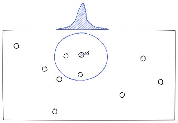
To understand how t-SNE works, let’s imagine that we have data points in 2D space as you can see below:


Now for each data point (xi), t-SNE will estimate the density of its neighbor (xj) with a student t-distribution, which gives us the probability probabilities of all points, let’s call it Pij.

Next, the t-SNE algorithm will try to find a set of probabilities in the lower-dimension, let’s call it Qij, that is similar to Pij. To measure the similarity between Pij and Qij, the Kullback-Liebler (KL) divergence is normally used, which has the following equation:
The KL divergence equation above will then be optimized with the gradient descent algorithm, the same that we saw in the article about the regression algorithm.
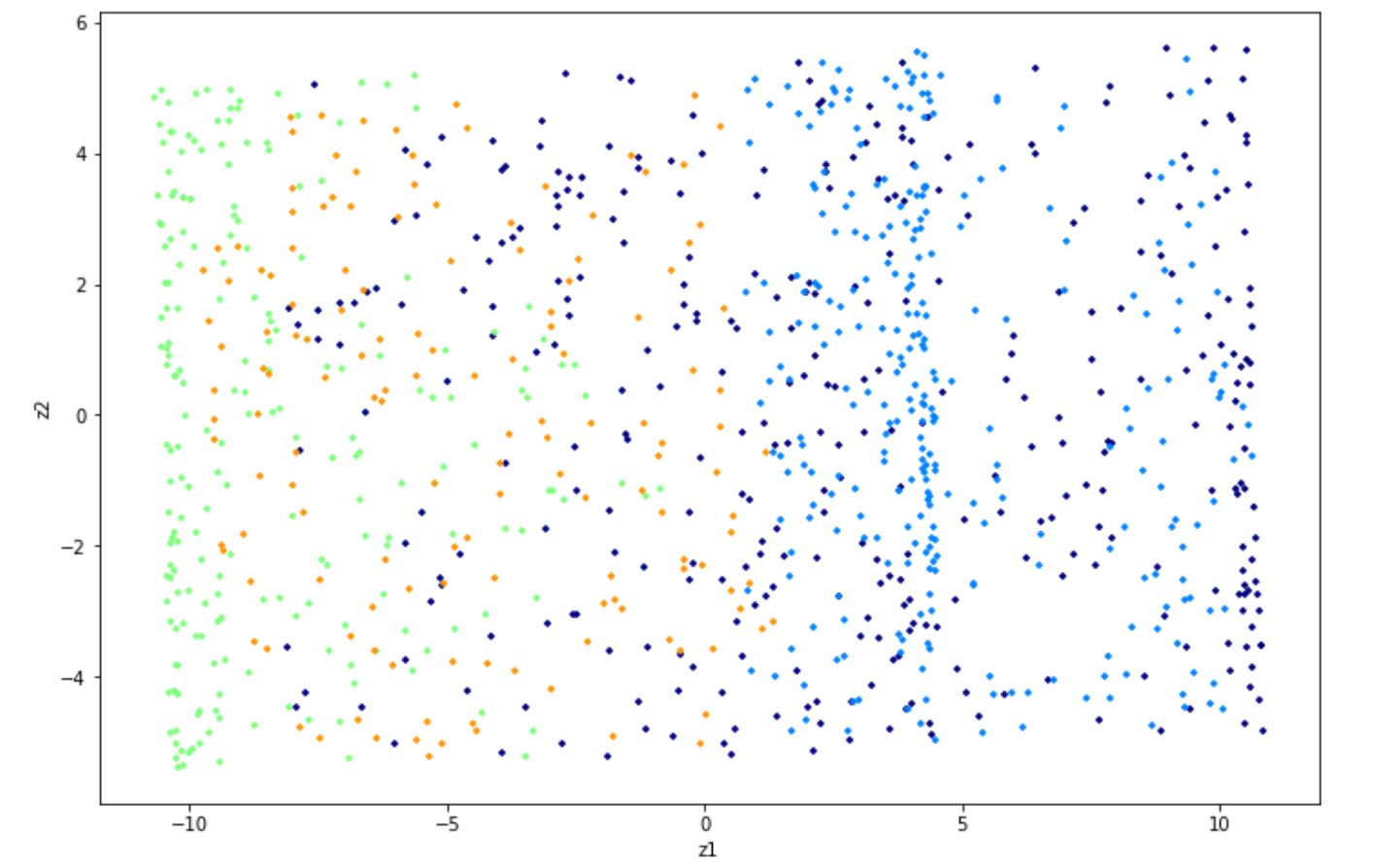
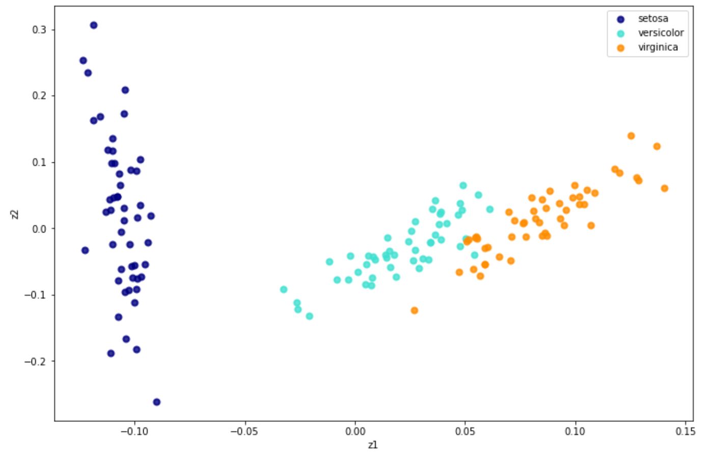
Implementing t-SNE with Python can be easily done with the scikit-learn library. Below is the code to implement t-SNE with Python on the iris dataset.
from sklearn.manifold import TSNE
from sklearn.datasets import load_iris

iris = load_iris()
x = iris.data
y = iris.target
target_names = iris.target_names

tsne = TSNE(n_components=2, random_state= 120)
X_new = tsne.fit_transform(x)
And below is the visualization result in 2D after implementing t-SNE on the iris dataset.

Locally Linear Embedding (LLE)
Aside from t-SNE, Locally Linear Embedding or LLE is another non-linear dimensionality reduction method that we can use. As you’ve already seen in the above section, this algorithm is based on manifold learning and doesn’t rely on simple projections.
LLE works by first identifying the n number of neighbors for each of the data points. So let’s say we have a data point x, the LLE algorithm then tries to identify its n closest neighbors and reconstruct x as a linear function of the identified neighbors.
In the end, the goal is to minimize the squared distance between x and the equation:
where w is the weight of each data point. The value of w of certain data points will be 0 if it’s not one of the k closest neighbors of x. Thus, we have the following condition to determine the weights of each data point:
where:
After LLE finds the weights, then it tries to map the data points into a lower dimension. Let’s say that z is the representation of x in the lower-dimension, then the LLE algorithm tries to minimize the squared distance between z and the equation:
whilst keeping the weights fixed. The main goal of this step is to find the optimal position of z in the lower dimension.
Implementing LLE in Python can be easily done with scikit-learn, as you can see below.
from sklearn.manifold import LocallyLinearEmbedding
from sklearn.datasets import load_iris

iris = load_iris()
x = iris.data
y = iris.target
target_names = iris.target_names

LLE = partial(
    LocallyLinearEmbedding,
    n_neighbors= 50,
    n_components= 2,
    eigen_solver='auto',
    method='standard'
)


lle = LLE()
X_new = lle.fit_transform(x)
And below is the visualization result after we implement LLE on iris dataset:

Aside from the standard one, there are three alternatives of LLE, which are:
- Modified LLE: The main problem with standard LLE is the regularization problem, especially when the number of neighbors is larger than the number of input dimensions. To solve this problem, multiple weight vectors in each neighborhood are applied when we use Modified LLE.
- Hessian LLE: The main goal of Hessian LLE is also to solve the regularization problem from standard LLE. With Hessian LLE, a method called Hessian-based quadratic form is applied in each of the neighborhoods to recover locally linear structure in lower dimension.
- Local Tangent Space Alignment (LTSA): Although this method technically is not a variant of LLE, its concept is very similar to LLE. The difference is that in LTSA, it seeks to recognize the local geometry in each neighborhood with its tangent space instead of using the distance as in LLE
All of these three alternatives can be implemented the same way as the standard LLE with the scikit-learn library. The only thing that we need to change is the method argument when we initialize LLE class, as you can see below:
from sklearn.manifold import LocallyLinearEmbedding

LLE = LocallyLinearEmbedding(method='ltsa') #LTSA
LLE = LocallyLinearEmbedding(method='modified') #MLLE
LLE = LocallyLinearEmbedding(method='hessian') #Hessian LLE
Isomap
Isomap is another manifold-based dimensionality reduction approach. Isomap itself uses various kinds of algorithms behind the scenes that makes it able to use a non-linear way to reduce the dimension of our data, while still preserving the local structures in lower dimension.
So how does Isomap work? In a nutshell, there are four steps to describe it in a high-level how this algorithm works:
- Find the k nearest neighbors of each data point by using the same approach as kNN algorithm (you can see more of kNN approach in another article about classification algorithms here)
- Next, each data point that is identified as one of k nearest neighbors of a particular data point will be connected to each other as one edge in a graph construction.
- The shortest path from one data point to another within the same edge will be computed using Dijkstra’s algorithm. This step is commonly called computing the geodesic distance.
- Finally, it will use the Multidimensional Scaling algorithm to map and preserve the distance in the lower dimensional space to be similar as in the high dimensional space.
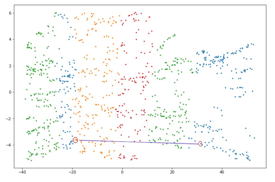
To make it clearer, let’s say we have the following Swiss roll data points:


First, the k nearest neighbors of a data point need to be detected by computing the Euclidean distance between two data points. Then, the shortest path or geodesic distance between two neighboring data points will be computed with Dijkstra's algorithm.
As a result, when we map the data points above, the distance between neighboring data points is preserved.

Isomap can be easily implemented with the scikit-learn library. Here is an example of how we can implement Isomap:
from sklearn.manifold import Isomap
from sklearn.datasets import load_iris

iris = load_iris()
x = iris.data
y = iris.target
target_names = iris.target_names

isomap = Isomap(n_components=2, n_neighbors=50)
X_new=isomap.fit_transform(x)
Unsupervised Learning Algorithms: Clustering
On a summer afternoon, you and your friends decide to visit a zoo. There you look around and stumble upon an animal that you’ve never seen before. It has wings and can fly. Without the help of an expert, you just know that the animal is some kind of bird, even though you’re not really sure what kind of bird it is. If you’ve ever done this in real life, then you’ve implemented a clustering method.
Clustering is an unsupervised learning algorithm to assign an instance to a particular group. This means that we don’t need to assign a label for each instance for it to be assigned to a group. And this is what differentiates clustering from classification algorithms.
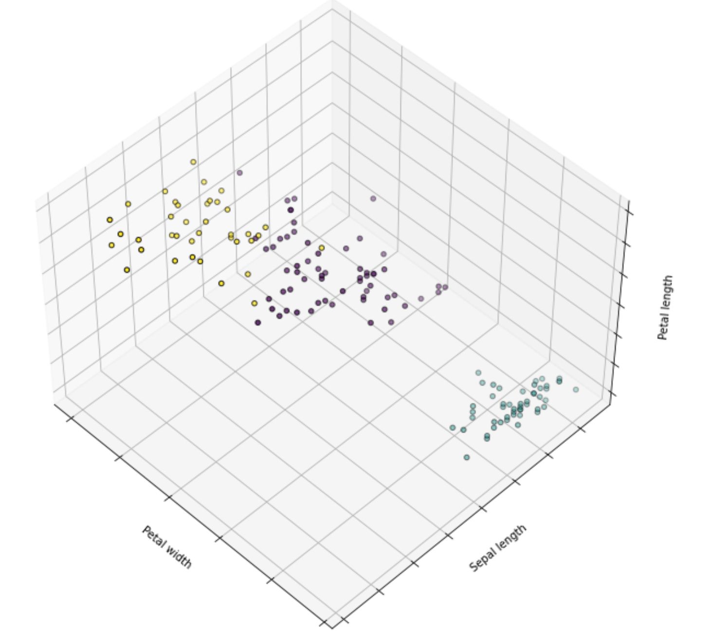
To make it easier to understand, let’s take a look at the comparison between classification and clustering algorithms with the iris dataset.


On the right-hand side, there is a classification algorithm and on the left-hand side, there is a clustering algorithm. With a classification algorithm, each data point comes with the ground truth label. Meanwhile, with a clustering algorithm, each data point doesn’t have a ground truth label, as the algorithm will try to learn the pattern of the data by itself.
There are several clustering algorithms that are commonly applied in real life and we’re going to discuss them in the following sections. So, let’s start with the most common one, which is the k-Means clustering.
k-Means Clustering
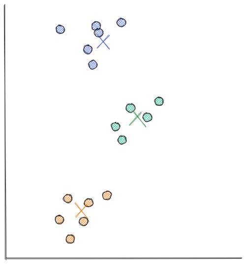
Let’s say that we have the following data points scattered in 2D:

From the visualization above, we can clearly see that the data points are grouped into 3 segments. With k-means clustering, these clusters can be recognized easily and efficiently, as you can see in the following visualization:

The process of how k-Means clustering works is also relatively simple. Below is the step-by-step on how k-means clustering algorithm works:
- We need to define the number of centroids in advance. Each centroid will be the center of each cluster. Thus, let’s say that we initialize 3 centroids in the beginning, then it means that there are going to be 3 clusters formed in the end.
- In this example, we’re using scatter 2D data from above. At first, the centroids are initialized randomly in the 2D space, as you can see below.
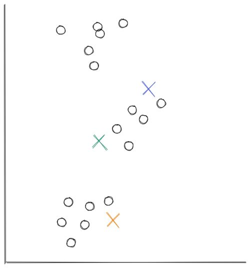
Now the distance between each data point and each centroid is calculated, usually with Euclidean distance. Next, we assign each data point to the nearest centroid.

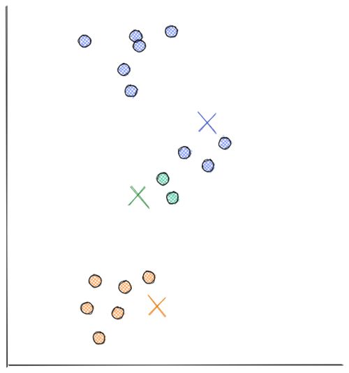
- Next, each centroid will move to the average of data points assigned to it. This concludes the first iteration.

Now we do step 2 all over again. The distance between each data point and recently moved centroids is computed again. Then, we assign each data point with its nearest centroid.

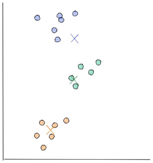
Next, each centroid will move to the average data points assigned to it. This concludes the second iteration. In the visualization below, we have found our optimal solution in this iteration (i.e the location of each centroid will stay the same even if you conduct a thousand more iterations)
As you can see from the visualizations above, k-means clustering moves each centroid location in every iteration to minimize the Euclidean distance between each data point to its nearest centroid. This in turn will minimize the sum of in-group errors.
Choosing the number of centroids to be initialized
The value k in k-Means clustering refers to the number of centroids or clusters that we should initialize. The problem is, most of the time we don't know how many centroids we should initialize in advance.
We know for sure that the more centroids we have, the lower the sum of in-group error because for each data point, there will be centroids that are located near to it. However, that's not what we want because we will end up with meaningless clusters.
Hence, to come up with the optimum number of clusters, normally we create a visualization that tracks the number of clusters and the corresponding sum of in-group error. Then, we choose the number of clusters where the error starts to flat out, as you can see in the visualization below:

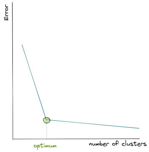
As you can see from the visualization above, the error drops very quickly as we keep adding the number of centroids, but then at a certain point it decreases more slowly as we add more centroids afterward, thus it resembles the shape of an elbow.
Since we don’t know how many centroids we should define in advance, then our best guess would be to pick the k where the ‘elbow’ shape is formed, which in the visualization above is shown with the green circle.
Implementing k-means clustering with Python is very simple with the scikit-learn, as you can see in the following example on the iris dataset.
from sklearn.cluster import KMeans
from sklearn import datasets
import numpy as np

np.random.seed(5)

iris = datasets.load_iris()
X = iris.data
y = iris.target

k_means = KMeans(n_clusters=3)
k_means.fit(X)
And below is the visualization after the implementation of k-means clustering on the iris dataset:

DBSCAN
Another algorithm besides k-means that we can use to do clustering is DBSCAN. This algorithm works by calculating how dense the neighborhood of a data point is. In a more detail, here is the step-by-step of how DBSCAN works:
- For each data point, the neighbors that lie within a certain threshold distance E (epsilon) will be counted.
- If the number of neighbors of a data point is higher than a threshold, let’s call it min_samples, then the DBSCAN algorithm will consider this data point as the so-called core sample. This means that DBSCAN considers that this data point is located in a dense region.
- Next, all of the data points that are included in the neighborhood of a core sample are clustered into one group.
- If any data point is not a core sample or it’s not considered as one of the neighborhoods of any core samples, then that data point can be considered as an outlier or anomaly.
Let’s say we have the following data points in 2D space.

We can implement DBSCAN to cluster these data in Python with the scikit-learn library as follows:
import numpy as np
from sklearn.cluster import DBSCAN
from sklearn.datasets import make_blobs, make_moons
from sklearn.preprocessing import StandardScaler
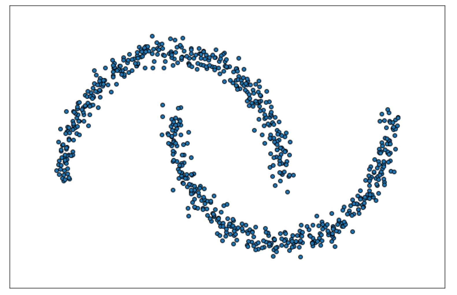
X, labels_true = make_moons(
n_samples=750, noise = 0.05, random_state=0
)
X = StandardScaler().fit_transform(X)
db = DBSCAN(eps=0.3, min_samples=10).fit(X)We can check the label of all data points with db.labels_ method from scikit-learn as follows:
db.labels_

Output: array([0, 1, 1, ..., 0, 1, 0, 0, 0])
As you can see from the result above, we can see the label of the clusters of each of the data points. You might also notice that there is a possibility that some data points are labeled with -1, which means that those particular data points are considered as outliers or anomalies by the DBSCAN algorithm.
Next, we can see the indices of the data points that are considered as core samples as follows:
db.core_sample_indices_

Output: array([  0,   1,   2, ..., 748, 749])
Finally, the visualization of the final cluster would be something like the following:

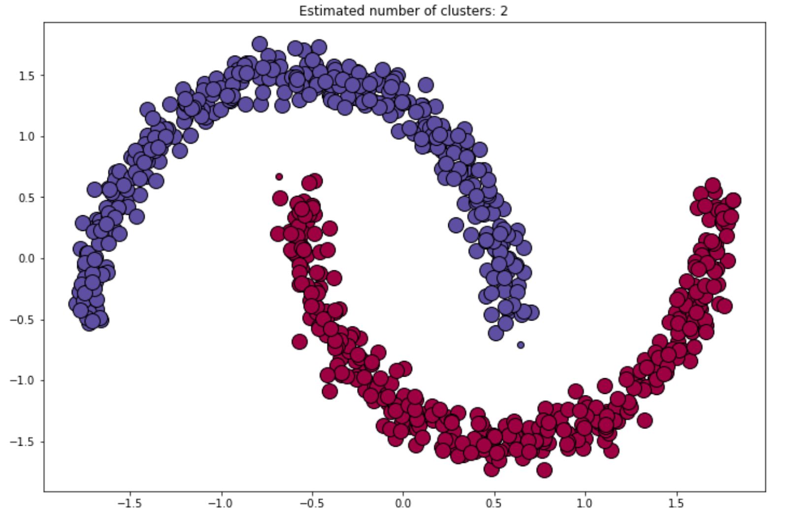
We can always refine or improve the result of the final clustering by changing the value of epsilon or min_samples that we always should define in advance when we initialize the DBSCAN algorithm with the scikit-learn library.
HDBSCAN
Hierarchical DBSCAN or commonly abbreviated as HDBSCAN is an extension of DBSCAN algorithm that we have discussed above. In a nutshell, with HDBSCAN, we don’t need to specify the distance epsilon in advance as this algorithm is basically a DBSCAN algorithm implementation for varying distance. Thus, the only parameter that we need to define in advance is the number of min_sample.
The fact that HDBSCAN doesn’t rely on the distance epsilon makes it an ideal algorithm to cluster data points with all of the positive attributes from DBSCAN whilst still being able to create a cluster with varying density.
We can’t implement HDBSCAN with the scikit-learn library, but we can implement it directly via a standalone HDBSCAN library, as you can see below.
import hdbscan
import numpy as np
from sklearn.datasets import make_blobs, make_moons
from sklearn.preprocessing import StandardScaler

X, labels_true = make_moons(
    n_samples=750,  noise = 0.05, random_state=0
)

X = StandardScaler().fit_transform(X)

hdb = hdbscan.HDBSCAN(min_cluster_size=5, gen_min_span_tree=True).fit(X)
Same as DBSCAN above, we can see the cluster of each data point with the label_ method.
hdb.labels_

Output: array([1, 0, 0, ..., 0, 1, 1, 1]
And below is the visualization of the cluster after implementing HDBSCAN on our data points:


Gaussian Mixture Model
The next method that we’re going to be looking at is Gaussian Mixture Model or commonly abbreviated as GMM. As you might have guessed, GMM is a probabilistic model in which it assumes that our data points were generated from mixtures of several Gaussian distributions where the parameters are unknown.
In the world of GMM, here is how data points are assumed to be generated from a probabilistic approach:
- Let’s say we use a GaussianMixture class from the scikit-learn library. First, we need to define in advance the number of Gaussian distributions, let’s say this as k.
- For each data point, one random cluster is picked from a possible k clusters, with the probability of choosing i th cluster defined by the cluster’s weight theta_j. Next, the index of the cluster chosen by each data point is denoted by z.
- Finally, the location of each data point is sampled randomly from a Gaussian distribution in ith cluster with mean and covariance matrix
To apply Gaussian Mixture, normally we have a specific dataset X, and then we can estimate the weight of each cluster, the mean, and the covariance matrix. Let’s say we have a dataset that looks like this:

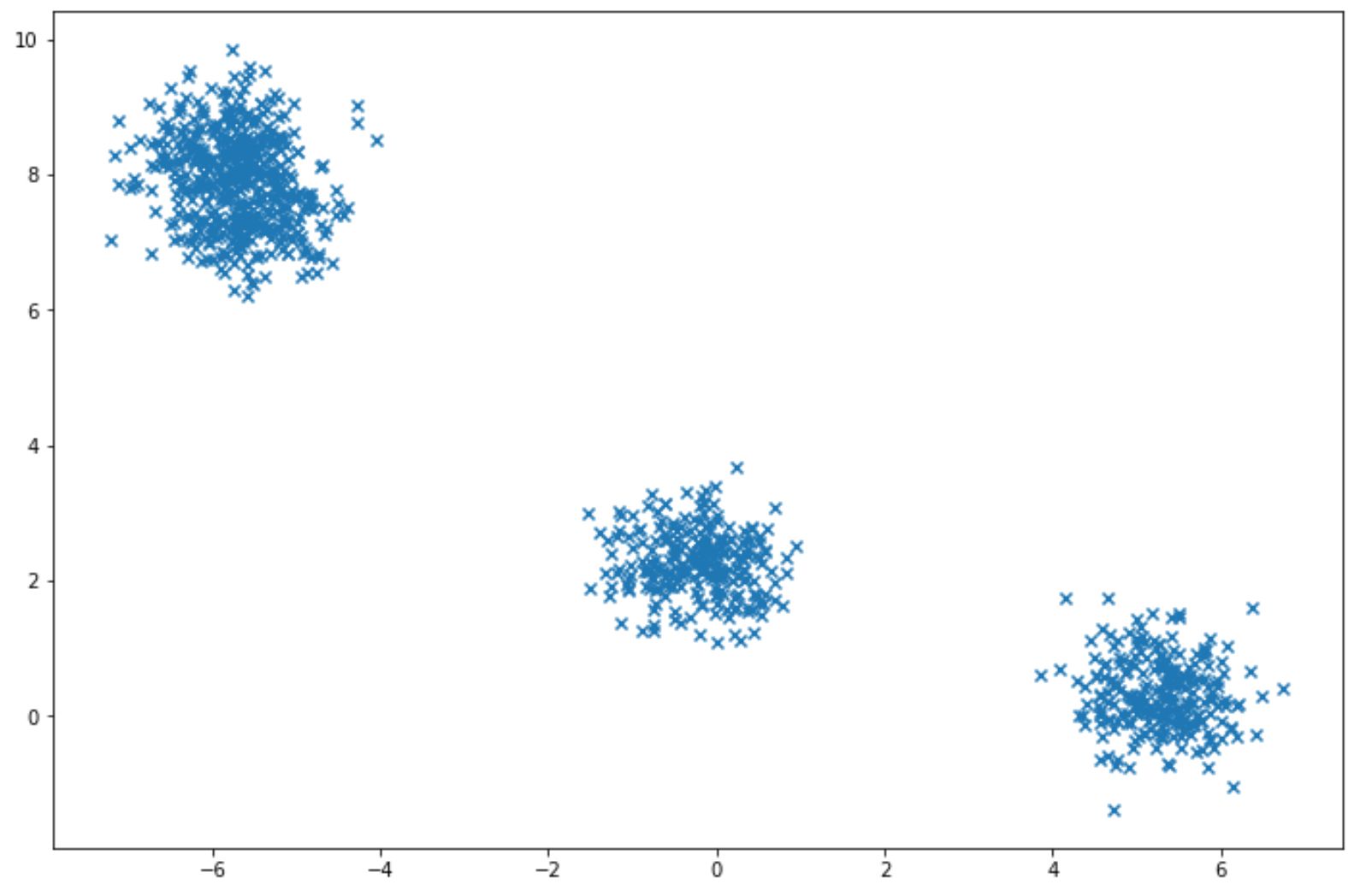
with the scikit-learn library, we can apply Gaussian Mixture easily as you can see in the code implementation below:
from sklearn import mixture

gm = mixture.GaussianMixture(n_components=3, covariance_type="diag")
gm.fit(X)
And we can check the final weight and the corresponding covariance of each cluster found by the algorithm with weights_ and covariances_ methods as follows:
gm.means_

>>> output: array([[-0.23103967,  2.27541772],
      	[-5.70136523,  7.91435788],
       	[ 5.28872507,  0.31883725]])

gm.covariances_

>>> output: array([[0.26414227, 0.22554449],
       	[0.26701248, 0.47963354],
            [0.23682694, 0.27394416]])
Gaussian Mixture Model for Clustering
So far, we have seen how we can implement Gaussian Mixture Model on a given dataset and then check the weights and covariances of the clusters found by the algorithm. The next question is: how can we use Gaussian Mixture Model for clustering? How could the algorithm find the best weight for each cluster?
GMM uses an algorithm called Expectation Maximization (EM) algorithm. If you’re familiar with how k-Means clustering works, then it’s easy to understand how an EM algorithm works, as there are similarities between both algorithms.
Just like k-Means clustering,GMM will first initialize cluster parameters randomly and then there are two steps that need to be repeated until convergence occurs in GMM. The first one is to assign each data point to a cluster (just like k-Means with a centroid), this is called the expectation step. Then, the cluster will be updated and this is called the maximization step.
The difference with GMM is, in each iteration, it is not only looking for the cluster center like k-Means, but also the covariance (shape and orientation) and the relative weights of the clusters.
Also, GMM uses soft assessment when assigning each data point into a certain cluster, which means that it will compute the probability of each data point belonging to a particular cluster during the expectation step.
We can check whether our GMM has converged with the following method:
gm.converged_
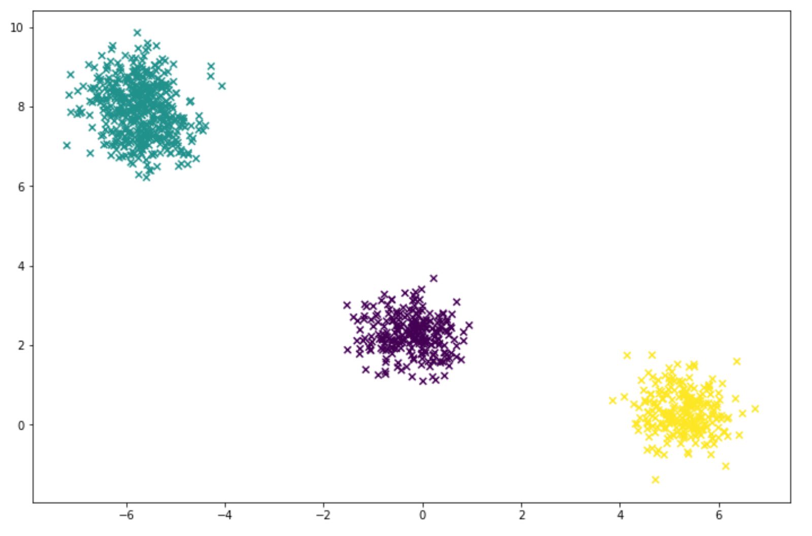
>>> output: TrueTo infer the label of each data point for clustering purpose with our GMM model, we just need to call predict method as follows:
labels = gm.predict(X)And below is the visualization of the clustering result that we got from our GMM model:
Choosing the Number of Cluster
In a k-Means clustering method, we have seen that an elbow method is a method that can help us to determine the number of clusters that we need to define in advance. But how about in GMM? In GMM, we need to minimize the theoretical information criterion. There are several theoretical information criteria, such as Bayesian information criterion (BIC) and Akaike information criterion (AIC).
Below are the equations for BIC and AIC:
where:
m: total number of data points
p: total number of parameters that GMM need to optimize
L: the likelihood function of the model
Implementing BIC and AIC with scikit-learn couldn’t be any simpler. We can find out the BIC and AIC values with bic and aic methods as follows:
gm.bic(X)

or

gm.aic(X)
Below is the example of how we can implement BIC and AIC for the data points above:
n_components = np.arange(1, 16)

gm = [mixture.GaussianMixture(n, covariance_type='diag', random_state=0).fit(X) for n in n_components]

plt.figure(figsize=(12,8))
plt.plot(n_components, [m.bic(X) for m in gm], label='BIC')
plt.plot(n_components, [m.aic(X) for m in gm], label='AIC')
plt.legend(loc='best')
plt.xlabel('n_components');
plt.ylabel('information criterion');
By using BIC and AIC as above, we get the following visualization.

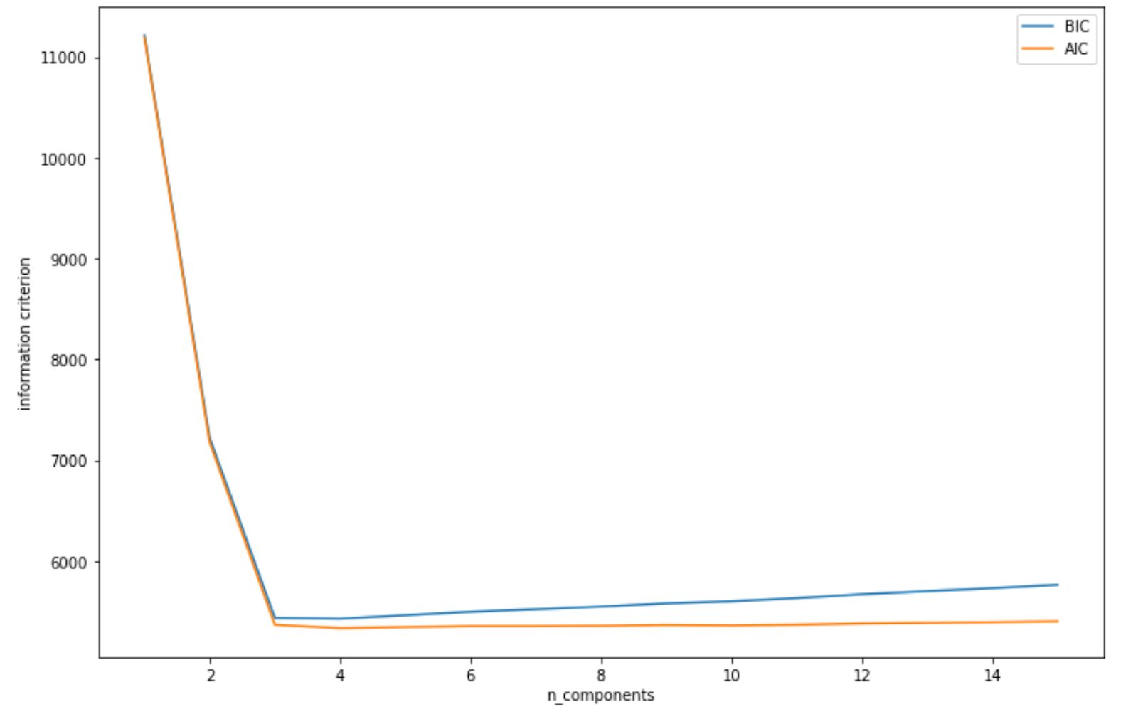
As we can see from visualization above, both AIC and BIC scores dipped when the number of clusters is 3. Thus, it will be a safe bet to initialize our number of clusters to 3, and then we will get the same clustering result as we have seen in the previous section.
Unsupervised Learning Algorithms: Anomaly Detection
The final unsupervised learning algorithms approach that we’re going to discuss is anomaly detection. The purpose of anomaly detection is to identify one or more data points on our datasets that can be considered as unusual or unexpected. This means that we’re looking for data points that deviate significantly from the other data points in our data set.
There are several anomaly detection algorithms that we can implement. In this article, we’re going to discuss 3 different algorithms for anomaly detection: Gaussian Mixture Model (GMM), Isolation Forest, and Local Outlier Factors. Let’s start with GMM.
Gaussian Mixture Model for Anomaly Detection
As we have seen from the previous section, GMM is a model that we can implement for clustering. However, it turns out that GMM can be useful for anomaly detection as well.
The concept is really simple. If a data point is located in a low-density region, then we can say that a data point is an anomaly. However, it’s important to note that we need to set up the threshold in advance because in the end, it should be us that determine whether a data point is an anomaly or not.
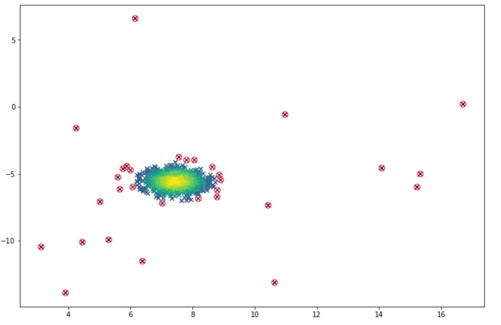
Let’s say that we want the algorithm to detect the anomaly in the following data points:

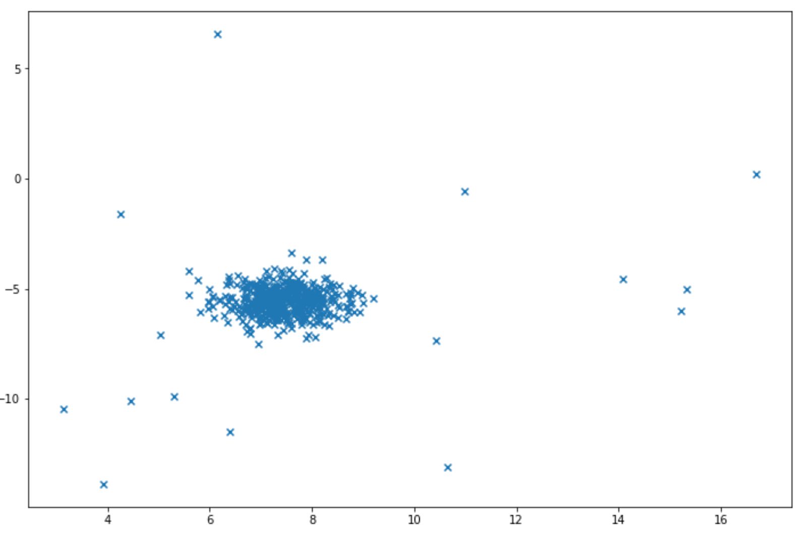
And we want to identify a data point as an anomaly when it is located in the area below 5% percentile. Below is the example of code implementation to do this:
import numpy as np
from sklearn.datasets import make_blobs
from sklearn import mixture
epsilon = 0.05

X, y_true = make_blobs(n_samples=1000, centers=1, cluster_std=0.5, random_state=5)
X_append, y_true_append = make_blobs(n_samples=20,centers=1, cluster_std=5,random_state=5)
X = np.vstack([X,X_append])
y_true = np.hstack([y_true, [1 for _ in y_true_append]])
X = X[:, ::-1]

gm = mixture.GaussianMixture(n_components=1, covariance_type="diag")
gm.fit(X)

k = len(gm.means_[0])
sigma=np.diag(gm.covariances_[0])
X = X - gm.means_[0].T
p = 1/((2*np.pi)**(k/2)*(np.linalg.det(sigma)**0.5))* np.exp(-0.5* np.sum(X @ np.linalg.pinv(sigma) * X,axis=1))

outliers = np.nonzero(p < epsilon)[0]
And the visualization of the anomaly detection can be seen below. The anomalies are shown in the red circle.

Since we can adjust the threshold value, then we can lower the threshold if we feel that we get too many false positive results (many normal data points are classified as anomalies). And vice versa, we can increase the threshold if we feel that we get too many false negatives (many anomalies are classified as normal data points).
Isolation Forest
Isolation forest is a tree-based anomaly detection algorithm. Since this algorithm is based on a decision tree algorithm, then the logic behind the isolation forest algorithm is that data points that are considered as anomalies would be closer to the root of the tree compared to normal data points.
But what does this mean? Let’s take a look at the following illustration.
Suppose that we’re collecting data about the area of people’s houses. Among those houses, one belongs to Cristiano Ronaldo, in which he has a house that is far larger than the usual house. In our example here, of course Cristiano Ronaldo’s house is considered to be an anomaly.
If you’ve read the previous Machine Learning algorithm series that discusses classification algorithms, the tree based algorithm will do a classification by creating one or more branches starting from the root until it reaches to a leaf node. In each of the branches, there is a True or False condition that each data point needs to fulfill.
The concept behind isolation forest is that if Cristiano Ronaldo’s house is far larger than the usual house, then his house would be closer to the root compared to if we try to find regular people’s house, as you can see in the following visualization:


Let’s say we have the following data points:

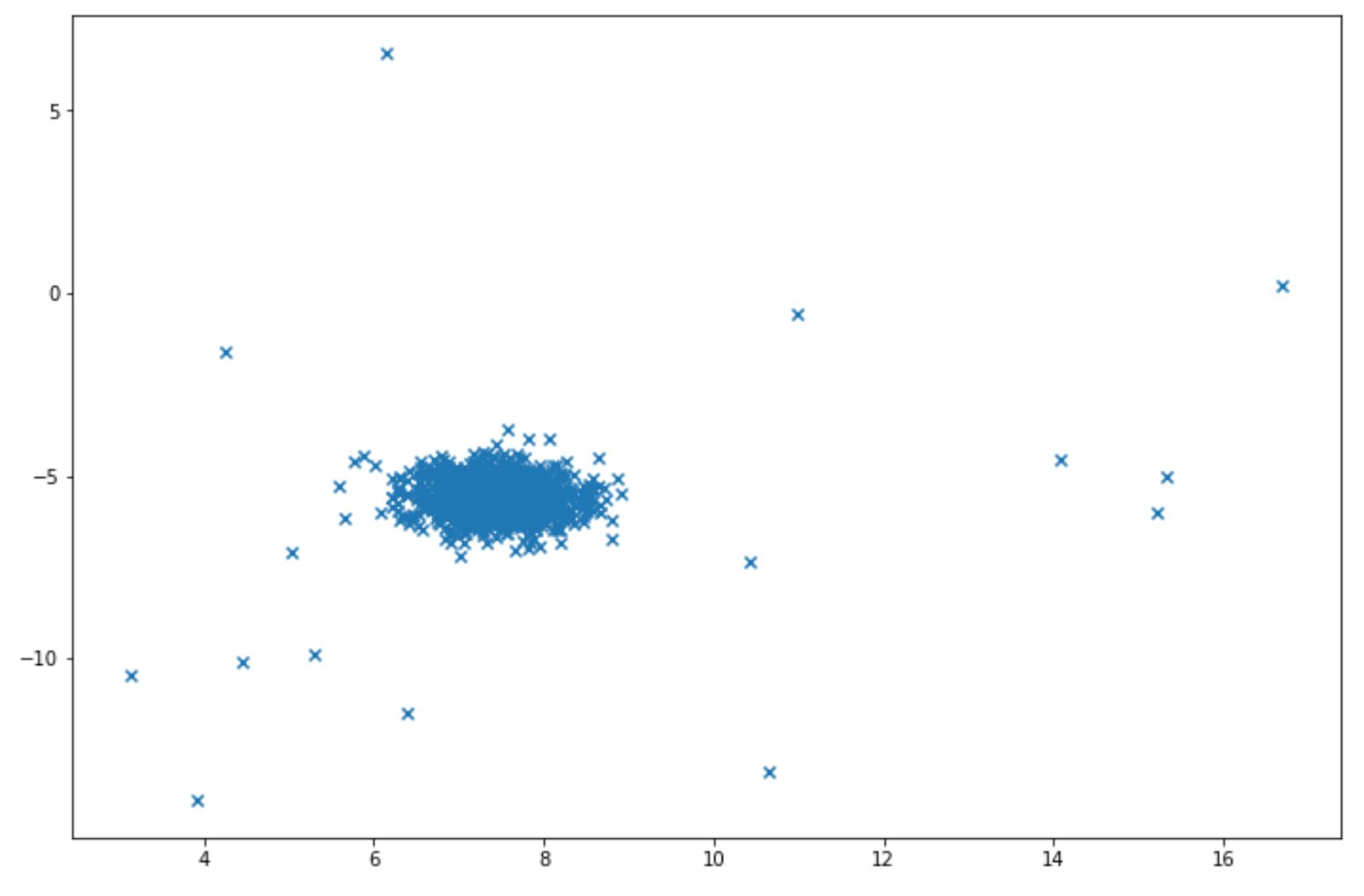
Isolation forest can be easily implemented for above data points with scikit-learn library. Below is the example of how we can implement isolation forest algorithm:
from sklearn.ensemble import IsolationForest
import numpy as np

X, y_true = make_blobs(n_samples=1000, centers=1, cluster_std=0.5, random_state=5)
X_append, y_true_append = make_blobs(n_samples=20,centers=1, cluster_std=5,random_state=5)
X = np.vstack([X,X_append])
y_true = np.hstack([y_true, [1 for _ in y_true_append]])
X = X[:, ::-1]

# fit the model
clf = IsolationForest(max_samples=100, random_state=42)
clf.fit(X)
After fitting-in an isolated forest algorithm, then we can observe which data point is considered an anomaly with the predict method. Alternatively, we can observe the anomaly score of each data point with score_samples method as follows:
clf.predict(X)
clf.score_samples(X)
The predict method will give us a value either 1 or -1. A value of -1 indicates that a data point is considered as an anomaly. Meanwhile, score_samples method will give us an anomaly score of each data point according to this formula:
where:
In the above equation:
s(x,n): anomaly score which has a value between 0 to 1, the higher the value, the more likely that a data point is an anomaly.
n: number of data points
h(x): the depth of the tree in which a data point is found
H: an armonic number
E(h(x)): average of h(x) across different trees
However, one important thing to note is that the scikit-learn implementation is the opposite of the formula shown above. With scikit-learn, the anomaly score is defined the same as the formula above, but in a negative sign.
Below is the visualization example after we implemented isolation forest algorithm on above data points:

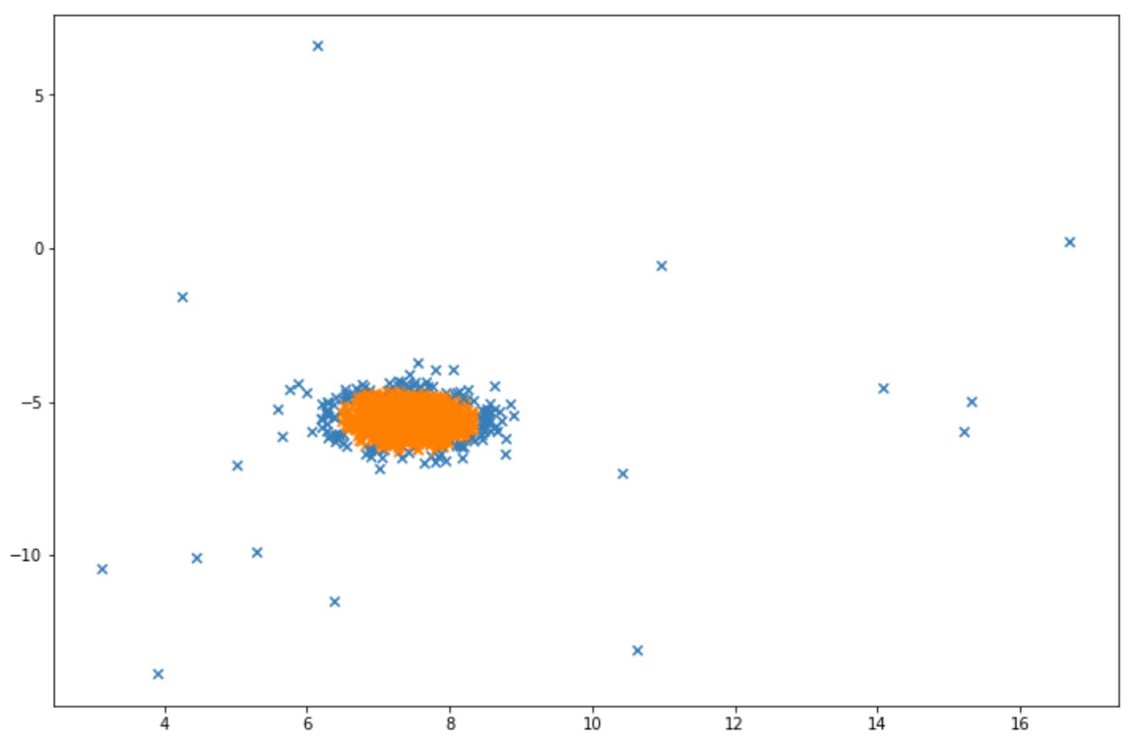
The blue points in the visualization above can be considered as anomalies. Next, we will discuss another algorithm designed for anomaly detection, which is Local Outlier Factor.
Local Outlier Factor (LOF)
In the previous Machine Learning algorithm series article about classification algorithms, we’ve discussed one specific classification algorithm called k-Nearest Neighbors. If we understand the concept behind k-Nearest Neighbors, then it’s going to be easy to understand how LOF works.
k-Nearest Neighbors algorithm tries to classify an unseen data point based on the true label of its k-nearest neighbors. Let’s say that we set the k=4 and we have a binary classification problem, where the true label is either 1 or 0. If the true label of its 4 nearest neighbors are three of 1 and one of 0, then the unseen data point will be labeled as 1.
With LOF, the concept is similar. First we set the number of k (neighbors). Then the distance between a data point with each of its k nearest neighbors is computed and this distance is called reachability distance. Below is the formula of reachability distance:
Next, with reachability distance, we can compute the local reachability distance, which is the inverse of the average of reachability distance between a data point to each of its k-nearest neighbors. Below is the formula of local reachability distance:
With LOF, we basically compare the average local reachability distance k-nearest neighbors of a data point to the local reachability distance of that data point itself.


If the local reachability distance of a data point is smaller than the average local reachability distance of its k-nearest neighbors, then the LOF value would be greater than 1, which means that the travel distance between a data point to its neighbors would take longer than the data point’s neighbors to their neighbors.
Thus, normally we conclude that when LOF > 1, then a data point is considered an anomaly and vice versa.
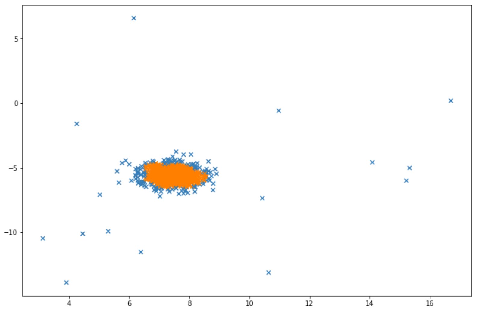
Just like before, let’s say we have the following data points:
LOF can be implemented easily with the scikit-learn library as follows:
import numpy as np
import matplotlib.pyplot as plt
from sklearn.neighbors import LocalOutlierFactor

X, y_true = make_blobs(n_samples=1000, centers=1, cluster_std=0.5, random_state=5)
X_append, y_true_append = make_blobs(n_samples=20,centers=1, cluster_std=5,random_state=5)
X = np.vstack([X,X_append])
y_true = np.hstack([y_true, [1 for _ in y_true_append]])
X = X[:, ::-1]

lof= LocalOutlierFactor(n_neighbors=35, contamination=0.15)
y_p=lof.fit_predict(X)
The fit_predict method above will give us a value either 1 or -1. A value of -1 indicates that a particular data point is considered as an anomaly.
And finally, below is the visualization that we will get after implementing LOF. Same as before, the blue data points indicate that they are considered as anomalies by the algorithm.

Conclusion
And that’s all. We’ve come to the end of the article! In this article, we have learned about different unsupervised learning algorithms or algorithms that lie within unsupervised learning methods. We hope that this article is useful to help you to get more familiar with unsupervised learning algorithms in machine learning.
Share