How to Perform Exploratory Data Analysis in Python (With Example)

Categories:
 Written by:
Nathan Rosidi
Step-by-step Exploratory Data Analysis in Python: From summarizing and visualizing to cleaning and preparing data for modeling.
Data has its story, but to extract this story from it, you should know how to read it. Before building any fancy predictive models like machine learning or deep learning algorithms, you should first get acquainted with them.
In this article, we will explore how you can explore this story using Python. We’ll start by summarizing the data, then visualizing it to gain better insights. Next, we will identify and remove missing values, and at the end, we will manipulate the data.
By the end of the article, the data will be ready to apply any predictive models, but this part of data analysis is as important as those predictive models, so let’s get started!
Example Project: Predicting Price with Exploratory Data Analysis in Python
In this data project below, Haensel AMS used this data project in data science interviews as an assignment.
Link to this data project: https://platform.stratascratch.com/data-projects/predicting-price
In this article, we’ll use this project as an example.
Step 1: Get to Know Your Data with Summary Statistics
Now, let’s summarize the data by first loading it. Next we will collect basic information.
Before we can analyze or visualize anything, we need to understand our dataset. This means checking its structure, identifying key statistics, and ensuring the data types are correct.
Loading the Dataset
We start by loading the dataset using Pandas. Let's import the necessary libraries and read the file:
import pandas as pd
df = pd.read_csv("sample.csv")
df.head()
Here is the output.
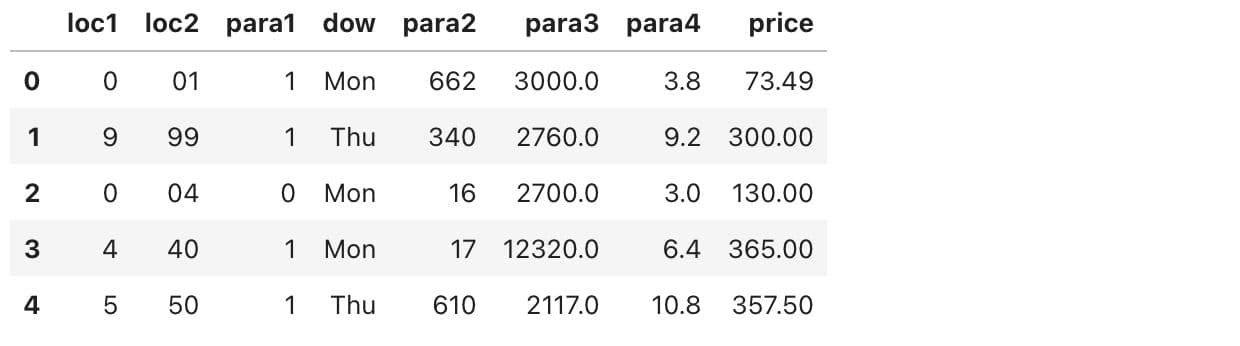
This gives us a quick look at the dataset, showing the first few rows to help us understand the column structure.
Basic Dataset Information
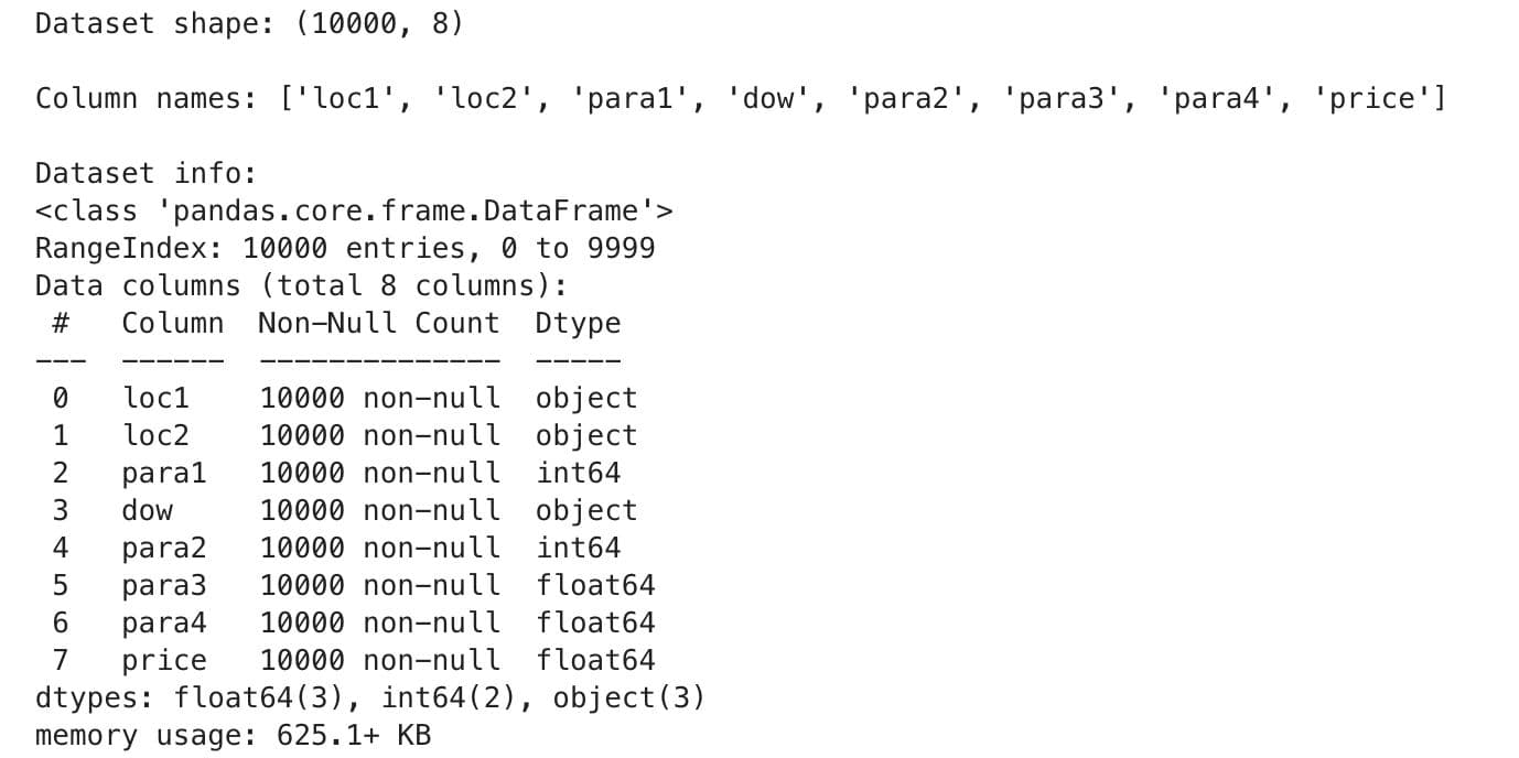
Next, we check the dataset's shape, column names, and data types:
# Get dataset shape
print("Dataset shape:", df.shape, "\n")

# Display column names
print("Column names:", df.columns.tolist(), "\n")

# Check data types and missing values
print("Dataset info:")
df.info()
Here is the output.
Descriptive Statistics
Next, let’s explore the key summary statistics for numerical columns. Here is the code:
print("Summary statistics:")
print(df.describe().to_string(), "\n")
Here is the output.
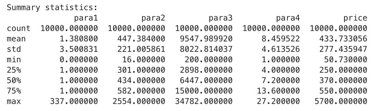
This output includes key statistics like count, mean, std(standard deviation), min, IQR’s(25,50,75) and max for each column. This would help you discover hidden trends like outliers or anomalies.
Good. Now that we have finished summarizing the dataset, let's start visualizing the data.
Step 2: Use Visuals to Spot Patterns and Outliers
Now that we understand the dataset's structure, we can use visualizations to discover any patterns it might contain, which tell more than just raw numbers. They show trends, outliers, and distributions far better than mere statistics can.
Histogram: See How Your Data Is Distributed
Let's create histograms for all numerical columns to see their distributions. Here is the code to see the distributions of the numerical columns.
import matplotlib.pyplot as plt

df.hist(figsize=(12, 8), bins=50, edgecolor="black")
plt.suptitle("Distribution of Numeric Features", fontsize=14)
plt.show()
Here is the output.
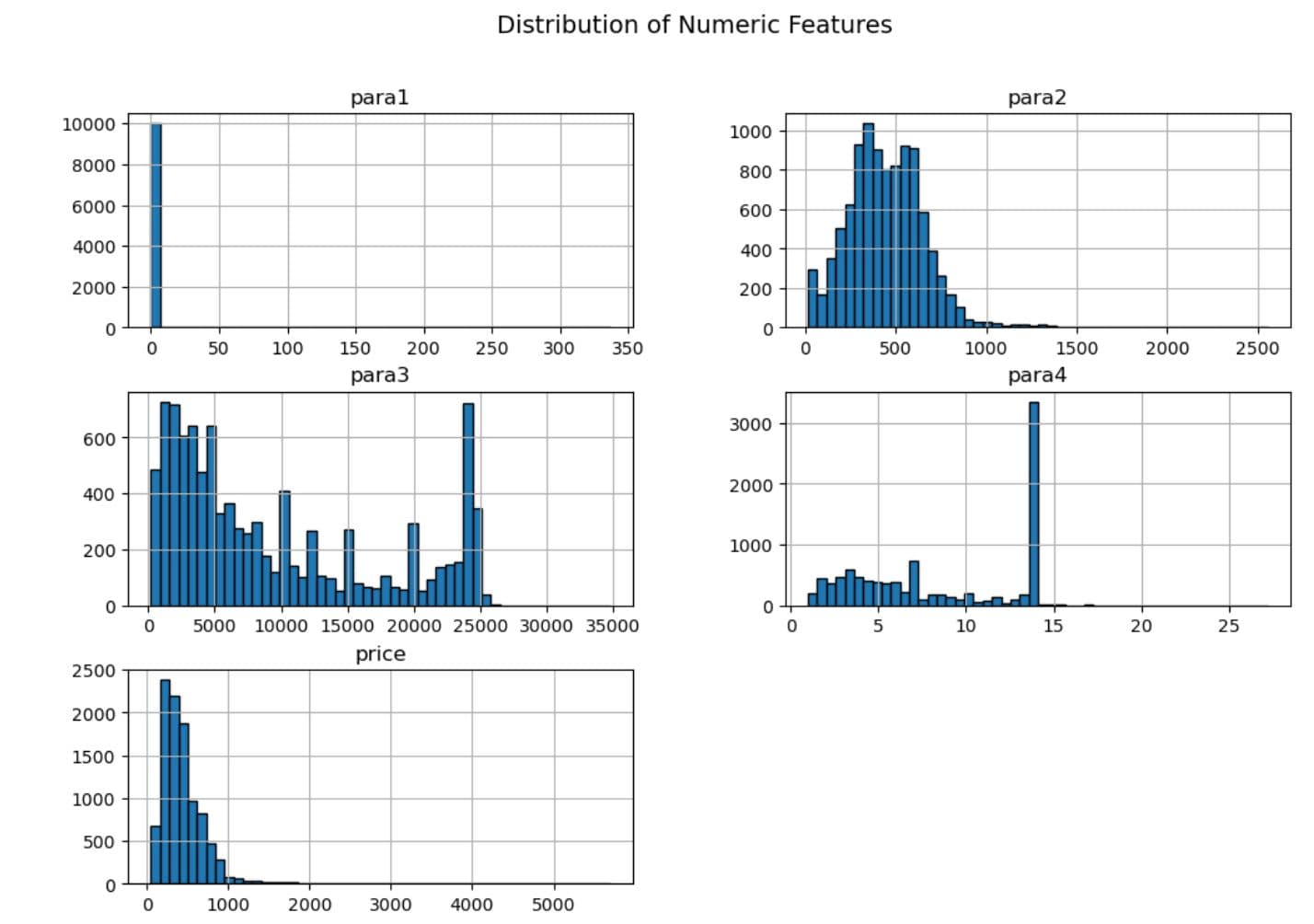
This helps us recognize skewed distributions, normal distributions, and possible outliers in each characteristic.
Scatter Plot: Find Relationships Between Variables
Scatter plots let us interpret the relationship between numerical variables. Since we're predicting price, let's see how some features correlate. Here is the code.
import seaborn as sns

plt.figure(figsize=(8, 5))
sns.scatterplot(x=df["para2"], y=df["price"], alpha=0.5)
plt.title("Relationship Between para2 and Price")
plt.xlabel("para2")
plt.ylabel("Price")
plt.show()
Here is the output.
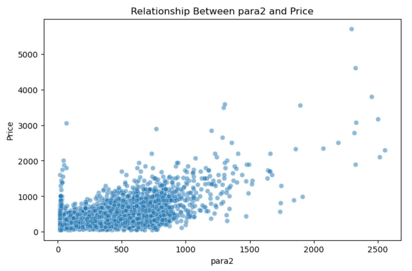
This visualization helps us spot trends, for example, whether price increases with para2.
Boxplot: Detect and Examine Outliers
Boxplots are good for searching outliers. Let’s look for some in the price column.
plt.figure(figsize=(8, 5))
sns.boxplot(y=df["price"])
plt.title("Boxplot of Price: Detecting Outliers")
plt.show()
Here is the output.
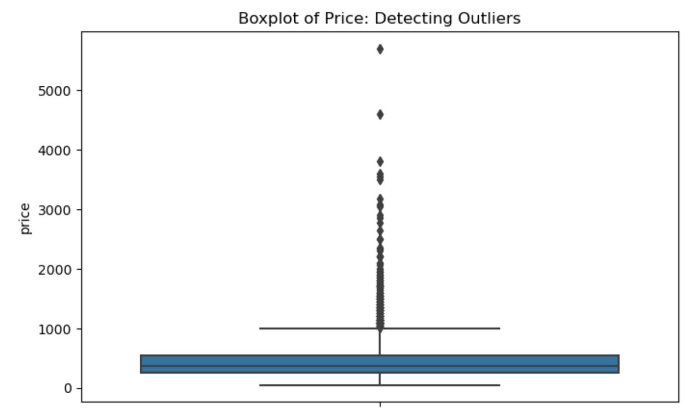
If there are extreme values, they will appear as dots outside the whiskers, which helps us decide whether to remove or transform them.
Step 3: Find and Handle Missing Data
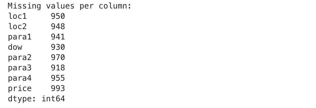
If any column in the dataset contains missing values, it might harm our analysis. Therefore, it is very important to check for and address these problem areas. At this step, we’ll check missing values first, and discover methods to handle those.
Checking for Missing Values
We’ll count the number of missing values in each column to see if any data is missing.
Let’s modify our dataset so that it has missing values. That’s how we can see how we can use methods to handle missing values. Here is the code that adds %10 of disappeared values to your dataset.
missing_fraction = 0.1  # 10% missing values
num_missing = int(missing_fraction * df.size)
np.random.seed(42)
missing_indices = [(np.random.randint(0, df.shape[0]),
                    np.random.randint(0, df.shape[1])) for _ in range(num_missing)]
for row, col in missing_indices:
    df.iat[row, col] = np.nan
Let’s rerun the code once again to check the missing values:
print("Missing values per column:")
print(df.isnull().sum(), "\n")
Here is the output.
Good so let’s discover the methods to handle missing values.
Handling Missing Values
There are several ways to deal with missing data, such as:
- Drop rows with missing values
- (if they are few and won’t affect analysis)
- Fill missing values with mean/median/mode
- (if they are important features)
- Use advanced imputation methods
- (for complex cases).
Let’s see some related codes. If we decide to drop missing values, we can use:
df_cleaned = df.dropna()
print("Missing values after dropping:", df_cleaned.isnull().sum().sum())
Here is the output.

Alternatively, if we want to fill missing values with the median of each column, we can use:
df_filled = df.fillna(df.median())
print("Missing values after filling:", df_filled.isnull().sum().sum())
Here is the output.
Choosing the right approach depends on the dataset and how much data is missing.
Step 4: Data Manipulation
A raw dataset often contains invalid values and categorical data that must be transformed. In this step, we will use our dataset to discover how to transform these. First, we will handle incorrect values, and convert categorical columns to numerical ones.
Because as you know, predictive algorithms need numerical data, so let’s start handling incorrect values first.
Handling Incorrect Values
Some columns, like loc1, should contain numerical values, but they include unwanted entries like "S" and "T". Let’s check and remove them:
Some numerical columns, such as loc1, need to be filtered from junk, such as “S” and “T.” Here is a related code.
print("Unique values in loc1 column before cleaning:")
print(df["loc1"].value_counts(), "\n")

df = df[~df["loc1"].astype(str).str.contains("S|T", na=False)]

df["loc1"] = pd.to_numeric(df["loc1"], errors='coerce')
df["loc2"] = pd.to_numeric(df["loc2"], errors='coerce')

df.dropna(inplace=True)

print("Dataset shape after cleaning:", df.shape)
Here is the output.
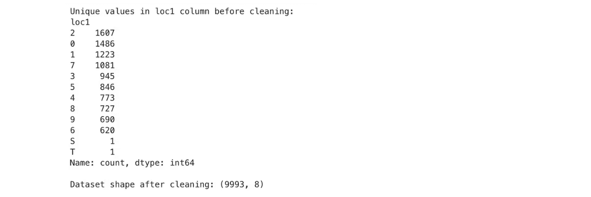
As you can see, all rows are numerical, but “S” and “T”, which should be removed!
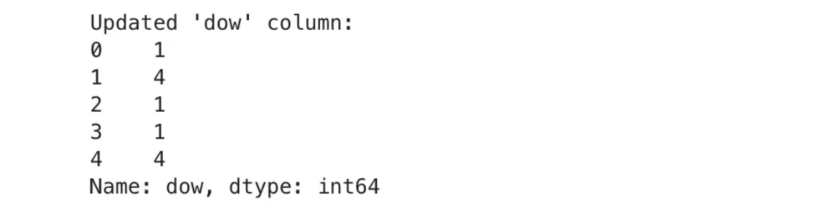
Converting Categorical Data (Weekdays to Numbers)
Text values like "Mon" or "Tue" appear in the dow (day of the week) column. They should be changed to numeric values, as most machine learning models work better this way.
Here is the related code.
days_of_week = {'Mon': 1, 'Tue': 2, 'Wed': 3, 'Thu': 4, 'Fri': 5, 'Sat': 6, 'Sun': 7}
df["dow"] = df["dow"].map(days_of_week)

print("Updated 'dow' column:")
print(df["dow"].head())
Here is the output.
Wrapping Up
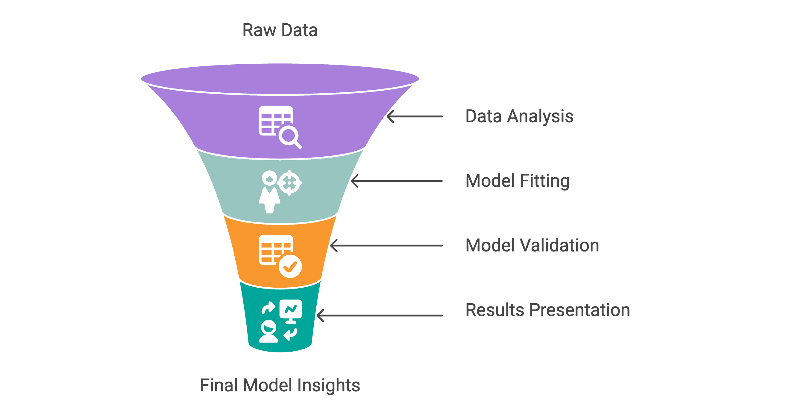
Exploratory data analysis (EDA) is the first step in any data science project. It helps you to understand the data structure and its anomalies, and it prepares it for data modeling. In this article, we have explored four steps:
- Step 1: Summarizing Data - We learned to inspect the dataset structure, confirm column types with certainty and compute key descriptive statistics.
- Step 2: Data Visualization - To visualize distributions, we drew histograms, created scatter plots, and built boxplots. We also made visible relationships between variables and outliers.
- Step 3: Identify Missing Values - We filtered out unwanted values in numerical columns to ensure that our data was sound.
- Step 4: Data Manipulation - We converted categorical values such as weekdays into a number form, which could make them suitable for transformation.
Share