How to Make a Boxplot with Matplotlib

Categories:
 Written by:
Nathan Rosidi
Drawing a boxplot in Matplotlib is a valuable skill for visualizing data distribution. You’ll get all the fundamentals and a real-world example in this article.
Boxplots are often an overlooked type of plot. That’s unfair. They can be incredibly insightful if you know what data to use them on and how to read them.
You’ll learn both in this article. We’ll discuss the use of boxplots and then demonstrate how to create and customize them in Matplotlib.
What Is a Boxplot?
Boxplots or box-and-whisker plots visualize the central tendency, spread, and skewness of data.
They do that by showing five key summary statistics.
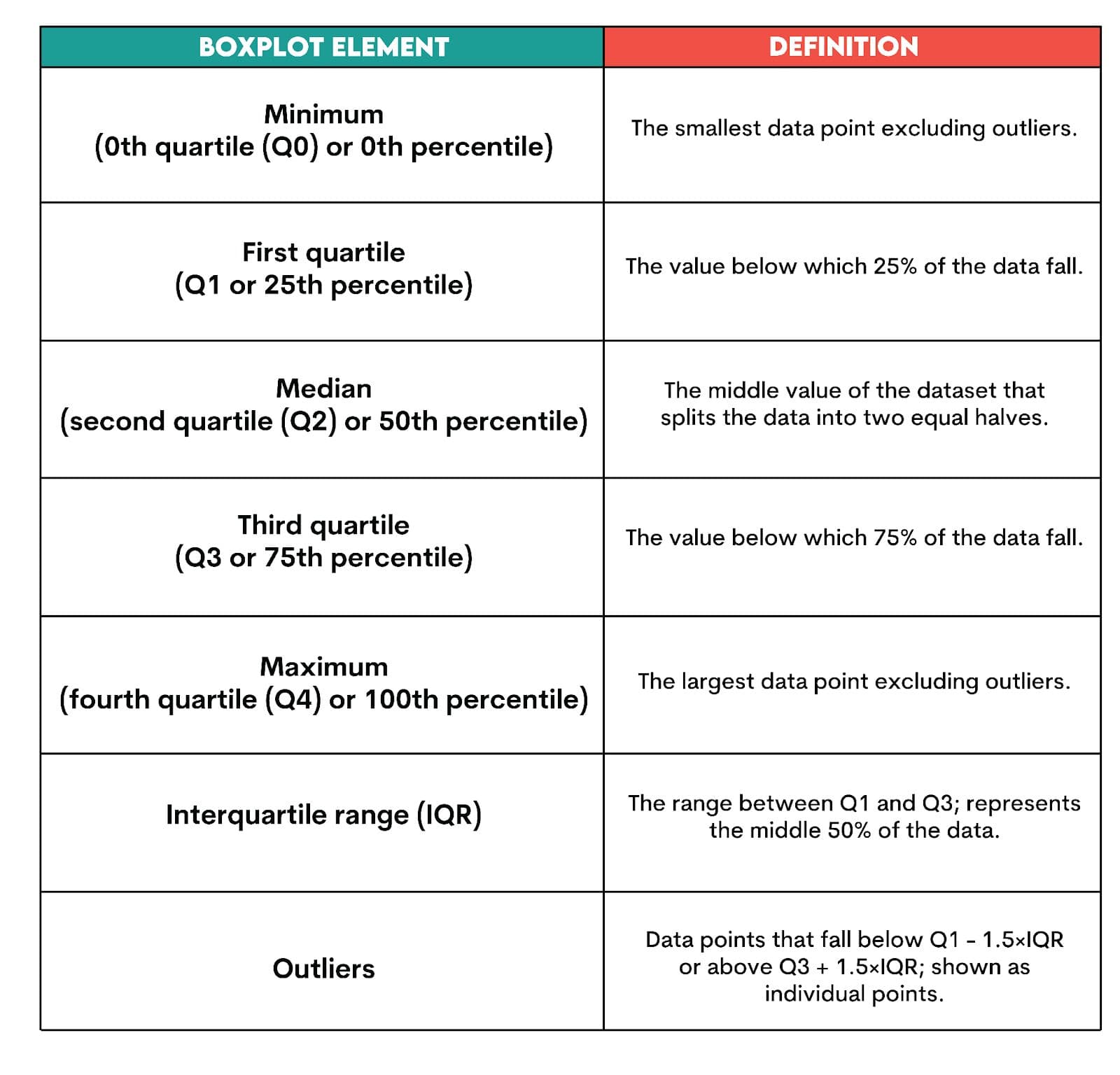
How To Read a Boxplot?
The generic example of a boxplot, along with its elements, is shown below.
Locality is where your data tends to cluster; its central point. It is shown by the median. If the median is right in the middle, then your data is balanced. If it’s off-center, it’s possible that outliers or skew are pulling it to the left or right.
Spread shows how stretched or compact your data is. The spread is demonstrated by the interquartile range (IQR), i.e., the range from Q1 to Q3. If the box is wide, there’s high variability in your data. If the box is narrow, most data points are bunched up together. Long whiskers show that data trails far from the center.
Skewness is the asymmetry of your data. It helps you understand outliers, transformation, or whether the mean and median differ significantly. If there’s a longer whisker or fatter box half on the right, that’s right or positive skew. If the longer whisker or the bigger half of the box is on the left, then that’s a left or negative skew.
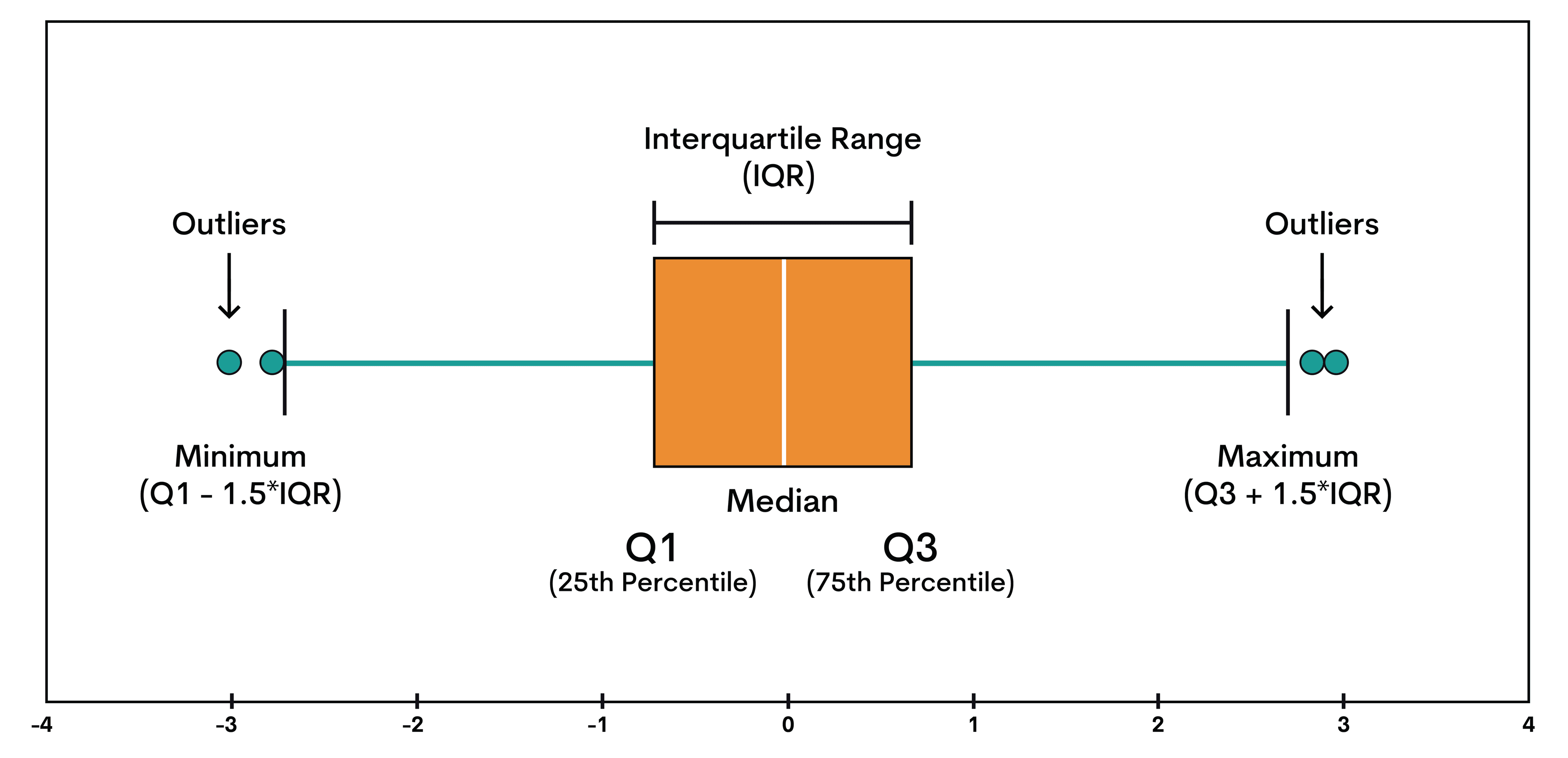
Example: Interpreting the Boxplot Values
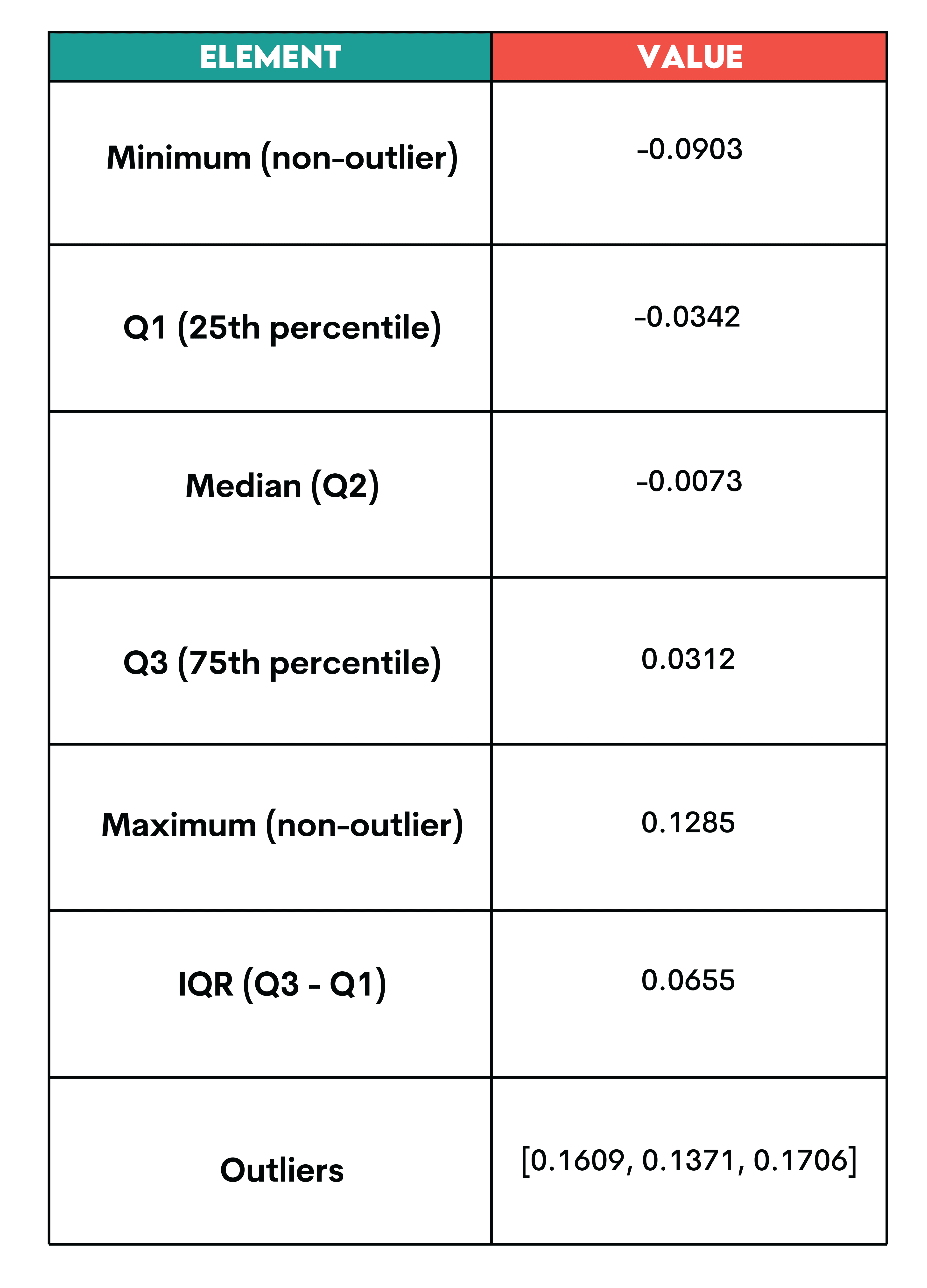
Here’s a boxplot showing body mass index (BMI) data.
These are the values shown on the boxplot above.
Let’s now interpret them.
Locality: The median is at -0.0073, slightly off-center in the box. This means the BMI distribution is slightly skewed to the right, i.e., there are higher values pulling the data upward.
Spread: The IQR is 0.0655, representing the middle 50% of BMI values. That means that half the people in this dataset have a BMI within roughly ±0.03 (i.e., ±0.0655 / 2 ≈ ±0.0327). As the box isn’t very wide, the data variability is moderate.
Skewness: The right whisker is longer. The outliers are only on the higher (right) side. This indicates a positive skew, i.e., a few people have unusually high BMI, but most cluster in the middle.
Why Use Boxplots?
As you just saw, boxplots aren’t exactly the fanciest visualizations, but they sure say a lot.
There are three distinct uses of boxplots in data science.
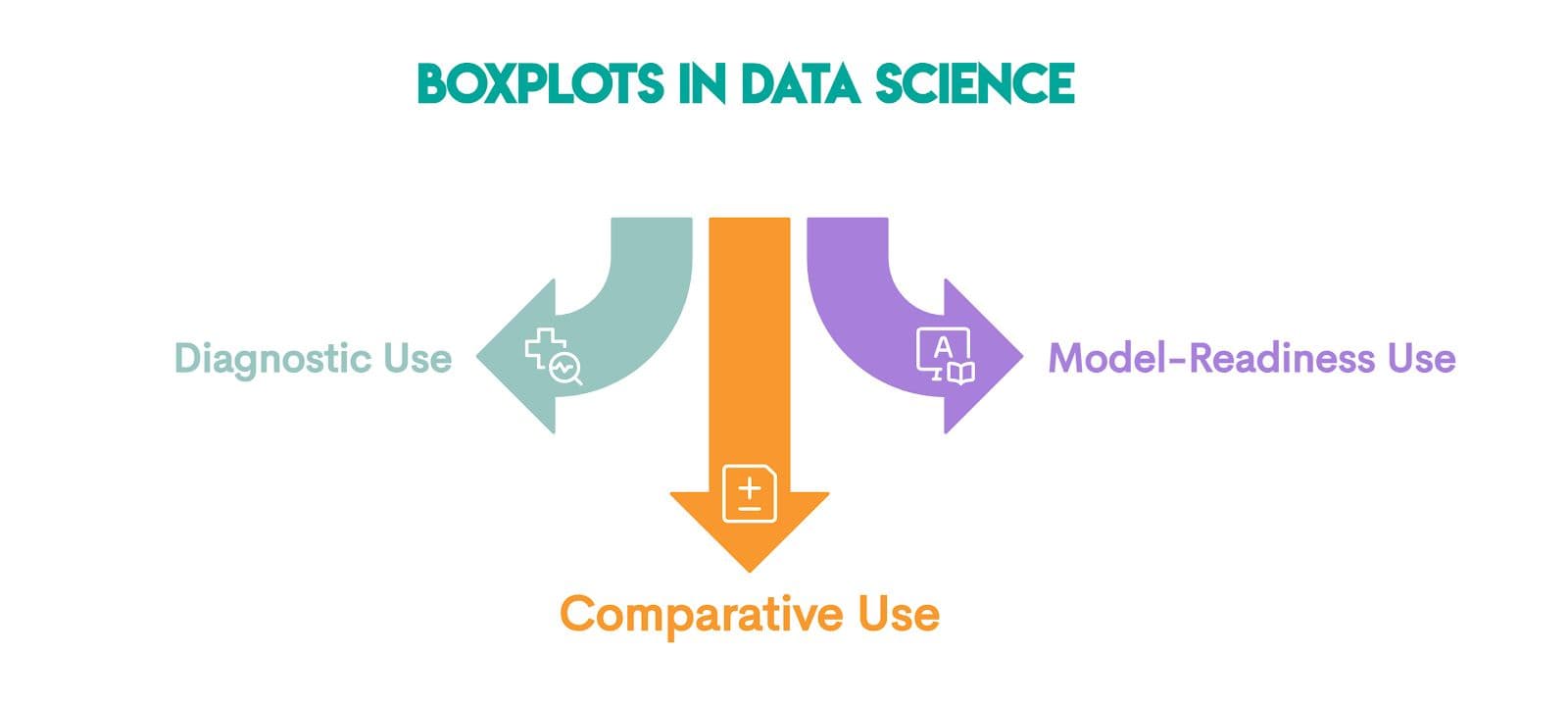
Diagnostic use: This is the basic use we showed earlier. It’s for detecting skewness, outliers, and spread.
Comparative use: Here, you use boxplots to compare distributions across groups, for example:
- regions
- categories
- timeframes
- experiments
Model-readiness use: This use is for assessing statistical assumptions. Before running statistical models like regression or ANOVA, boxplots can help you check symmetry (important for parametric models) and homogeneity of variance (“Are groups equally spread out?”). Depending on what boxplots show, you can decide whether transformations are needed.
Setting up Matplotlib for Boxplots
Before we can start drawing boxplots in Python, we need to set up the environment for using Matplotlib.
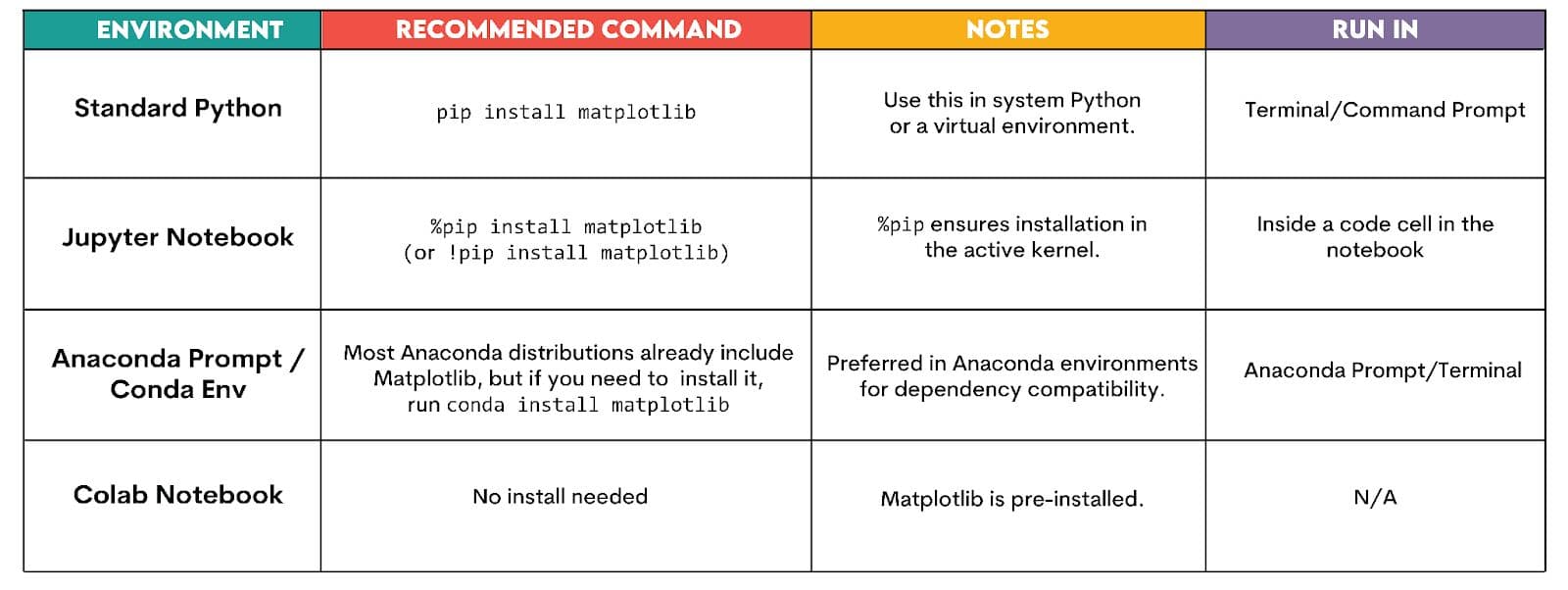
Installation (If You Haven’t Already)
If you don’t have Matplotlib installed already, here’s how to do it in the most common environments.
Basic Imports
To create the most basic boxplots, we typically import Matplotlib and pandas (for working with structured data, such as CSVs or tables).
import matplotlib.pyplot as plt
import pandas as pd  # optional, for data handling
Creating a Basic Boxplot in Matplotlib
In this section, we’ll learn how to create a basic boxplot in Matplotlib. Let’s first prepare the data.
Preparing the Data
We’ll create a list of numerical values that we’ll visualize in a boxplot. Boxplots require 1D numerical data, which is typically given as a single list or series of values, or grouped lists for comparison.
import matplotlib.pyplot as plt

# Example dataset: test scores or prices
data = [42, 55, 67, 68, 70, 72, 75, 79, 81, 88, 95, 102]
This data simulates something like test scores, sale prices, or any other numerical measurement.
This is the first part of the query.
Creating the Boxplot
We can now draw a boxplot following these steps.
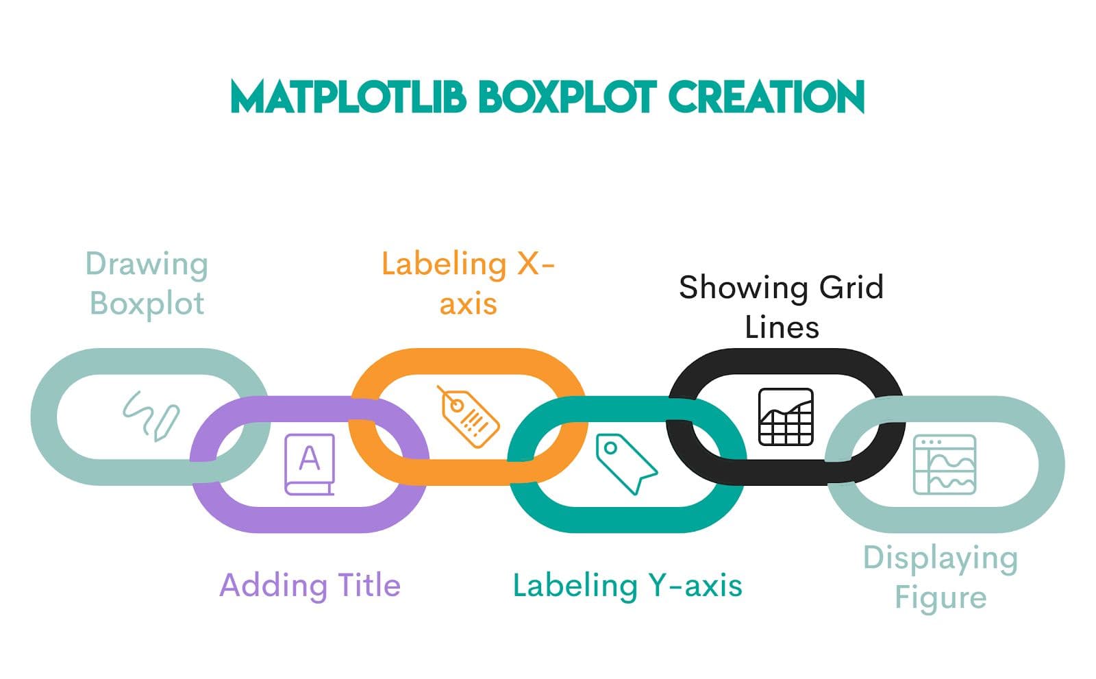
1. Drawing a Boxplot
Code:
plt.boxplot(data)
Explanation: The function draws a boxplot for the values inside data. Behind the scenes, Matplotlib calculates Q1, median, Q3, whiskers, and outliers.
2. Adding Title
Code:
plt.title("Boxplot")
Explanation: The function adds a title “Boxplot” to the plot; it will be displayed above the figure.
3. Labeling X-Axis
Code:
plt.xlabel("Sample")
Explanation: The function labels the x-axis with the label “Sample”. Labeling is important if you have multiple groups or categories.
4. Labeling Y-Axis
Code:
plt.ylabel("Value")
Explanation: The function labels the y-axis with “Value” on the left side of the plot. This tells the reader what the numbers represent.
5. Showing Grid Lines
Code:
plt.grid(True)
Explanation: The function turns on the grid lines in the background. It helps you follow the values across the figure, especially when values vary. If you wanted to hide the grid lines, you would pass False in the parentheses.
6. Displaying Figure
Code:
plt.show()
Explanation: The function displays the figure. Without it, the figure might not appear in some environments, like plain Python scripts. In notebooks, figures often show automatically, but it’s still a good habit to include plt.show() explicitly.
Consolidated Code & Output
Putting it all together gives this code.
import matplotlib.pyplot as plt

# Example dataset: test scores or prices
data = [42, 55, 67, 68, 70, 72, 75, 79, 81, 88, 95, 102]

plt.boxplot(data)
plt.title("Basic Boxplot")
plt.xlabel("Sample")
plt.ylabel("Value")
plt.grid(True)
plt.show()
That code will produce the following output.
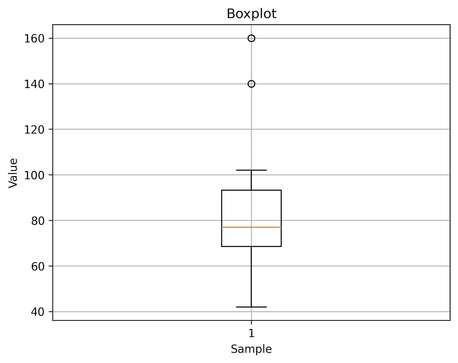
This really is a basic box plot. You can get the idea about your data from this visualization, but we can improve it with customization.
Customizing Your Boxplot with Matplotlib
The customizations can significantly improve the visual presentation and the precision of your basic boxplot.
Matplotlib offers you many options for plot customization. For more advanced styling, you can explore this detailed guide on matplotlib colors. You can control every visual element with simple arguments and enhance the readability of the box plot.
We’ll talk about these customization options.
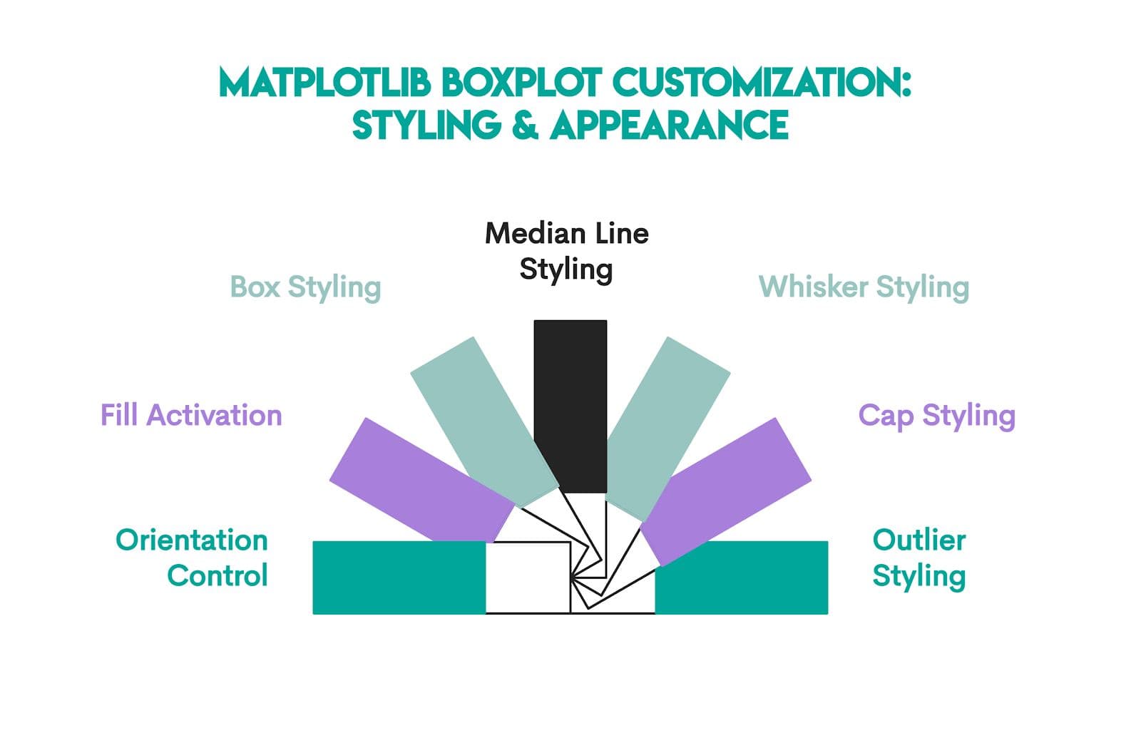
1. Orientation Control
Code:
vert=False
Explanation: By default, Matplotlib draws vertical boxplots. This code line makes the boxplot horizontal.
2. Fill Activation
Code:
patch_artist=True
Explanation: Boxes are drawn as unfilled outlines by default. The code above lets you fill the box with color, which is controlled by boxprops, our next code line.
3. Box Styling
Code:
boxprops=dict(facecolor="#98C5C0", color="black")
Explanation: The facecolor="#98C5C0" part fills the box with a teal-like color, while color="black" sets the border of the box to black.
4. Median Line Styling
Code:
medianprops=dict(color="#F8982E", linewidth=2)
Explanation: Styles the median line inside the box with color="#F8982E", making it orange and linewidth=2, making it thicker for emphasis.
5. Whisker Styling
Code:
whiskerprops=dict(color="black", linewidth=1.5)
Explanation: This controls the whiskers; specifically, it makes them black and slightly thicker than default.
6. Cap Styling
Code:
capprops=dict(color="black", linewidth=1.5)
Explanation: Styles the caps at the ends of whiskers; specifically, this code sets them to black with a line width of 1.5.
7. Outlier Styling
Code:
flierprops=dict(
        marker="o",
        markerfacecolor="red",
        markeredgecolor="black",
        markersize=8
    )
Explanation: This code customizes outliers, specifically:
marker="o"-> small circle markersmarkerfacecolor="red"-> fills the inside of the circle with redmarkeredgecolor="black"-> sets the border (outline) color of the circle to blackmarkersize=8-> makes the points large enough to stand out
Consolidated Code & Output
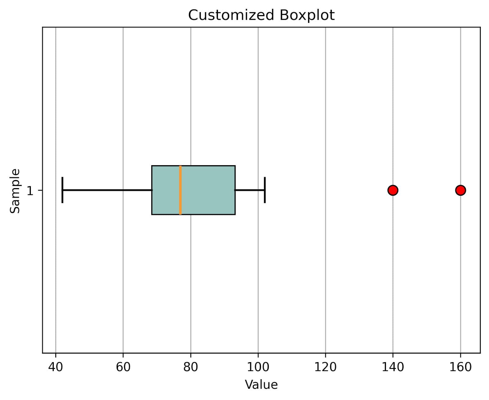
Here’s the code when we put it together, along with the basic boxplot code from earlier.
There are some slight changes. We rename the plot to “Customized Boxplot”.
Since we have now made the boxplot horizontal, we also flip the x- and y-axis labels. The x-axis is now labeled as “Value”, while the y-axis is labeled as “Sample”.
Due to the boxplot flipping, we also show the grid lines along the x-axis only; see the plt.grid() command.
import matplotlib.pyplot as plt

data = [42, 55, 67, 68, 70, 72, 75, 79, 81, 88, 95, 102, 140, 160]

plt.boxplot(
    data,
    vert=False,
    patch_artist=True,
    boxprops=dict(facecolor="#98C5C0", color="black"),
    medianprops=dict(color="#F8982E", linewidth=2),
    whiskerprops=dict(color="black", linewidth=1.5),
    capprops=dict(color="black", linewidth=1.5),
    flierprops=dict(
        marker="o",
        markerfacecolor="red",
        markeredgecolor="black",
        markersize=8)
)

plt.title("Customized Boxplot")
plt.xlabel("Value")
plt.ylabel("Sample")
plt.grid(axis="x")

plt.show()
Here’s the output.
Real-World Example: Boxplots with a Dataset
Let’s now solve one interview question from our platform to learn how boxplots work with real-world data.
Question Requirements
The “Student Performance Comparison” interview question asks you to craft a boxplot to compare the performance scores of students across various schools. You should use the 'plum' color for School 1, 'peachpuff' for School 2, and 'palegreen' for School 3.
Student performance comparison
Craft a box plot to compare the performance scores of students across various schools using 'plum' for School 1, 'peachpuff' for School 2, and 'palegreen' for School 3.
Dataset
The dataset consists of the columns school and performance_scores. Here’s the preview.
Code
In the solution, we prepare a list of three colors. Each one will be applied to a different school’s box in the boxplot.
Then we create a new figure (plot canvas) with a width of 10 inches and a height of 6 inches.
After that, we use the plt.boxplot() function to build a boxplot with three groups, i.e., schools. We store a dictionary of boxplot elements in bp. The patch_artist=True allows coloring the boxes, and labels=[...] (or tick_labels=[...])sets custom x-axis labels under each box.
The for loop iterates over each box in the boxplot and applies a unique fill color from the colors list.
In the last code segment, we add a plot title, label the x-axis as “School” and the y-axis as “Performance Scores”, add a grid for readability, and display the finished plot.
- The dataset has already been loaded as a pandas.DataFrame.
- print() functions and the last line of code will be displayed in the output.
- In order for your solution to be accepted, your solution should be located on the last line of the editor and match the expected output data type listed in the question.
Output
Here’s the output.
Expected Visual Output

Let’s interpret each box separately, then give an overall conclusion.
School 1 (purple box):
- Median is around the mid-70s -> average performance is solid.
- IQR is fairly tight (roughly 70-80), meaning most students cluster close together.
- Outliers: one very high outlier (close to 100).
- Interpretation: Most students in School 1 perform consistently well, with a few exceptionally high performers.
School 2 (peach box):
- Median is lower, around the low 60s -> weaker central performance compared to School 1.
- IQR is much wider (roughly 55-75), showing a significant variation among students.
- Whiskers extend further, and there’s at least one low outlier (~20s).
- Interpretation: School 2 has the most diverse performance – some students do very well, while others struggle significantly. It’s the least consistent school.
School 3 (green box):
- Median is high, mid-80s -> best average performance of the three schools.
- IQR is narrow (roughly 80-88), meaning performance is very consistent.
- No obvious extreme outliers.
- Interpretation: School 3 not only scores highest on average but also has the most uniform student performance.
Overall Comparison:
- Best performance overall -> School 3
- Most consistent performance -> School 3 (narrow IQR)
- Most varied performance -> School 2 (wide IQR, extreme low outlier)
- Moderately strong and consistent -> School 1
Common Errors and Troubleshooting
Creating boxplots is pretty straightforward (thanks, Matplotlib!), but beginners often stumble over a few common issues.
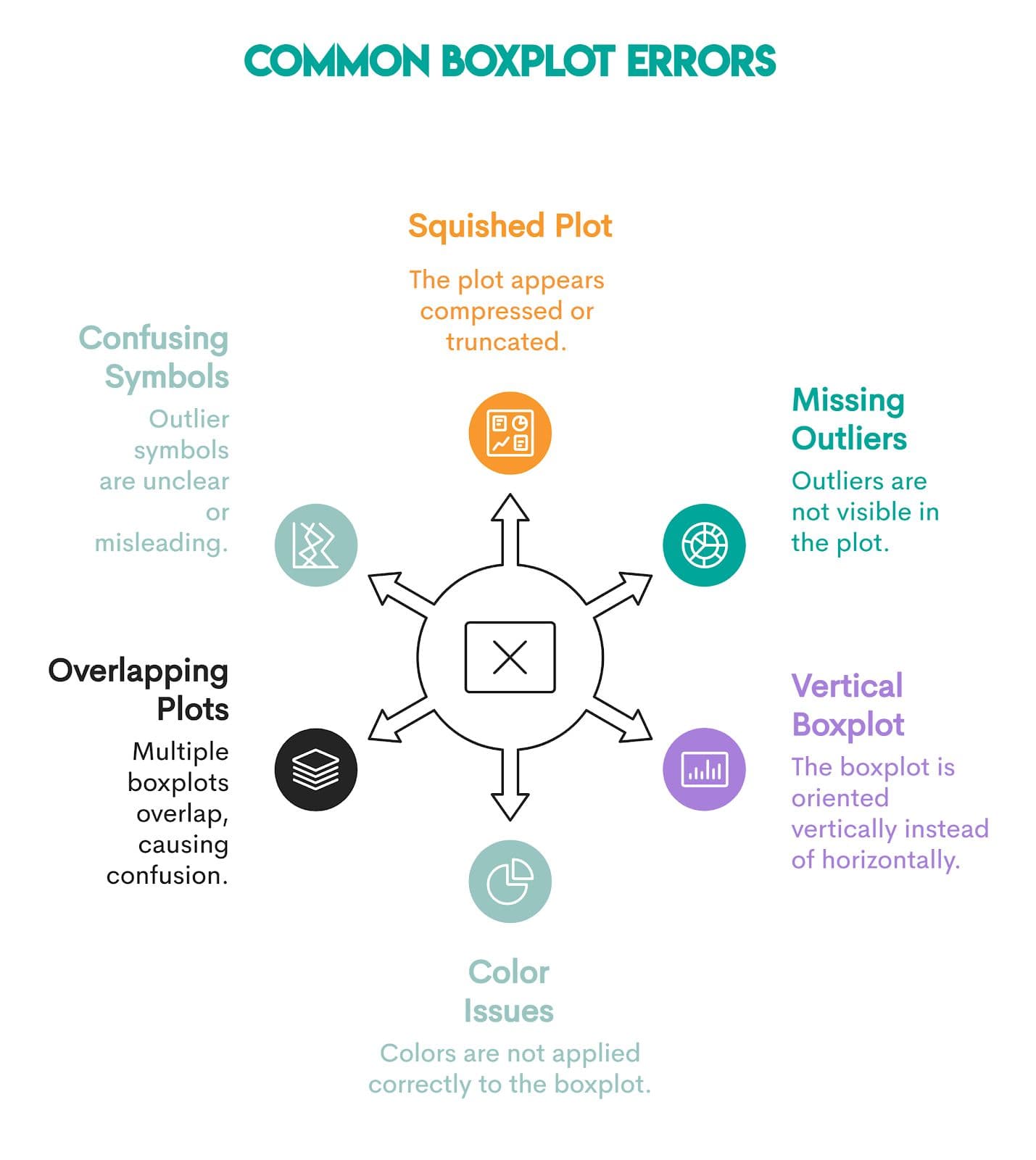
1. Plot Looks Squished or Cut Off
Cause: Labels or outliers are drawn too close to the figure edges.
Fix: Use plt.tight_layout() or adjust padding with plt.savefig(..., bbox_inches="tight").
2. No Outliers Visible
Cause: Your dataset doesn’t have values outside the 1.5*IQR range (the default Matplotlib formula for calculating outliers), so no points are marked as outliers.
Fix: If you want to change how outliers are defined, use the whis argument.
3. Boxplot Drawn Vertically Instead of Horizontally
Cause: Maptloblib draws vertical boxplots by default.
Fix: Set vert=False in the code.
4. Error When Applying Facecolor
Cause: If you forget patch_artist=True, you’ll get an error message.
Fix: Always include patch_artist=True so the boxes are drawn as filled patches, which can accept color.
5. Error When Plotting Multiple Boxplots
Cause: Passing multiple arrays as separate arguments will not result in multiple boxplots, but in an error.
Fix: Wrap the datasets inside a single list within the plt.boxplot() function.
6. Confusing Outlier Symbols
Cause: By default, Matplotlib draws outliers as small hollow black circles. On busy plots or with many points, they can blend in or be hard to distinguish.
Fix: Customize outlier markers with flierprops to make them more visible.
FAQs
1. What are the main features of a boxplot in Matplotlib?
A boxplot displays key statistics of a dataset:
- Median -> the central line inside the box
- Q1 and Q3 -> the edges of the box, representing the 25th and 75th percentiles
- Interquartile range (IQR) -> distance between Q1 and Q3
- Whiskers -> line extending from the box to show the data spread (typically within 1.5 x IQR)
- Outliers -> points outside the whiskers.
2. How can I customize colors in a Matplotlib boxplot?
Use patch_artist=True to allow fillex boxes and customize with boxprops, medianprops, etc. For example, like this.
plt.boxplot(
    data,
    patch_artist=True,
    boxprops=dict(facecolor="lightblue", color="black"),
    medianprops=dict(color="red", linewidth=2),
    whiskerprops=dict(color="black"),
    capprops=dict(color="black"),
    flierprops=dict(marker="o", markerfacecolor="orange", markersize=8)
)
3. How do I create horizontal boxplots in Matplotlib?
Set vert=False to flip the boxplot horizontally.
4. Can I add notches to the boxplot in Matplotlib?
Yes. Pass notch=True to add notches around the median. Notches will help you visualize confidence intervals for the median.
Conclusion
No one can call themselves a serious data scientist without knowing how to interpret and draw boxplots using Matplotlib.
After reading this article, you don’t have such an excuse. You learned how to interpret every statistic shown on a boxplot and understand what they tell you within the context of your data. You also learned to create a boxplot using Matplotlib’s default settings and how to customize the boxplot’s appearance.
We’ve also provided a real-world example and discussed the common errors that beginners make when creating a boxplot in Matplotlib.
You’ve got all that you need. It’s up to you to hone your skills through practicing visualization questions on our platform and become a boxplot master.
Share