How to Create a Bubble Plot with Python and Matplotlib?

Categories:
 Written by:
Nathan Rosidi
Learn how to build bubble plots in Python with Matplotlib by visualizing multi-dimensional data using real-world interview datasets.
Have you ever started creating a scatter plot and thought there could be a more advanced one? That is where bubble plots are very useful, when simple dots just won't be enough for you.
In this article, we will explore how to create a bubble plot, and we will do this by using two different interview challenges step by step. Let’s get started!
What is a bubble plot?
A bubble plot is good when you want to show relationships between two variables. Also, if you discover a correlation, look at the size of the bubbles. For instance, you are analyzing product sales and customer satisfaction. Here, sales show the x-axis and satisfaction the y-axis, while bubble size represents total revenue.
How to create a bubble plot?
Bubble plots are similar to scatter plots, but with an extra dimension. You are still plotting these points on X and Y axes, but you are also saying, “Hey, let’s add size”.
In the example below, we will simulate sales satisfaction and revenue. Sales go on the x-axis and the satisfaction on the y-axis, and bubble sizes will tell us how much revenue each point generated.
import matplotlib.pyplot as plt
import numpy as np

np.random.seed(42)
sales = np.random.uniform(100, 1000, 15)
satisfaction = np.random.uniform(1, 10, 15)
revenue = np.random.uniform(1000, 10000, 15)

plt.figure(figsize=(8, 6))
plt.scatter(sales, satisfaction, s=revenue/10, alpha=0.5, c='purple', edgecolors='w', linewidth=0.5)

plt.title('Sales vs Satisfaction with Revenue as Bubble Size')
plt.xlabel('Sales (Units Sold)')
plt.ylabel('Customer Satisfaction (1-10)')
plt.grid(True)
plt.show()
Here is the output.
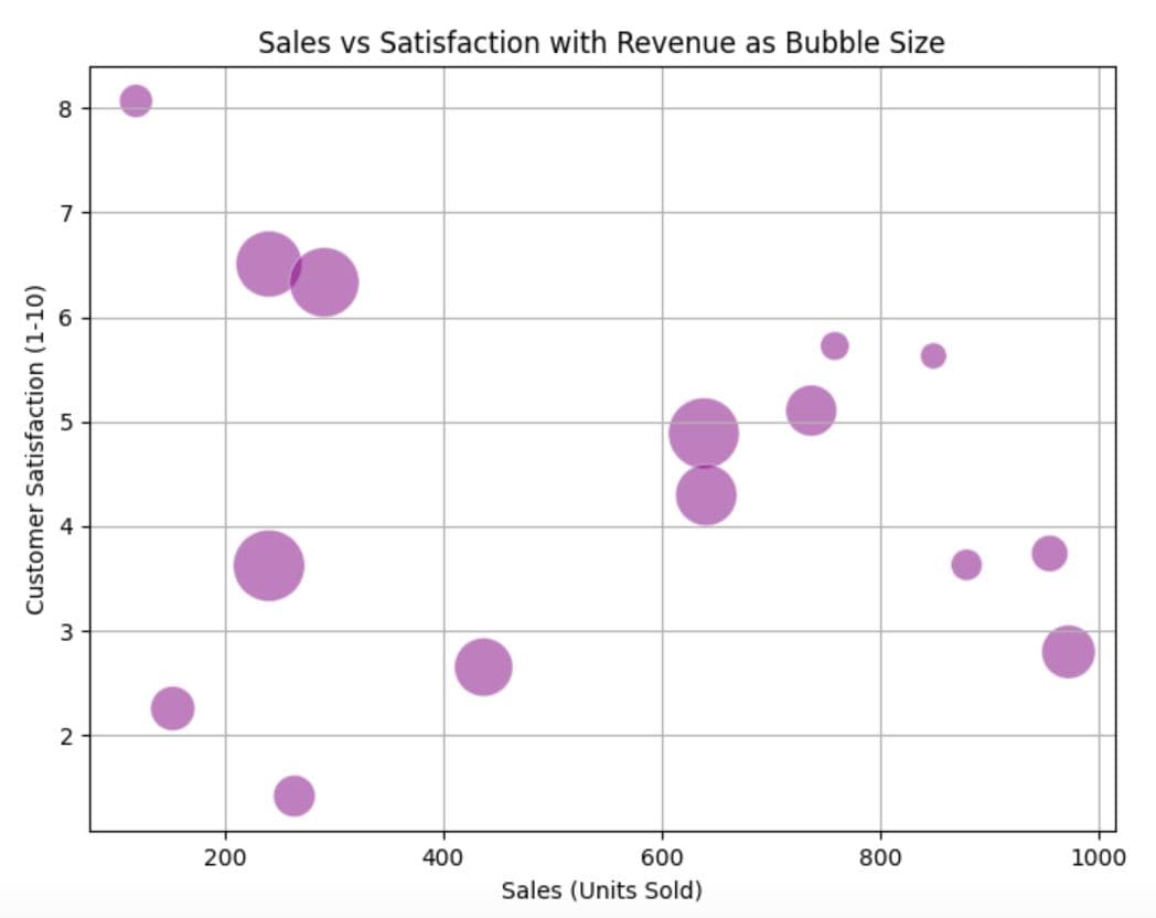
You see 15 bubbles in different sizes. Their size? That is the revenue doing all the talking.
Bubble Plot Example #1: Visualizing Real Estate Investment Performance
In this question, we have been asked to deploy a bubble plot to evaluate the investment returns of different real estate markets.
Real estate returns
Construct a bubble chart to evaluate the investment returns of different real estate markets, using 'skyblue' for residential, 'darkgreen' for commercial, and 'gray' for industrial properties.
Link to the question: https://platform.stratascratch.com/visualizations/10536-real-estate-returns
Data Exploration
Now let’s explore our dataset.
Each row here represents different features in the real estate market.
- invesment_return: How profitable the market is
- market: The name of the market
- category: type of real estate
- market_size: how large the market is
Creating the Bubble Plot
We want to plot:
- X-axis: Investment Return (%)
- Y-axis: Market Name
- Bubble Size: Market Size
- Bubble Color: Property Type
Now let’s build it step-by-step.
Setting the Plot
Let’s first set the plot. Here, we would put the figure size and select the x and y axes inside the scatter method from matplotlib. We have also defined the colors and loaded the libraries.
import matplotlib.pyplot as plt

# Color mapping based on property type
color_map = {'Residential': 'skyblue', 'Commercial': 'darkgreen', 'Industrial': 'gray'}
colors = df['category'].map(color_map)


plt.figure(figsize=(12, 8))
scatter = plt.scatter(
    df['investment_return'],
    df['market'],
    s=df['market_size'] * 10,
    c=colors,
    alpha=0.6,
    edgecolors='w',
    linewidth=0.5)
Aesthetics
Next, enhance the chart by adding a title to the plot and the axis. Also, we have set the grid for readability.
plt.title('Investment Returns of Different Real Estate Markets')
plt.xlabel('Investment Return (%)')
plt.ylabel('Market')
plt.grid(True)
Adding Legends
Next, we add legends so each color will explain itself on the plot.
plt.legend(handles=[
    plt.Line2D([0], [0], marker='o', color='w', markerfacecolor='skyblue', markersize=10, label='Residential'),
    plt.Line2D([0], [0], marker='o', color='w', markerfacecolor='darkgreen', markersize=10, label='Commercial'),
    plt.Line2D([0], [0], marker='o', color='w', markerfacecolor='gray', markersize=10, label='Industrial')
], title='Property Type', loc='upper right')
Displaying the Plot
In this final part, we will use the following code to display the graph.
plt.show()- The dataset has already been loaded as a pandas.DataFrame.
- print() functions and the last line of code will be displayed in the output.
- In order for your solution to be accepted, your solution should be located on the last line of the editor and match the expected output data type listed in the question.
Bubble Plot Example #2: Visualizing Business Performance by Size
In this question, we will create a bubble chart to explore the relationship between company size, profitability, and market presence.
Company size-profitability correlation
Construct a bubble chart to explore the relationship between company size, profitability, and market presence, using 'mediumseagreen' for small companies, 'darkkhaki' for medium-sized, and 'coral' for large companies.
Link to this question: https://platform.stratascratch.com/visualizations/10481-company-size-profitability-correlation
Data Exploration
Let’s explore the data.
We’ve got company size buckets (Small/Medium), profitability scores, market presence values, and bubble sizes.
Setting the Plot
Here, let’s first set the plot. To do that, we will define the colors for each company size, put the figure, and separate groups using groupby().
import matplotlib.pyplot as plt

# Setting colors based on company size
colors = {'Small': 'mediumseagreen', 'Medium': 'darkkhaki', 'Large': 'coral'}

plt.figure(figsize=(12, 8))

# Plotting each group
for size, group in df.groupby('company_size'):
    plt.scatter(group['profitability'], group['market_presence'],
                s=group['bubble_size'] * 10,
                color=colors[size],
                alpha=0.6,
                label=size)
Using a loop here lets us color and scale each size group separately.
Aesthetics
Next, add a clean title, labels, and a grid to keep everything readable.
plt.title('Relationship between Company Size, Profitability, and Market Presence')
plt.xlabel('Profitability (%)')
plt.ylabel('Market Presence')
plt.grid(True)
Adding Legends
Now let’s show what each color means.
plt.legend(title='Company Size')Displaying the Plot
Now let’s display the plot.
plt.show()
- The dataset has already been loaded as a pandas.DataFrame.
- print() functions and the last line of code will be displayed in the output.
- In order for your solution to be accepted, your solution should be located on the last line of the editor and match the expected output data type listed in the question.
Common Mistakes When Creating Bubble Plots
Bubble plots can look good, but you should be careful while creating them. Here are the most common mistakes that ruin clarity or mislead analysis.
- Misleading Bubble Sizes: The bubble area grows faster than expected, so you must use proper scaling methods.
- Too many Categories: If there are too many categories in bubble plots, stick with a few key groups to maintain a better look.
- Missing Legends: If you don’t know what it is, it has no meaning, right? So, make sure to use legends that explain your story more clearly.
When Not to Use a Bubble Plot?
Bubble plots look better than scatter plots. However, sometimes they might not be the right tool, but when?
- Too little data: The bubble plot might be overkill when you have a few points.
- Hard-to-Quantify Categories: When your third variable has no numeric meaning, bubble size becomes noise.
- Crowded Dataset: When you have dozens of data points in a small range, consider a heatmap or faceted plots instead, because the bubble size becomes noise.
Check out how to customize Matplotlib colors to enhance your plots, if you're interested in learning more about plot customization.
Conclusion
When you want to pack more than two dimensions on a chart, bubble size is for you. It lets you compare not just what to where, but also how much in a single graph. In this article, we have explored bubble charts, starting from what bubble charts are, and creating bubble charts for complex questions, step by step. With the right scaling and design choices, bubble plots can make complex data easier to interpret and more impactful in presentations or interviews.
Share