4 Python Data Visualization Libraries You Can’t Do Without

Matplotlib, seaborn, Plotly, and pandas - the 4 Python data visualization libraries you can’t do without. Learn how to use them with our code examples.
In this article, I will explain data visualization libraries in Python in detail. We'll explore some of the most popular Python data visualization libraries, such as Matplotlib, seaborn, Plotly, and pandas. We'll see the strengths and weaknesses of each library and provide practical examples of how to use them to create compelling visualizations.
Data visualization is communicating your findings with graphs and presenting the information visually. It’s a must-have skill for any data scientist, as it’s a regular part of a data science cycle. In each cycle part, there’s at least one Python library you should know. The one that will help you successfully do the work required.
It is preceded by data collection, for which you can use several data collection libraries in Python. However, collecting data is just the first step in the process of making predictions and gaining insights.
Now, let’s focus on data visualization and see how Python libraries help you here.
What is Data Visualization in Data Science

Data visualization is an essential tool for data science that helps data scientists explore, analyze, and communicate data.
Data science uses data visualization to examine large data sets and identify trends, patterns, and relations in the data.
It could be useful for building machine learning models or for other purposes.
When visualizing data, you will create different types of graphs, like line plots, scatter plots, and bar charts. They help data scientists understand and check the data trends and patterns.
Aside from choosing the right chart to visualize your data, you’ll also have to choose between many design options. These include selecting different color schemes and labeling axes, titles, and legends.
These chart and design options should be used for focusing on important information the chart shows.
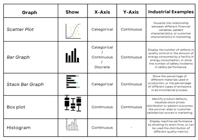
Choosing the Right Graph
Here, you can see an overview of the most typical graphic used in data science, with their characteristics. This will help you find adequate data visualization for your project.

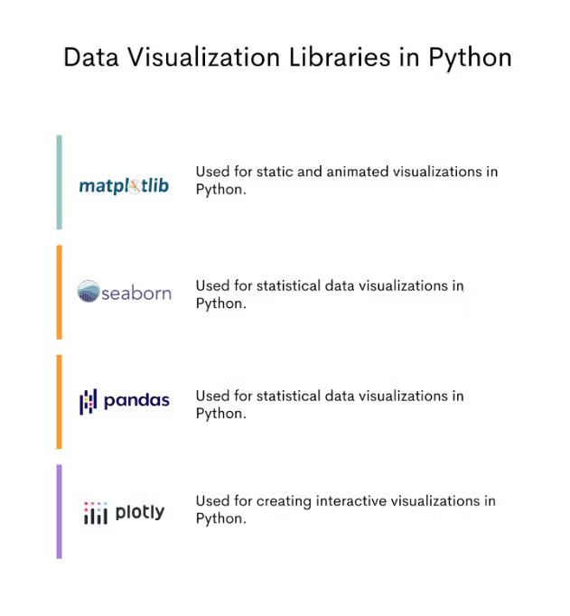
4 Python Libraries for Data Visualization
In this section, I will discuss the four most common Python data visualization libraries. I’ll also show you some examples that can help you learn how to visualize data.
Here’s the overview of these four libraries.

Let’s talk about each, and then we’ll go to the coding example to show you each library’s syntax and usage.
Python Data Visualization Library #1: Matplotlib
Matplotlib is a famous plotting library for creating visualizations in Python. John Hunter created it in 2002.
The visuals in Matplotlib can be animation or interactive visualization.
It’s a library widely used in data science and scientific computing and is a core library for many other Python data visualization libraries.
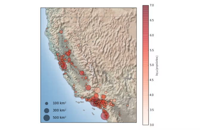
You can see its usage in data science below. It is a scatter graph that shows the population of California cities.

Here is the official Matplotlib library website.
Data Visualization in Matplotlib
Let’s start with the basics. In this example, we will draw a stack plot to analyze the world cup matches data, like goals, offsides, or fouls on different days.
Import the Libraries
We’ll import the library, together with NumPy and pandas.
import pandas as pd
import numpy as np
import matplotlib
Defining data
We’ll then add two variables.
The x variable is a list of strings that specifies the day for the plot.
The df variable is a pandas DataFrame containing the plot's statistical data.
x = ["Monday","Tuesday", "Wednesday", "Thursday"]


df = pd.DataFrame({'goals': [18, 22, 19, 14],
                   'offsides': [5, 7, 7, 9],
                   'fouls': [11, 8, 10, 6]})
Create Figures and Plot Data
The columns of the DataFrame represent the different data series that will be plotted in the stack plot.
The code then creates a figure and axes object using the plt.subplots() function, and plots the data using the ax.stackplot() function with labels argument, because it will be useful for us to add legends.
The x-axis labels and y-axis data for each data series are passed as arguments to the stackplot() function.
# Create a figure and axes
fig, ax = plt.subplots()

# Plot the data
ax.stackplot(x, df['goals'], df['offsides'],df['fouls'], labels=['Goals', 'Offsides', 'Fouls'])
Add Legend and Show The Plot
The ax.set() function is used to add a title and axis labels to the plot.
We will use the legend() function with loc and fontsize arguments. This defines where we put the legend and what its size is.
Finally, the plt.show() function displays the plot.
# Add a title and axis labels
ax.set(title="World Cup Analysis", xlabel="Match Day", ylabel="Match Statistics")
ax.legend(loc='upper right',fontsize=8)
# Show the plot
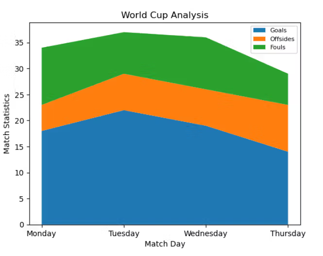
plt.show()The resulting stack plot shows the cumulative values of the goals, offsides, and fouls statistics for each match day.
The y-axis values represent each match's total number of goals, offsides, and fouls.
The different data series are stacked on top of each other to show the cumulative values.
This code creates a stack plot using matplotlib, NumPy, and pandas libraries.
Output
Here is what the graph looks like.

Python Data Visualization Library #2: seaborn
seaborn is a python data visualization library based on Matplotlib. It’s a higher-level library designed explicitly for statistical visualization and is commonly used in conjunction with pandas for data exploration and analysis. Michael Waskom created it in 2014.
When building a machine learning model in data science, you should detect and remove the outliers. This technique will increase your model's performance. By drawing a distribution plot like we’ll show you, you can detect outliers and set filters to remove them.
Here is the official seaborn website.
Data Visualization in Seaborn
We’ll use an iris dataset in this example. It’s a popular built-in data set that contains different data about plants.
We will use a scatter plot to show the relations between petal length and sepal length.
Import the Libraries
As always, first import the library.
import seaborn as snsLoad the Dataset
The iris variable is a DataFrame that contains the Iris flower dataset, which is loaded using the sns.load_dataset() function.
iris = sns.load_dataset('iris') Also, many built-in datasets exist in Python libraries. You can access them by loading the libraries. Here is an informative article that explains how to access other datasets using different libraries.
Set Style
The sns.set_style function is used to set the plot style to "darkgrid".The code then creates a scatter plot using the sns.scatterplot function.
sns.set_style("darkgrid")Draw a Graph
The data argument specifies the DataFrame that contains the data for the plot, and the x and y arguments specify the columns to use for the x-axis and y-axis data. The hue argument is used to color the points by the values in the "species" column, and the legend argument is used to show the full legend for the plot.
sns.scatterplot( data=iris, x='sepal_length', y='petal_length', hue="species", legend="full")Output

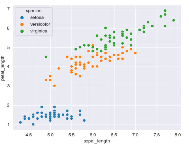
The resulting scatter plot shows the sepal length and petal length for each flower in the dataset, with each flower species represented by a different color. The legend shows the mapping of colors to species.
Python Data Visualization Library #3: Plotly
Plotly was created by Alex Johnson, Chris Parmer, and Jack Parmer in 2012. It is a library commonly used in web applications and dashboarding and can be integrated with other languages and frameworks, such as R, MATLAB, and Shiny.
You can use the Plotly library in data science to visualize PCA, see the regression line, draw roc and pr curves, and more. Learn more here about using Plotly in artificial intelligence and machine learning.
Here is Plotly’s official website.
Data Visualization in Plotly
Let's see one example of data visualization in Plotly to understand it better.
Fenerbahce and Galatasaray are two famous football (soccer) teams in Turkey. We will visualize one of their match results, including ball possession, fouls, and offsides, by creating a stacked bar chart in the Plotly library.
Import the libraries
First, let’s load Plotly.
import plotly.graph_objects as goCreate Figures
Fig is a Figure object representing the plot, and the add_trace() function is used to add data series to the plot. The code creates two data series, one for "Fenerbahce" and one for "Galatasaray" teams.
Add Traces
Each data series is added using the add_trace() function, which takes the x-axis and y-axis data as arguments, as well as the name of the data series and other properties, such as the marker color and line style.
import plotly.graph_objects as go

fig = go.Figure()
fig.add_trace(go.Bar(
    y=['Fauls', 'Offsides', 'Ball possession percentage'],
    x=[20, 14, 52],
    name='Fenerbahce',
    orientation='h',
    marker=dict(
        color='rgba(21, 78, 139, 0.6)',
        line=dict(color='rgba(246, 78, 139, 1.0)', width=3)
    )
))
fig.add_trace(go.Bar(
    y=['Fauls', 'Offsides', 'Ball possession percentage'],
    x=[12, 18, 48],
    name='Galatasaray',
    orientation='h',
    marker=dict(
        color='rgba(210, 71, 80, 0.6)',
        line=dict(color='rgba(58, 71, 80, 1.0)', width=3)
    )
))
Update layout
The update_layout() function is then used to set the barmode argument to "stack", which stacks the data series on top of each other to show the cumulative values. The title argument is also set to specify the title of the plot.
fig.update_layout(barmode='stack', title="Match Statistics between Fenerbahce and Galatasaray")Finally, the show() function is used to display the plot.
fig.show()Output

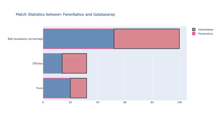
The resulting horizontal stacked bar chart shows the fouls, offsides, and ball possession percentage for both teams.
The x-axis values represent the total number of fouls, offsides, and ball possession percentages in the match.
The y-axis labels indicate which statistics are being plotted.
The different data series are stacked on top of each other to show the cumulative values.
Python Data Visualization Library #4: pandas
pandas was created by Wes McKinney in 2008. It’s a powerful tool for working with tabular data, including data cleaning and analysis. Not only that, but it also works excellently when visualizing data. It is often used with other python data visualization libraries, such as Matplotlib and seaborn, to create rich, informative plots and charts.
Pandas provide somewhat less complex graphs than other visualization libraries. Yet, it still can be used for different purposes in data science, like seeing data points with scatter plots or looking at the distribution of the features by histogram and more.
Here is the official pandas website.
Data Visualization in pandas
In this example, we will create a bar chart that shows the salary of different job titles. We will draw a bar chart by using pandas with matplotlib. It will show the salaries for different job titles.
Import Libraries
The code imports matplotlib.pyplot and renames it as plt. As I said, pandas is often used with Matplotlib when drawing a graph.
The code also imports NumPy and pandas as np and pd, respectively.
import matplotlib.pyplot as plt
import numpy as np
import pandas as pd
Create Data
As a next step, the code creates a DataFrame object in pandas, which is a 2-dimensional size-mutable, tabular data structure with rows and columns.
The DataFrame is constructed with a dictionary that contains two columns: "Job Title" and "salary". The "Job Title" column contains the names of different job titles, and the "salary" column shows the corresponding salaries for each job title.
df = pd.DataFrame({'Job Title': ['Machine Learning Engineer', 'Data Scientist', 'Python Developer','Software Engineer','Full Stack Developer' ],'salary': [130000, 120000, 50000, 70000, 125000]})Draw a Graph
After the DataFrame is created, the code uses the df.plot.barh() function to create a horizontal bar chart from the data. The x and y parameters specify which columns should be used for the x-axis and y-axis, respectively.
In this case, the "Job Title" column is used for the x-axis, and the "salary" column is used for the y-axis. The title parameter is used to specify the chart's title, which in this case is "Salary According to Job Titles".
ax = df.plot.barh(x='Job Title', y='salary', title = "Salary According to Job Titles")Finally, the code uses the xaxis attribute of the ax object (which represents the x-axis of the chart) to set the major formatter for the x-axis labels.
This is used to specify the format of the x-axis labels. In this case, it formats the values as dollar amounts with no decimal places.
ax.xaxis.set_major_formatter('${x:1.0f}')Alright, let's see the output.
Output

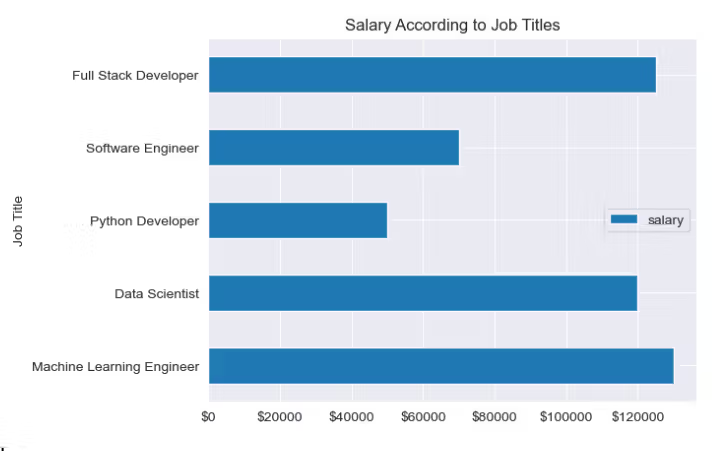
The bar chart shows the salary of different job titles, and the salary values are formatted as dollar amounts on the y-axis.
Conclusion
In this article, I explained the most popular Python data visualization libraries.
Python libraries, in general, have an essential role in data science and are a vital tool for data scientists.
Matplotlib, seaborn, Plotly, and pandas are some of Python's important (and most used!) data visualization libraries. You should be familiar with them if you’re serious about data science.
These libraries offer a wide range of features and allow customizations according to your project needs. Whether a beginner or an experienced data scientist, learning and mastering these libraries can increase your ability to communicate data through data visualization.
Latest Posts:


Share